From kitchen cabinets to house plants, green is a home décor trend right now and today we’re going to talk specifically about decorating with moss green (but you can learn more about decorating with deeper greens here)
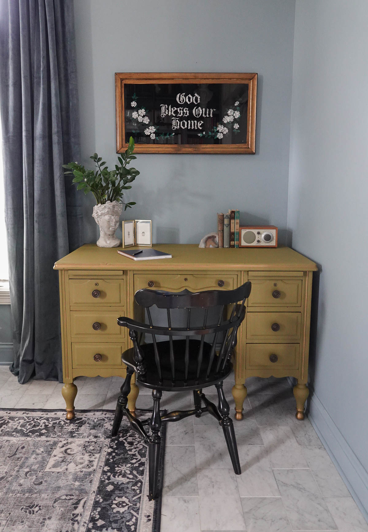
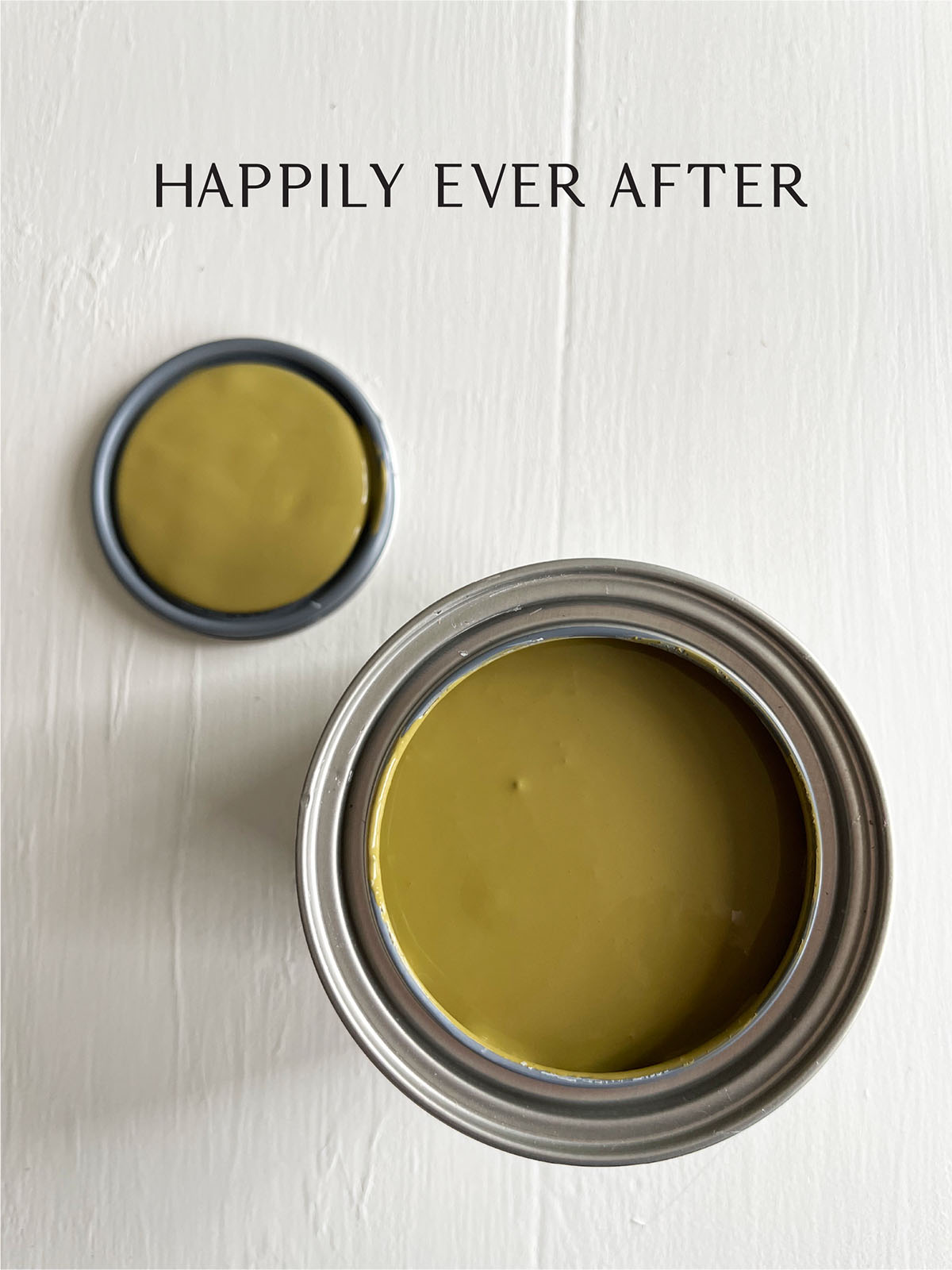
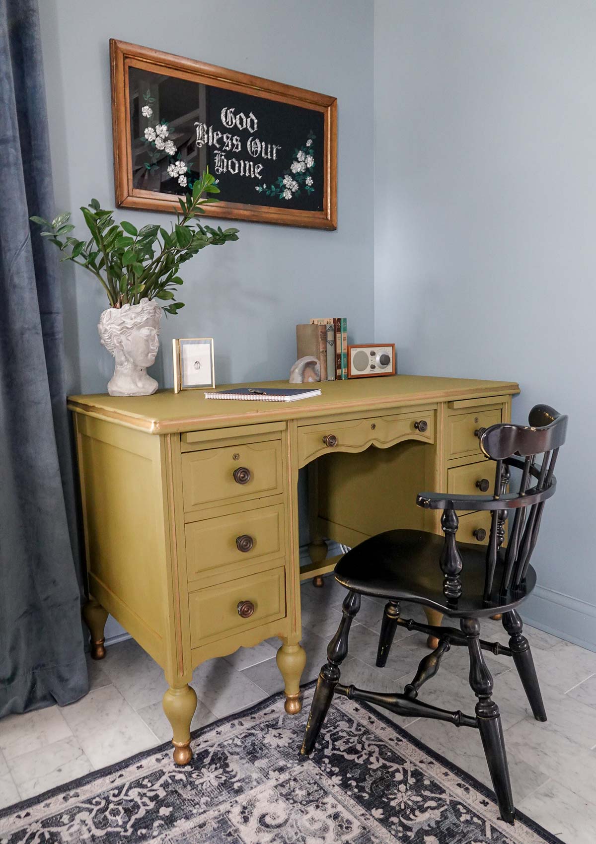
I partnered with Amy Howard Home to share their Color of the Month. This is a new monthly subscription where Color of the Month subscribers will receive a new color every month exclusive to the club. This month’s Color of the Month is Happily Ever After, and it is a warm, moss green – which is why we’re talking about all things green!
In nature, green symbolizes growth, harmony, and tranquility which makes it a great color to add to your own home and create a peaceful feel throughout.
The color of the month is a mossy green – the last color to shine before the air starts to cool in the fall. It’s a warm yellow-green that is a bit whimsical.
Because green is associated with nature and plants, it is an energizing hue. Even a touch of green can breathe life into any space. You can pair green-color home décor pieces with houseplants for double the impact.
Green is nature’s neutral. Have you ever brought a plant into a room and thought that it clashed? Probably not!
Green is one of those colors that can be both trendy and traditional. An earthy hue that evokes images of lush grass and fresh air, green is a color that easily brings the outdoors in and helps calm and balances a space.
COLOR THEORY
On the visible spectrum, green sits between blue and yellow. In painting and printing, green is a secondary color, meaning that it is created by mixing two primary colors—yellow and blue.
SHADES AND TINTS OF GREEN
Green can vary in both shades (in which the green is mixed with black for a darker green) and tints (which are mixed with white, to produce a paler result). But, there is also a broad range of green varieties that are mixed with other colors, such as yellow, blue, gray, and brown.
- Yellow greens such as mossy green, chartreuse (named after the French liquor which shares the distinctive color), and lime green have a lively, energetic feel.
- Blue greens such as sea green, aqua, and teal have more subtle energy which helps designs feel calmer and chicer. These colors are associated with emotional healing.
- Gray greens like seafoam and sage are wintery and more somber than their yellow- and blue-green relations.
- Brown greens like dark olive have a formal and dignified air, which explains why they are often selected for military uniforms. Olive green is the traditional color of peace.
Using moss green in your home can help you feel closer to nature and encourage relaxation and a serene environment – excellent qualities to have in your bedroom. Green is believed to be the easiest color for our eyes to process, and for that reason works to help calm us down.
Here are some of my favorite color combinations with green:
Green + Blue
These two colors often appear in nature together which is probably why they look so good indoors as well.
Green + White
Pairing moss green with lighter white gives it an instant tropical vibe, especially if you throw in a pop of yellow.
Green + Green
Just like in nature, layer hues of greens with each other for a fun look.
Green + Taupe
Taupe is gray-brown and has an earthy feel which makes it match well with moss green. It’s a very subtle color combination.
Moss green is a rich, vibrant earthy tone that will add grounding and depth to your home when used. There are so many different ways to incorporate this shade, from the most subtle to the most grandiose. When done the right way, this hue can give your home a relaxed, calming feel that makes unwinding after a busy day all the more enjoyable.
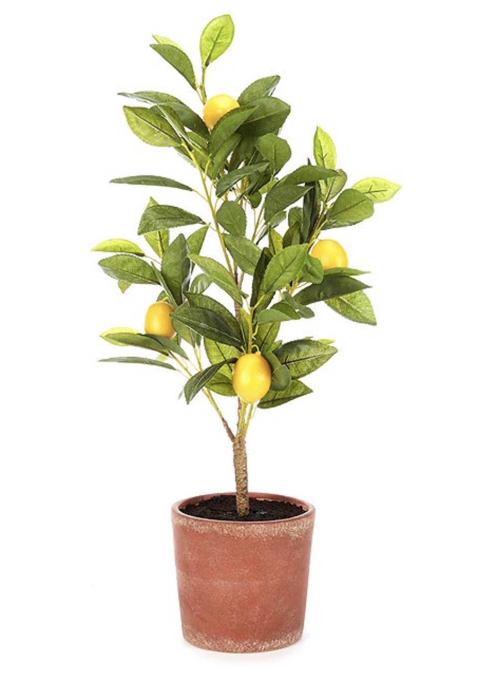
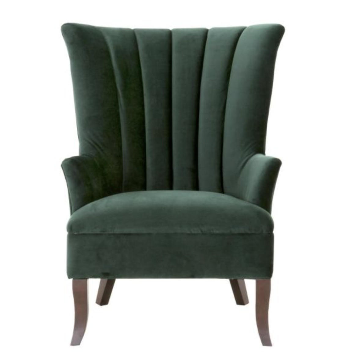
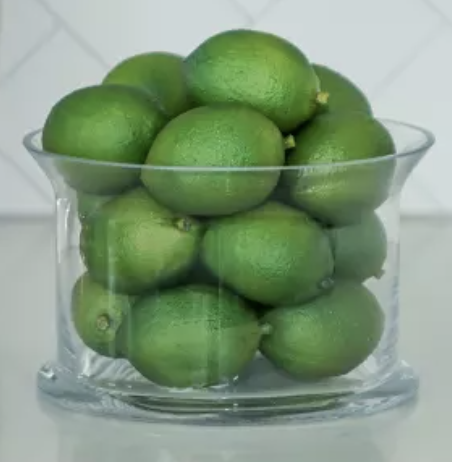
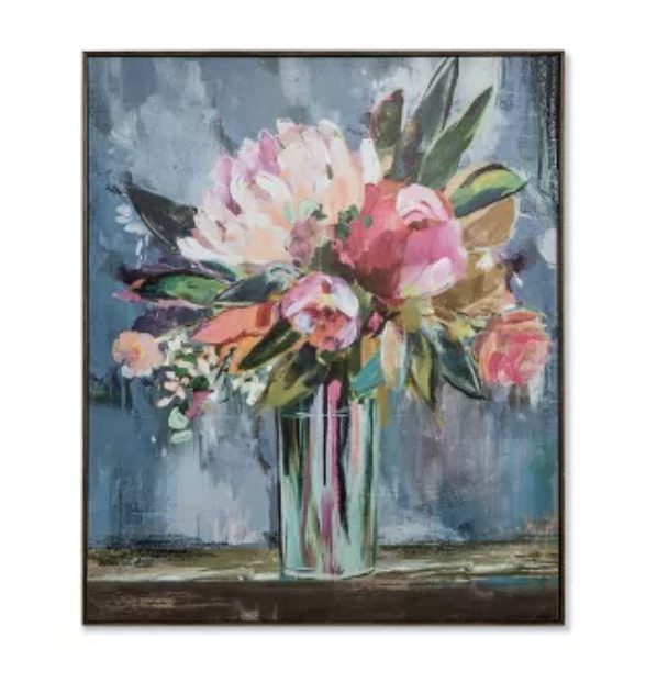
If you aren’t quite ready to tackle painting your room moss green or are looking for less permanent ways to incorporate the color through your home, then why not start with your home décor?
*This post contains affiliate links and is a sponsored post by Amy Howard at Home. I take pride in reviewing only products that fit my brand and will be beneficial to my readers. And while this post is sponsored, all the opinions are my own.

Are you new to my blog? Go HERE to see my home tour and HERE to shop for items I use in our home.


