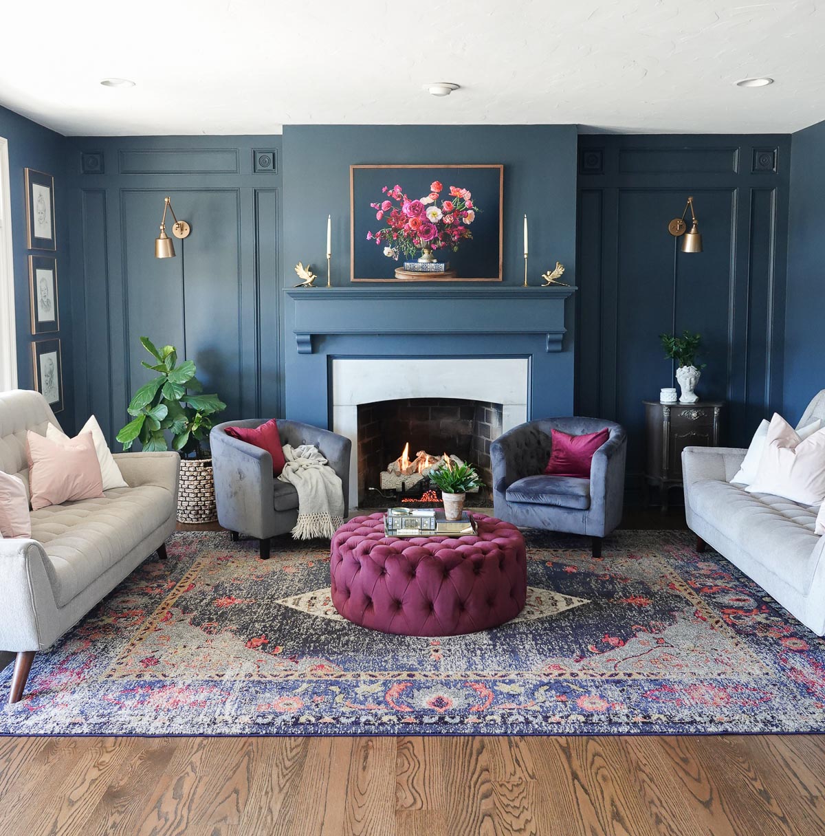
I am always switching things up, so the fact that I’ve had this same navy on my walls for over five years really means this is the best navy paint color.
This is the first of many paint color posts. Each week, I plan to share a paint color of the week to help you find the right color for your next project.
The Best Navy Paint Color
This navy is Valspar’s Night View, and I believe it is the perfect shade of dark navy blue.

Navy’s dark tones capture the eye and cause brighter colors to pop. It compliments all styles of decor and is a wonderful color to add to any space. However, it is a very dark color that should be balanced to ensure it doesn’t overwhelm.
It helps that I have a large wall of windows in our living room which allows plenty of natural light to flood in.

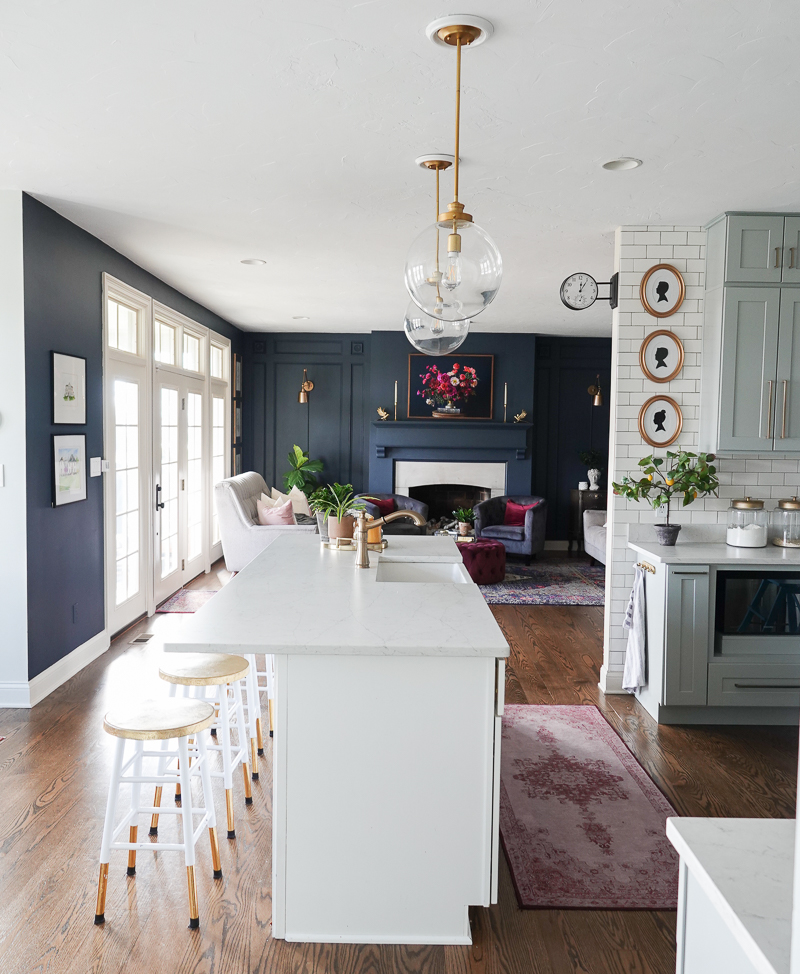
If you want to use Night View in your home but don’t have a lot of natural light, consider balancing the darker space with a lighter, brighter space.
Our kitchen is the opposite of moody and the contrast of the crisp whites provides some relief.
Brighten up moody paint with brighter colors and neutrals. Notice the various shades of pink and burgundy along with the lighter sofas and pillows. The metallic gold also adds another dimension of color and shine.

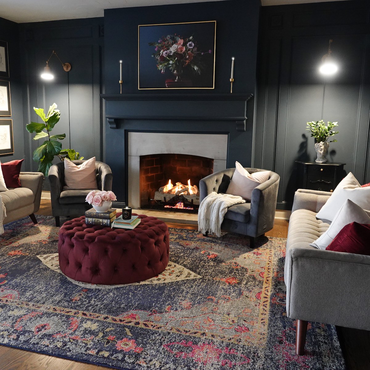
Moody colors bring sophistication to your room, and they look extra special in the evening.
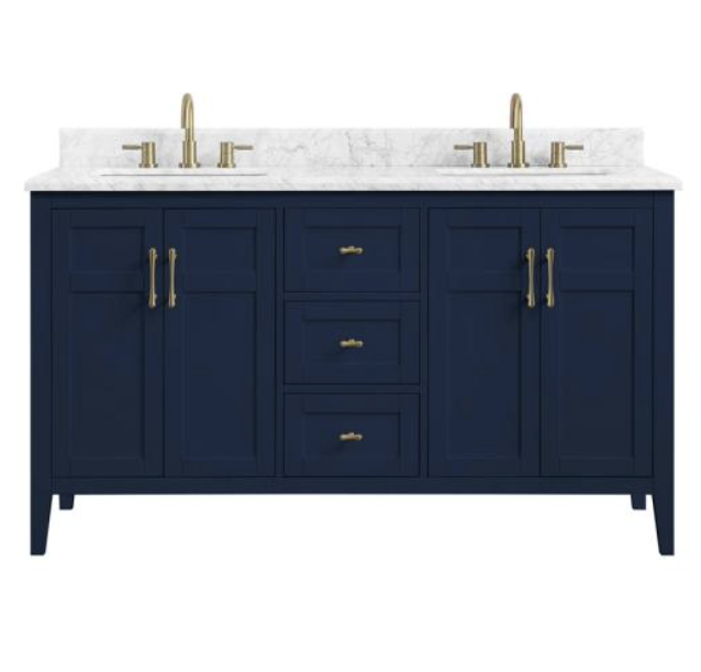
I painted everything in this perfect navy blue – the air vent, the outlets, and even the trim. I typically use an eggshell/satin finish for my walls and a semi-gloss for trim colors. Keep in mind that you really don’t need much paint for the trim, so only buy a pint of the trim paint.

Why Use Navy Color in Decor
The color blue is one of the world’s most popular colors with nearly half of men (42%) and one-third of women (30%) claiming blue as their favorite color. It is the color of skies and oceans and is often described as being tranquil, peaceful, secure, and full of serenity. Blue can lift our mood and improve the energy of a space.
From a color psychology perspective, blue is typically associated with stability and trustworthiness—there is a reason blue is universally appealing.
Different blue tones evoke different feelings:
- DARK BLUE: trust, dignity, intelligence, authority
- BRIGHT BLUE: cleanliness, strength, coolness
- LIGHT BLUE: peace, serenity, spiritual
If you want more ideas on decorating with navy, you can go HERE.

Night View vs Hale Navy
If you have researched classic navy paint colors, then I’m sure you are familiar with Benjamin Moore’s Hale Navy. It is also a beautiful rich blue and very similar to Valspar’s Night View.
Here’s a side-by-side of the two true navy paint colors. On the left is Night View and on the right is the popular navy loved by interior designers.

They are very similar, and when it comes down to finding the right navy, I would select Night View because the cost of Valspar paint is significantly less than that of Benjamin Moore. Also, Valspar paint provides good coverage and a beautiful finish.
Night View is a beautiful hue that would look great on an accent wall, cabinetry, piece of furniture, or even your front door.
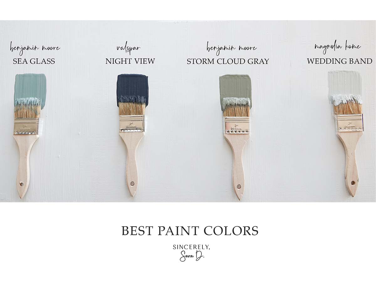
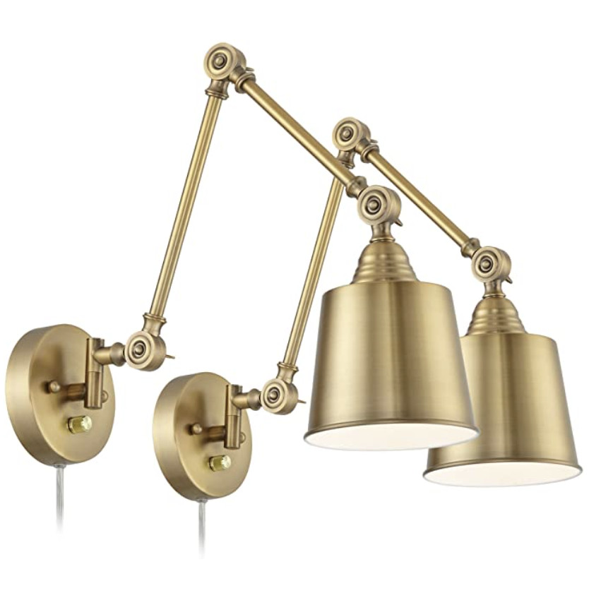
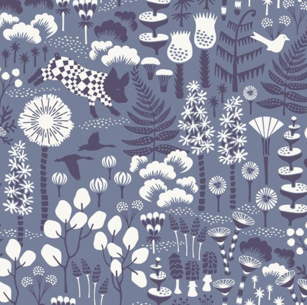
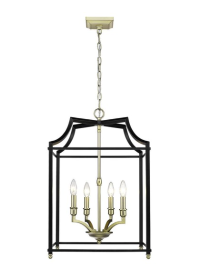
Here’s a sneak peek of some of my upcoming favorite paint colors. Do you have a perfect paint color you’d love for me to add to this series? Comment below and let me know!
Want to learn more about other great paint colors? Check out the previous colors of the week:

Are you new to my blog? Go HERE to see my home tour and HERE to shop for items I use in our home.

