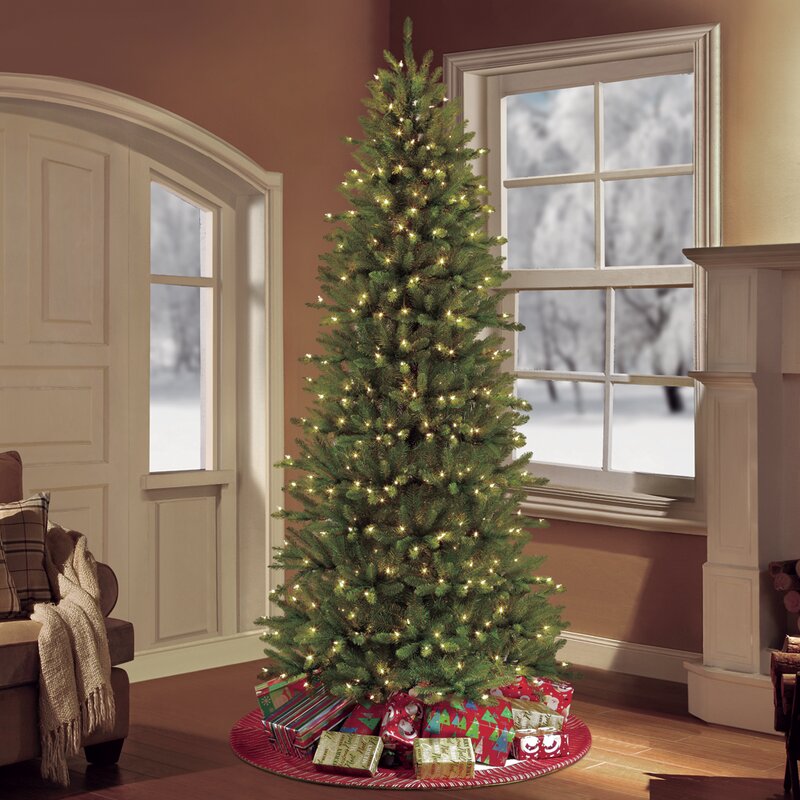
This family room is where we spend all of our time as a family, and we didn’t have a tree up here because I wanted two trees in our formal living room this year. I thought it would be fine, but Lena was so upset. This is the tree that we decorate with all the kids handmade ornaments. Luckily Joss and Main came to the rescue!
I have the 7.5′ Pre-lit Slim Fraser Green Fir, and the price was fantastic for the quality of the tree. It’s full, pre-lit, and looks perfect in our space!
Lena and I spent the evening watching a Christmas movie and hanging all her favorite handmade ornaments from over the years.
The tree is full of memories, and I look forward to setting up this tree every year.
I love the simple pinecone and berry wreath in our window. It doubles and indoor and outdoor decor. I added a simple navy bow to hang it from.
Keeping with the navy bow theme (the large tree also has them), I added a cute tabletop tree to the space and added a bow to the top of it.
Our family room is now festive and ready for the holidays, and we couldn’t love the space more!
Go create something!
Are you new to my blog? Go HERE to see my home tour and HERE to shop for items I use in our home.
*This post is a sponsored post by Joss and Main. I take pride in reviewing only products that fit my brand and will be beneficial to my readers. And while this post is sponsored, all the opinions are my own.
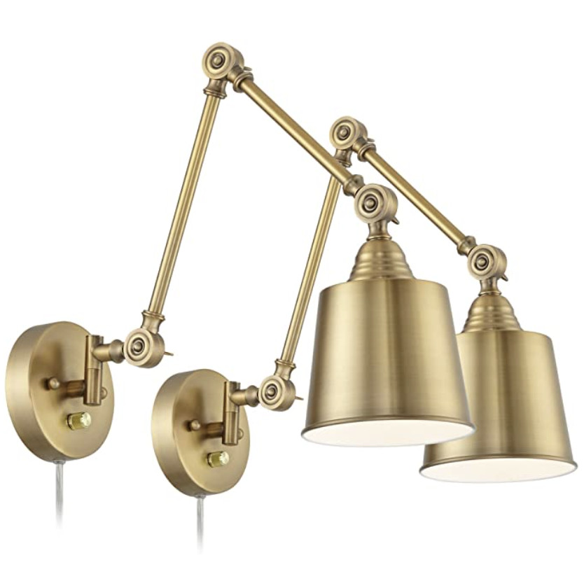
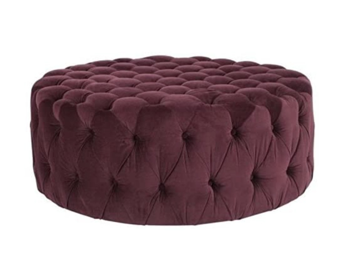
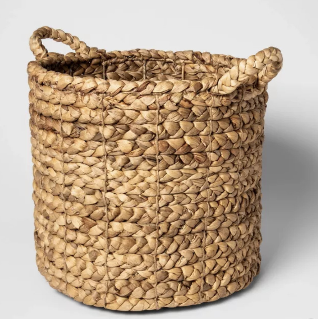
We spend so much time in our family room, so I decided to make it really festive this year. I rounded up my favorite Christmas decor from Joss and Main, and I’m using many of these items in our space:
Blue is one of the world’s most popular colors (with nearly half of men (42%) and one-third of women (30%) claiming blue as their favorite color). It is the color of skies and oceans and is often described as being tranquil, peaceful, secure, and full of serenity. Blue can lift our mood and improve the energy of a space.
From a color psychology perspective, blue is typically associated with stability and trustworthiness—there is a reason blue is universally appealing. By incorporating this shade of blue into your designs, you can create a sense of stability in your space.
Digging even deeper into blue tones, different blue tones evoke different feelings:
DARK BLUE: trust, dignity, intelligence, authority
BRIGHT BLUE: cleanliness, strength, coolness
LIGHT BLUE: peace, serenity, spiritual
Rainy Night is a mid-tone blue (bright blue) that is warmer than denim but softer than navy. It is a color that can fit into almost any style and design aesthetic – it would work well in everything from a modern farmhouse to a traditional craftsman home. It is class and refined and adds the right amount of depth and brightness to any space.
If you are nervous about adding color to your home, Rainy Night is the perfect place to begin. You don’t have to be a risk taker to incorporate this color into your home since it is so universally appealing. Painted furniture is a low-commitment way to introduce a new color into your space. Coffee tables, consoles or end tables are perfect spots for adding color to your living room.
As if this color isn’t great enough, you can use Rainy Night as a neutral. Remember, blues like navy and denim can be paired with almost any color.
Monochromatic Blues
Use it in a monochromatic scheme. Blueprint can work with lighter and darker blue shades.
Neutrals and Reds
Try Rainy Night with a neutral like Serengeti Gray or go bold with a color like Chinese Red.
Saturated Color
If you love the look of saturated color, you can totally use a mid-tone blue like Blueprint in your living room with other mid-tone colors. Mid-tone is a way of identifying colors that may be different, but are of similar light or darkness. Using colors of similar tones can give you a hip, eclectic look.
*This post contains affiliate links and is a sponsored post by Amy Howard at Home. I take pride in reviewing only products that fit my brand and will be beneficial to my readers. And while this post is sponsored, all the opinions are my own.
Are you new to my blog? Go HERE to see my home tour and HERE to shop for items I use in our home.
Painting cabinets is a fantastic way to inexpensively bring life to your outdated kitchen. Renovating an entire kitchen is expensive, but it is incredible how much painting cabinets can completely transform a space. There are so many options, but we’re going to talk through how to select the perfect kitchen cabinet paint colors for your home.
There are so many options for kitchen cabinet colors, but my advice is this: choose what YOU like. YOU are the one who lives in your home, so your cabinets should make you happy. And, it is just paint, and cabinets can always be repainted.
I know that no one wants to think about painting cabinets twice, but I say this so you realize you are not paralyzed by the color decision thinking the color is permanent. It is just paint!
When thinking about a color for your kitchen cabinets, there are several things you can consider to help guide your color decision.
CONSIDER THE DESIGN STYLE OF YOUR KITCHEN
Consider the design style of your kitchen and let it guide you. For example, traditional kitchen designs benefit from more classic kitchen cabinet paint colors such as creams and whites. For more modern and retro designs, bright colors are great. However, as I mentioned before, ultimately you have to do what you love and feel free to break the rules.
CONSIDER LIGHTING
Consider the lighting in your kitchen when selecting a cabinet color. For example, if light is limited and cold, try lighter, warmer colors. If your kitchen is flooded with natural light, you can try a darker, moodier color.
CONSIDER MIXING COLORS
Upper and lower cabinets don’t need to match! For a lighter, airier feeling, do white kitchen cabinets on top and dark kitchen cabinets in a navy, black, or deep green on the bottom. If you have an island, paint it a darker color than the cabinets.
Now, let’s talk specifically about color. There are so many color and paint options, but I’ve narrowed it down to colors in Amy Howard’s One Step Paint Collection. I’ve selected this paint because it requires no sanding or priming, it comes in a gorgeous assortment of colors, and I’ve personally had lots of success with this paint on cabinets.
White cabinets may seem like they’re everywhere, but I do believe it’s because they are timeless. They will always be in style and fit everywhere from traditional to a more contemporary space.
There are downsides to white, and this is simply because they’re all white. They get dirty and scratches are more obvious – especially if you have kids and/or pets in the house. Don’t let this scare you away from white, but the maintenance of white is definitely something to consider.
Gray is a good middle ground for a cabinet color – it’s not as stark as white and not as traditional as wood. It can come in many shades and like white it can also fit into any design style.
The downside to gray is that some see it as trendy, although gray has been around in home decor for some time now.
Blue makes for a fun color and can almost be a neutral (think about how we wear blue jeans with everything). Besides adding some color, blue is a universally loved color and can make you feel good because blue psychologically has calming effects.
The downside is that you need to make sure you really love the shade of blue you’ve selected.
Moody, dark paint works great for hiding disasters (spills and stains). The darker paint colors can seamlessly blend modern and classic design while making a statement in your kitchen.
The downside to a moody paint color is that it will darken your space so natural light is a must.
A bright pop of color is a fun personal style statement. Not everyone likes neutrals, and choosing a bright color will show your kitchen truly belongs to you.
The downside is that bright colors in large doses can be overpowering and you’re more likely to grow tired of them.
Two kitchen cabinet colors can be fun and impactful. As I mentioned earlier, you can also mix up the color of your kitchen island (if you have one). You can be bold with color choices or play it safe by pairing a bolder color with a neutral cabinet color. Mixing is a fun way to add color without an overpowering punch of color.
I painted our kitchen cabinets using One Step Paint before we remodeled it (you can see our remodel HERE). Here’s a little before and after of the cabinets:
I also painted our laundry room cabinets with One Step Paint, and I had a lot of luck spraying the doors. They still look great years later. Here’s a before:
And here’s how the space looks now:
Go create something!
*This post contains Amy Howard Home affiliate links
Are you new to my blog? Go HERE to see my home tour and HERE to shop for items I use in our home.
This is my absolute favorite way to decorate a tree – it’s elegant but still fun and colorful. I’m going to show you step-by-step how to create a colorful Christmas tree.
I share similar online sources to create the look towards the end of this post.
I began with an unlit artificial Fraser Fir from Balsam Hill. I’ve had it for several years now, and it still looks fantastic (you can see more on this tree HERE).
Create a Colorful Christmas Tree
Lights
To begin, I added clear lights to the tree.
Floral
Besides the fun color scheme, I think florals are what make this tree so much fun. I found unique faux florals stems at our local craft store (Hobby Lobby).
I cut the bunches into individual stems so I can spread them throughout the tree(s).
Besides the florals, I also added some faux fern stems. I love them because of their delicate, feather look.
I also added some candied cranberry sprays as well.
Here a looks at the tree with all the sprays.
Besides yellows and burgundys, I wanted to add some blues and found these sparkly blue floral stems.
The final floral are some eucalyptus leaves.
Fruit
I lucked out with finding these candied pear ornaments, but if you don’t have my luck, you can create your own! just hot glue some string to any faux fruit.
Bulbs
The final touch to this colorful tree are classic bulb ornaments. I bought an. inexpensive variety pack of light pink bulbs and love all the finishes and textures.
I also added some classic deep burgundy bulbs and blue (although I forgot to take a photo of the blue) as well.
And that’s it! With some florals, faux fruit, and classic bulbs, you can create a colorful, texture-filled Christmas tree of your dreams!
Here are similar online sources to create a similar look (so you don’t have to go to the store):
I have slowly been creating a “Get the Look” for all the spaces in our home, and I finally created a “Get the Look: Bathroom Design”
I first shared my boys’ bathroom remodel HERE, and you can see what the space looked like before. I absolutely love the after. It is sophisticated but masculine enough that my boys love it.
*The vanity and faucet were gifted in partnership with Signature Hardware, and they are stunning. However, here is a less expensive option for the vanity:
Here’s a roundup of some fun pumpkin crafts you can create and customize to match your own decor!
*Spray Painted Pumpkins
The spray painted pumpkins is an easy project, and you can see the tutorial HERE. I created this Kate Spade inspired pumpkins using spray paint, painters tape, and stickers.
*Use a faux pumpkin for this craft so you can enjoy it year after year!
They are the easiest pumpkins to make, and the result is a pumpkin you can enjoy every year!
*Tissue Paper Pumpkin
The tissue paper pumpkin is one of my personal favorites, and I keep adding to my collection. Once you get the hang of it, they are easy to make and the perfect way to customize a pumpkin to match your personal decor and style.
*Use a faux pumpkin for this craft so you can enjoy it year after year!
The wrapping paper pumpkin gives you more options since patterned wrapping paper is easier to find than tissue paper, but it is a little more difficult. Since the paper is thicker, you have to cut the paper into strips and wrap the pumpkin. You can see more on how to create your own wrapper paper pumpkin HERE.
*Use a faux pumpkin for this craft so you can enjoy it year after year!
*Succulent Pumpkin
For this project, you won’t carve into the pumpkin which helps this succulent pumpkin last awhile (mine lasted two months). You will need to mist the moss and succulents, and it makes a gorgeous centerpiece.
*You will need to use a real pumpkin for this craft.
If you’re not familiar with One Step Paint, it is the easiest paint to use. It requires no sanding or priming, and I used Majesty One Step Paint on my bedroom nightstands and love the result! I also used One Step Paint on my laundry room cabinets, and they have held up so well.
Join me LIVE on Amy Howard Home’s Facebook page on October 22nd at 8pm EST where Amy Howard and I will talk about Majesty and the Color of the Month subscription!
I love to talk color theory, and I’m talking specifically about why the color of the month is so special while sharing several different accent colors to pair with October’s Color of the Month (Majesty). Read on to learn more!
AUBERGINE (ow·br·zheen)
Aubergine is a dark, brownish-purple hue resembling skin of eggplants. It’s the perfect fall color and is flattering both in home décor and in fashion. It has the warmth and energy of red and the calmness and coolness of blue – to create any purple color, a mix of red and blue are needed. Red, blue and yellow are primary colors, aka, the root colors of all the other colors that are created.
In color theory, these three colors (red, blue, and yellow) are the building blocks of the color wheel. The combination of these primary colors creates secondary colors. Mixing blue and yellow together creates green, mixing yellow and red creates orange and mixing blue and red creates purple. The simple mix then needs tone, tint and shade to build a more complex color like an aubergine color. The resulting mix is called a tertiary ( TER-she-err-ee ) color. Red and purple mixed together create a complex tertiary color that can be used with white or brown to create an eggplant hue.
What is Aubergine Color Like?
Because this color falls into the middle of the color spectrum, meaning it isn’t too warm or too cool, it makes a fabulously flattering color. The director of the Pantone Color Institute calls the tone “the perfect purple” because it is extremely versatile, almost like a black, a dark brown, or a navy. In ancient times, purple was associated with rank and royalty. In psychology it radiates confidence and self-esteem, so it’s a fantastic color all around. In design, aubergine looks very solid and luxurious which is why I love it. It can create a cozy and comfortable environment while being sophisticated.
White and Aubergine Color
White is by definition all colors combined, which might be exactly why it goes together so well with pretty much any color.
Aubergine and Cream
The slight touch of pink in this off-white color helps to create a relaxing balance to the vibrant, energetic vibe that comes with a purple color palette. The end result feels fresh without feeling overwhelming.
Aubergine and Greens
Aubergine is a color that goes particularly well with other colors with which it might be paired in nature. That is particularly true when it comes to green, which is one of the best colors to complement purple of all shades. The nature-inspired pairing is sure to create a sense of positive energy in any room.
Brown and Aubergine
Similarly, a deep brown looks perfect with aubergine, as it is reminiscent of an eggplant growing in fertile soil. This color pairs well with dark brown and the combination with natural textures such as wood and leather it creates a very masculine and sophisticated look.
Aubergine and Gray
Going along with the whole eggplant in nature theme, gray is a perfect shade to match an aubergine color scheme. The clean, earthy tones will create a warm, pleasant and sophisticated look.
Dark Blue and Aubergine
While aubergine is well suited to match many natural shades, blue can be difficult to pair with it since purples naturally have so much blue. However, rather than shying away from the blue, go with a nice deep shade that stands out even against the vivid shade of aubergine. The dynamic color scheme creates a vibrant feel in a room.
Aubergine and Purple
Purple on purple? Yes! Purple on purple creates a dramatic, vibrant look sure to catch the eye. If you like purple, consider layering aubergine with shades that have more white (lilac) or more red (plum) for a look that is sure to impress.
Black and Aubergine
Not everyone will feel comfortable with a space this dark in the home, but it does provide a warmth and mystery created by these dark colors.
Aubergine is the perfect color to add to any home – especially as we all gravitate towards deeper fall colors. To make it easy for you, I created three different Amy Howard at Home One Step Paint color combinations using Aubergine as the focal point.
Favorite Aubergine Color Combinations
As I mentioned earlier, Majestic is only available to Color of the Month subscribers. However, you can get a similar look with Amy Howard Home’s One Step Paint in Aubergine (although the paint color Aubergine is darker than Majestic). I’ve paired the Aubergine paint color with other beautiful One Step Paint Colors.
Aubergine is the perfect fall color for any home and any style. Don’t forget to check out Amy Howard Home’s new Color of the Month subscription, so you can have the exclusive Majesty: a gorgeous Aubergine paint color. If you join, you’ll have video training with me talking all things color theory along with:
32oz can of the color of the month
Free Shipping
10% off site-wide discount code
Stir Stick
Go create something!
Are you new to my blog? Go HERE to see my home tour and HERE to shop for items I use in our home.
*This post contains affiliate links and is a sponsored post by Amy Howard at Home. I take pride in reviewing only products that fit my brand and will be beneficial to my readers. And while this post is sponsored, all the opinions are my own.
Our bedroom is on the main floor, so its visibility alone motivates me to make it every morning. It just takes a minute or two, and there is something so nice about climbing into a made bed every night. I am going to share my formula for making our bed and encourage you to make a habit of it (watch this video from a Navy Seal Admiral as he shares reasons why to make your bed everyday – it’s SO good)!
To begin, remove pillows and pull back sheets and duvet/comforter. Pull fitted sheet tight.
Pull of sheet and duvet/comforter near top end of bed being away of even sides and leaving enough of the duvet/comforter to cover the end of the bed. I leave a few inches, but you can bring them all the way to the top if wanted. Fold back duvet/comforter (you can also fold back sheet as well).
I like to tuck in the sides of my duvet, but this is preference and works well with my footboard.
I add my pillows/shams, and then a row of three square pillows. I complete with another (smaller) row of three square pillows.
I like to keep an additional blanket at the end mainly for looks, but I use it on during those rare times where I lay down on the bed during the day and don’t want to crawl under the sheets.
Making your bed gives you a sense of accomplishment first thing in the morning and you will love crawling into it at night!
The weather is getting cooler and the leaves are changing here in Indiana. It officially feels like fall here in the midwest. I rounded up some fun fall decor for you – everything from a yummy candle to a cozy throw so you can add some fall touches to your home!
I’ve seen this paper bats taking over instagram, so I had to add them to this decor roundup. They come in different sizes with stickers, so you just stick and go. They look great inside or on your front door.
I love this fall apple cider sign. The chalkboard artwork is fun and colorful while adding some character to any space – and it looks like it was handmade.
I love velvet (I shared a roundup of my favorite velvet finds earlier this year), and these velvet pillow covers come in a rainbow of colors to match any style or decor.
Go create something!
Are you new to my blog? Go HERE to see my home tour and HERE to shop for items I use in our home.
I am in love with our boys’ bathroom remodel. We kept the same footprint of the bath to help with the budget, but we updated the walls, paint, flooring, and vanity. The cosmetic changes made a huge difference in updating the bath.
This is a sponsored post written by me on behalf of Signature Hardware. All opinions are 100% mine.
Here’s a before of the space:
And the after:
My goal was to design a space that was masculine enough for my boys while still maintaining the sophisticated traditional style of the rest of our home. I also wanted to add the navy in their bedroom while adding some additional pops of color. Bathrooms are spaces you can have a little more fun in with patterns and color.
The vanity provides plenty of storage for the boys, and they each appreciate having their own sink. The bottom open storage provides for customizable organization. We added a basket for each boy and use the center to store towels.
I painted the toilet room a deep green (Vine Green by Behr) to add a little unexpected color (and it’s the boys’ school color).
The flooring is luxury plank vinyl which looks like wood floors, and we added a schoolhouse light and vintage artwork which adds a fun contrast to the more modern wallpaper.
The boys love their updated bathroom and promise to keep it clean, but time will tell…
Thanks so much to Signature Hardware for partnering with me on the bathroom remodel! Go check out the half bath remodel I did with them earlier this year.
Are you new to my blog? Go HERE to see my home tour and HERE to shop for items I use in our home.
I had the honor of partnering with The RoomPlace on our bonus room makeover. This is the space where we spend all of our time as a family, yet it’s the space you see the least – mainly because it just wasn’t very pretty. However, thanks to The RoomPlace, it has been transformed into a beautiful and comfortable space that is perfect for our family!
Here is a before of the room:
And here’s the after:
Color
Since the room was all white, I added lots of color. I selected navy sofas and accent chairs and found the entire set at The RoomPlace. They were floor models which came with a fantastic price. I accented the navy and blues with greens, rusts, and coppers and golds.
Texture
I love the mix of textures of the seating – the velvet-looking sofas, the tweed accent chair, and the faux leather chair are the perfect combination. Try playing with texture – it adds a lot to any space.
The ottomans are from The RoomPlace Clearance Center, and they were the perfect solution for this space. We love having something to prop our feet up for movie night, but I didn’t want pieces that would make the room feel smaller. Since these gray ottomans almost match the floor, they disappear despite their massive size.
Every room needs some wood tones, and this gorgeous piece (and the basket) were also Clearance Center finds. We use it to store all the boys’ gaming miscellaneous.
The boys have a gaming center set up on the wall when you first walk in, and the media cabinet is also a RoomPlace find from several years ago (see more on that here).
The RoomPlace offers gorgeous home decor accent pieces like this amazing wood and concrete lamp. I fell in love with it the minute I laid eyes on the lamp, and the Clearance Center price sealed the deal. The side table was also a Clearance Center find, and I love the more masculine look in provides in the space.
Since there isn’t a lot of pattern happening in the sofa and chairs, I brought in pattern with some throw pillows and this gorgeous floral accent table – also a Clearance Center find!
These gorgeous brass trays are another example of the gorgeous accent pieces offered by The RoomPlace.
Get the Look
Since our items were all discounted pieces, I can’t link up to the exact pieces. However, I found similar gorgeous pieces from The RoomPlace and created a mood board and links if you want a similar look in you home:
The RoomPlace showroom is a fun place to find inspiration for your next room update. They have everything from traditional styles to rustic farmhouse to modern glam – and everything is set up in fun room vignettes.
I really enjoyed The Clearance Center because it’s more of a challenge since in requires some mixing and matching. The prices are amazing, and I will definitely come back the next time we’re looking to furnish a space.
Shopping Experience
See more on our shopping experience here:
I couldn’t be happier with the space. It’s classy but comfortable and absolutely perfect for our family. Thanks so much to The RoomPlace for this fun partnership!
Want to see more room makeovers with The RoomPlace? Check out these amazing transformations:
#DutchBoyPartner This bathroom leaned a little cool, so I warmed it up with Sandstone Tint by @dutchboypaints and it completely changed the look of the space.
No major reno. No new cabinets. Just paint.
Save this if you’ve been wanting to try a DIY project
#DutchBoyPartner This bathroom leaned a little cool, so I warmed it up with Sandstone Tint by @dutchboypaints and it completely changed the look of the space.
No major reno. No new cabinets. Just paint.
Save this if you’ve been wanting to try a DIY project...
56
32
I created this reel two years ago, but since the fields behind our house rotate between corn and beans… it’s a corn summer again. 🌽
The older I get, the more I appreciate these ordinary little rhythms of life. Watching the field change through the seasons has quietly become one of my favorite parts of home.
I created this reel two years ago, but since the fields behind our house rotate between corn and beans… it’s a corn summer again. 🌽
The older I get, the more I appreciate these ordinary little rhythms of life. Watching the field change through the seasons has quietly become one of my favorite parts of home....
52
8
I love this chair and side table from @zgallerie that I decided to try it in my office/library. I’m not sure where I love it more - here or my bedroom! It adds so much elegance and charm to the spaces. Use my code SY5 at checkout for 5% off your entire purchase. Shop My Favorites by commenting LINKS or through the link in my bio #ZGallerie #MyZgallerie #Zgallerie #ModernLuxury #LuxuryInterior
I love this chair and side table from @zgallerie that I decided to try it in my office/library. I’m not sure where I love it more - here or my bedroom! It adds so much elegance and charm to the spaces. Use my code SY5 at checkout for 5% off your entire purchase. Shop My Favorites by commenting LINKS or through the link in my bio #ZGallerie #MyZgallerie #Zgallerie #ModernLuxury #LuxuryInterior...
38
11
We waited 13 years for this - and our house looks happier with her glow-up!
We went from a drafty single door (with a 90s glass inlay I poorly covered up) to double doors that allows in more light and feel right for our home.
My patio is all ready for warmer weather thanks to the new launch with @livabliss + @galeyalix! I’m LOVING the checkerboard outdoor rug. Comment “PATIO” and I’ll send you the links! #Livabliss #LivablissHome #GaleyALixxLivabliss #HomeDecor #Rugs
My patio is all ready for warmer weather thanks to the new launch with @livabliss + @galeyalix! I’m LOVING the checkerboard outdoor rug. Comment “PATIO” and I’ll send you the links! #Livabliss #LivablissHome #GaleyALixxLivabliss #HomeDecor #Rugs...
43
16
I’ve been slowly refreshing our bedroom and recently added this beautiful swivel chair and side table from @zgallerie! They add the perfect elegant modern touch to the space. Use my code SY5 at checkout for 5% off your entire purchase. Shop My Favorites by commenting “LINKS” or through the link in my bio. #gifted #ZGallerie #MyZgallerie #Zgallerie #ModernLuxury
I’ve been slowly refreshing our bedroom and recently added this beautiful swivel chair and side table from @zgallerie! They add the perfect elegant modern touch to the space. Use my code SY5 at checkout for 5% off your entire purchase. Shop My Favorites by commenting “LINKS” or through the link in my bio. #gifted #ZGallerie #MyZgallerie #Zgallerie #ModernLuxury...
23
16
Bathroom Reveal. 💫 Last spring, our upstairs shower leaked into our living room below. We were put on our contractor’s list - and the wait was worth it! We now have a gorgeous bathroom with checkerboard floors - a dream of mine since I first saw my husband’s granny’s farmhouse bathroom with checkerboard floors (years and years ago)! The shower glass is coming soon. Comment LINKS, and I’ll send you the blog post and bathroom product links.
Bathroom Reveal. 💫 Last spring, our upstairs shower leaked into our living room below. We were put on our contractor’s list - and the wait was worth it! We now have a gorgeous bathroom with checkerboard floors - a dream of mine since I first saw my husband’s granny’s farmhouse bathroom with checkerboard floors (years and years ago)! The shower glass is coming soon. Comment LINKS, and I’ll send you the blog post and bathroom product links....
120
26
What started as a leak turned into my dream bathroom ✨ I partnered with @wayfair and found everything - from checkerboard tile to the vanities, mirrors, and faucets. Comment “LINK” and I’ll send you all my favorite finds! *Shower glass coming soon! #ad #wayfaircreator #homereno
What started as a leak turned into my dream bathroom ✨ I partnered with @wayfair and found everything - from checkerboard tile to the vanities, mirrors, and faucets. Comment “LINK” and I’ll send you all my favorite finds! *Shower glass coming soon! #ad #wayfaircreator #homereno...
74
34
@wayfair is helping us turn a disaster into something beautiful ✨A leak from our upstairs shower led to a full remodel, and I can’t wait to show you the AFTER! Bathroom remodel reveal coming soon. Comment “LINKS” and I’ll send all my Wayfair favorites! #ad #wayfaircreator #wayfair #homereno
@wayfair is helping us turn a disaster into something beautiful ✨A leak from our upstairs shower led to a full remodel, and I can’t wait to show you the AFTER! Bathroom remodel reveal coming soon. Comment “LINKS” and I’ll send all my Wayfair favorites! #ad #wayfaircreator #wayfair #homereno...
50
15
I used to paint everything. I literally taught chalk paint classes and wrote an ebook about it.
So I don’t blame whoever painted these, but every room needs a little natural wood.
I used to paint everything. I literally taught chalk paint classes and wrote an ebook about it.
So I don’t blame whoever painted these, but every room needs a little natural wood....
159
26
*TWO THINGS that make wallpaper removal easy* Wallpaper has come a long way and there’s no need to be scared of it anymore! Before I hang wallpaper, I size the walls and often use pre-pasted SureStrip wallpaper that is activated with water! Comment WALLPAPER for easy to remove wallpaper links!
*TWO THINGS that make wallpaper removal easy* Wallpaper has come a long way and there’s no need to be scared of it anymore! Before I hang wallpaper, I size the walls and often use pre-pasted SureStrip wallpaper that is activated with water! Comment WALLPAPER for easy to remove wallpaper links!...
#DutchBoyPartner This bathroom leaned a little cool, so I warmed it up with Sandstone Tint by @dutchboypaints and it completely changed the look of the space.
No major reno. No new cabinets. Just paint.
Save this if you’ve been wanting to try a DIY project
#DutchBoyPartner This bathroom leaned a little cool, so I warmed it up with Sandstone Tint by @dutchboypaints and it completely changed the look of the space.
No major reno. No new cabinets. Just paint.
Save this if you’ve been wanting to try a DIY project...
56
32
I created this reel two years ago, but since the fields behind our house rotate between corn and beans… it’s a corn summer again. 🌽
The older I get, the more I appreciate these ordinary little rhythms of life. Watching the field change through the seasons has quietly become one of my favorite parts of home.
I created this reel two years ago, but since the fields behind our house rotate between corn and beans… it’s a corn summer again. 🌽
The older I get, the more I appreciate these ordinary little rhythms of life. Watching the field change through the seasons has quietly become one of my favorite parts of home....
52
8
I love this chair and side table from @zgallerie that I decided to try it in my office/library. I’m not sure where I love it more - here or my bedroom! It adds so much elegance and charm to the spaces. Use my code SY5 at checkout for 5% off your entire purchase. Shop My Favorites by commenting LINKS or through the link in my bio #ZGallerie #MyZgallerie #Zgallerie #ModernLuxury #LuxuryInterior
I love this chair and side table from @zgallerie that I decided to try it in my office/library. I’m not sure where I love it more - here or my bedroom! It adds so much elegance and charm to the spaces. Use my code SY5 at checkout for 5% off your entire purchase. Shop My Favorites by commenting LINKS or through the link in my bio #ZGallerie #MyZgallerie #Zgallerie #ModernLuxury #LuxuryInterior...
38
11
We waited 13 years for this - and our house looks happier with her glow-up!
We went from a drafty single door (with a 90s glass inlay I poorly covered up) to double doors that allows in more light and feel right for our home.
My patio is all ready for warmer weather thanks to the new launch with @livabliss + @galeyalix! I’m LOVING the checkerboard outdoor rug. Comment “PATIO” and I’ll send you the links! #Livabliss #LivablissHome #GaleyALixxLivabliss #HomeDecor #Rugs
My patio is all ready for warmer weather thanks to the new launch with @livabliss + @galeyalix! I’m LOVING the checkerboard outdoor rug. Comment “PATIO” and I’ll send you the links! #Livabliss #LivablissHome #GaleyALixxLivabliss #HomeDecor #Rugs...
43
16
I’ve been slowly refreshing our bedroom and recently added this beautiful swivel chair and side table from @zgallerie! They add the perfect elegant modern touch to the space. Use my code SY5 at checkout for 5% off your entire purchase. Shop My Favorites by commenting “LINKS” or through the link in my bio. #gifted #ZGallerie #MyZgallerie #Zgallerie #ModernLuxury
I’ve been slowly refreshing our bedroom and recently added this beautiful swivel chair and side table from @zgallerie! They add the perfect elegant modern touch to the space. Use my code SY5 at checkout for 5% off your entire purchase. Shop My Favorites by commenting “LINKS” or through the link in my bio. #gifted #ZGallerie #MyZgallerie #Zgallerie #ModernLuxury...
23
16
Bathroom Reveal. 💫 Last spring, our upstairs shower leaked into our living room below. We were put on our contractor’s list - and the wait was worth it! We now have a gorgeous bathroom with checkerboard floors - a dream of mine since I first saw my husband’s granny’s farmhouse bathroom with checkerboard floors (years and years ago)! The shower glass is coming soon. Comment LINKS, and I’ll send you the blog post and bathroom product links.
Bathroom Reveal. 💫 Last spring, our upstairs shower leaked into our living room below. We were put on our contractor’s list - and the wait was worth it! We now have a gorgeous bathroom with checkerboard floors - a dream of mine since I first saw my husband’s granny’s farmhouse bathroom with checkerboard floors (years and years ago)! The shower glass is coming soon. Comment LINKS, and I’ll send you the blog post and bathroom product links....
120
26
What started as a leak turned into my dream bathroom ✨ I partnered with @wayfair and found everything - from checkerboard tile to the vanities, mirrors, and faucets. Comment “LINK” and I’ll send you all my favorite finds! *Shower glass coming soon! #ad #wayfaircreator #homereno
What started as a leak turned into my dream bathroom ✨ I partnered with @wayfair and found everything - from checkerboard tile to the vanities, mirrors, and faucets. Comment “LINK” and I’ll send you all my favorite finds! *Shower glass coming soon! #ad #wayfaircreator #homereno...
74
34
@wayfair is helping us turn a disaster into something beautiful ✨A leak from our upstairs shower led to a full remodel, and I can’t wait to show you the AFTER! Bathroom remodel reveal coming soon. Comment “LINKS” and I’ll send all my Wayfair favorites! #ad #wayfaircreator #wayfair #homereno
@wayfair is helping us turn a disaster into something beautiful ✨A leak from our upstairs shower led to a full remodel, and I can’t wait to show you the AFTER! Bathroom remodel reveal coming soon. Comment “LINKS” and I’ll send all my Wayfair favorites! #ad #wayfaircreator #wayfair #homereno...
50
15
I used to paint everything. I literally taught chalk paint classes and wrote an ebook about it.
So I don’t blame whoever painted these, but every room needs a little natural wood.
I used to paint everything. I literally taught chalk paint classes and wrote an ebook about it.
So I don’t blame whoever painted these, but every room needs a little natural wood....
159
26
*TWO THINGS that make wallpaper removal easy* Wallpaper has come a long way and there’s no need to be scared of it anymore! Before I hang wallpaper, I size the walls and often use pre-pasted SureStrip wallpaper that is activated with water! Comment WALLPAPER for easy to remove wallpaper links!
*TWO THINGS that make wallpaper removal easy* Wallpaper has come a long way and there’s no need to be scared of it anymore! Before I hang wallpaper, I size the walls and often use pre-pasted SureStrip wallpaper that is activated with water! Comment WALLPAPER for easy to remove wallpaper links!...


