I love our foyer update thanks to Dutch Boy® Paints in Ironside 422-7DB.

This is a sponsored post by Dutch Boy® Paints’. I take pride in reviewing only products that fit my brand and will benefit my readers. While this post is sponsored, all the opinions are my own.
Before the foyer makeover, my foyer was unforgettable with light walls and a black door.

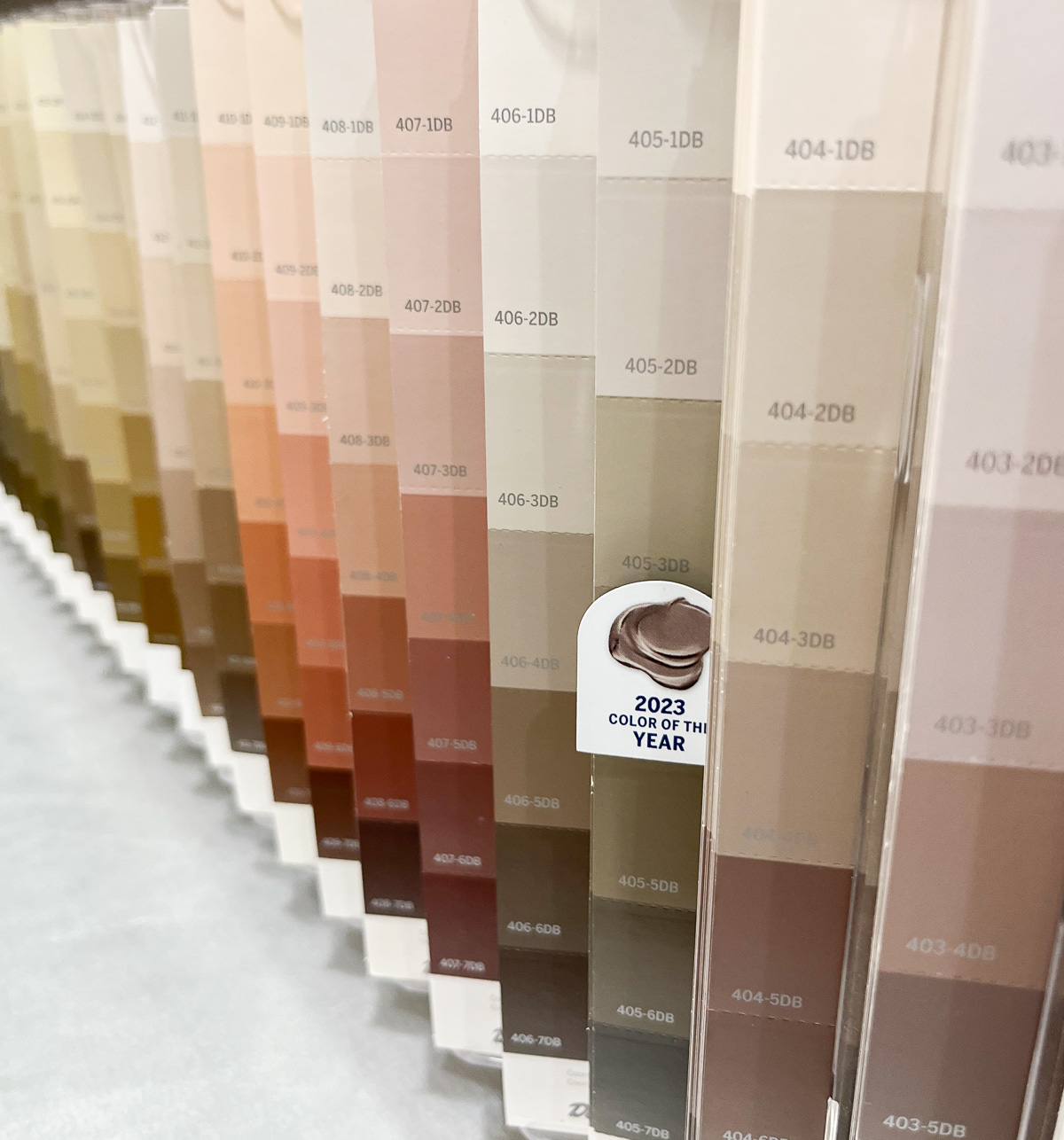
It didn’t connect with the surrounding spaces well, so I headed to Menards to look at Dutch Boy Paint’s wide color selection.

I ended up selecting Dutch Boy Paint’s Ironside 422-7DB.
It is the most gorgeous deep olive green.

Foyer Update
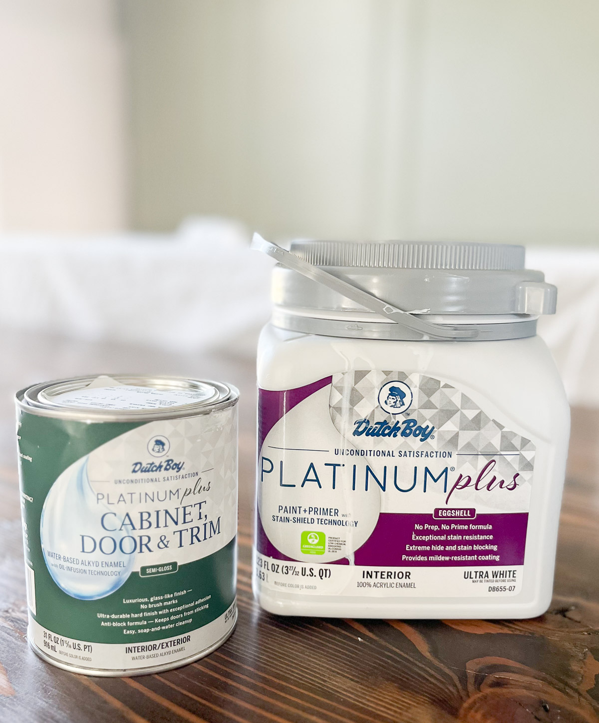
I used Dutch Boy® Paints’ Platinum® Plus Cabinet, Door, & Trim Paint in semi-gloss for the trim and door. This paint goes on smooth without brushmarks to give my trim and doors a luxurious, glass-like finish.
I painted the walls with Dutch Boy® Paints’ Platinum® Plus Interior Paint in eggshell. I LOVE this paint. It offers excellent hide and coverage with a durable and washable finish.

I painted the ceiling with Platinum® Plus Interior Ceiling Paint. It features splatter-resistant technology and smooth, even application in a flat sheen.

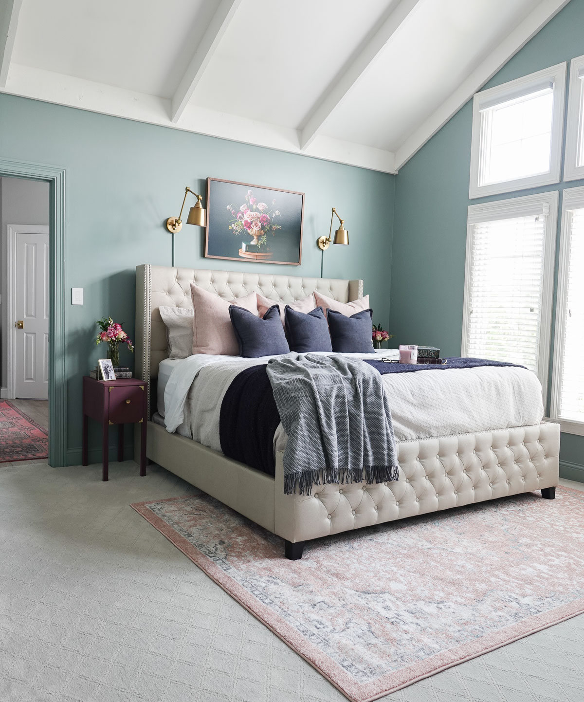
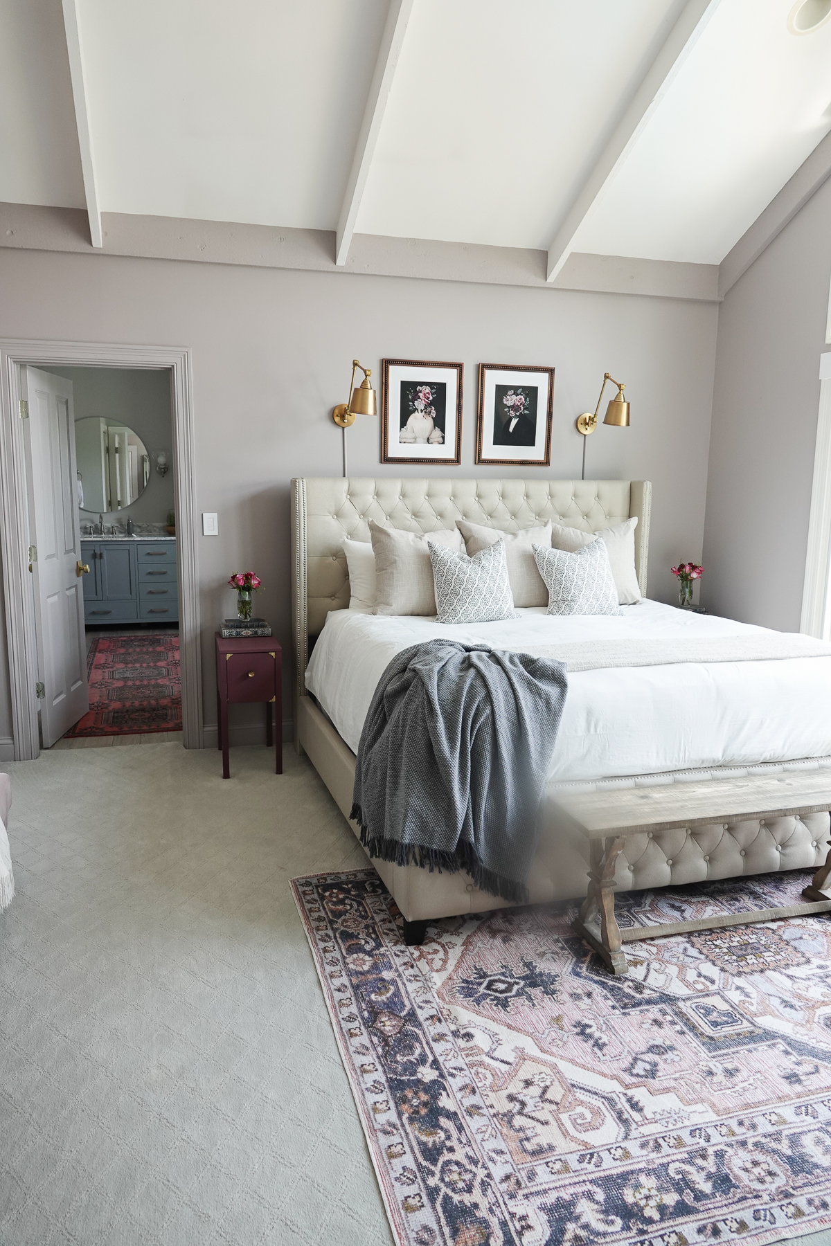
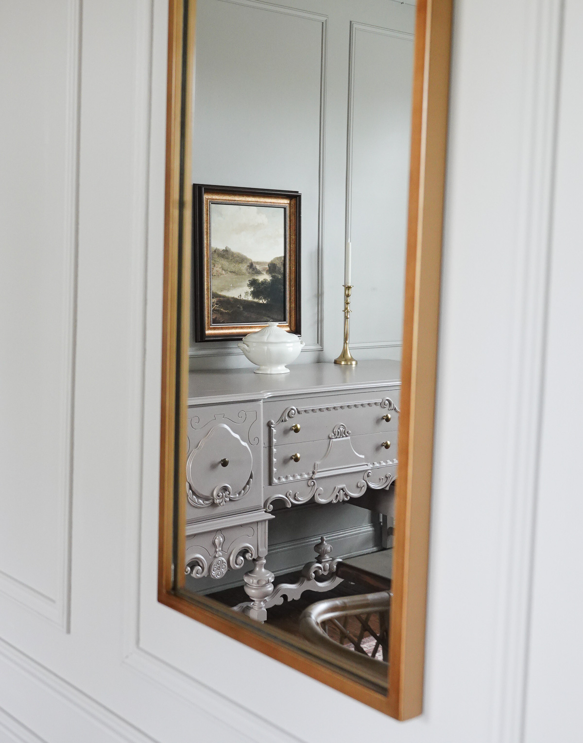
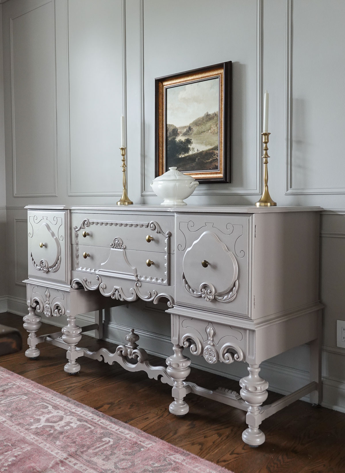
Ironside connects all three adjoining rooms so well.

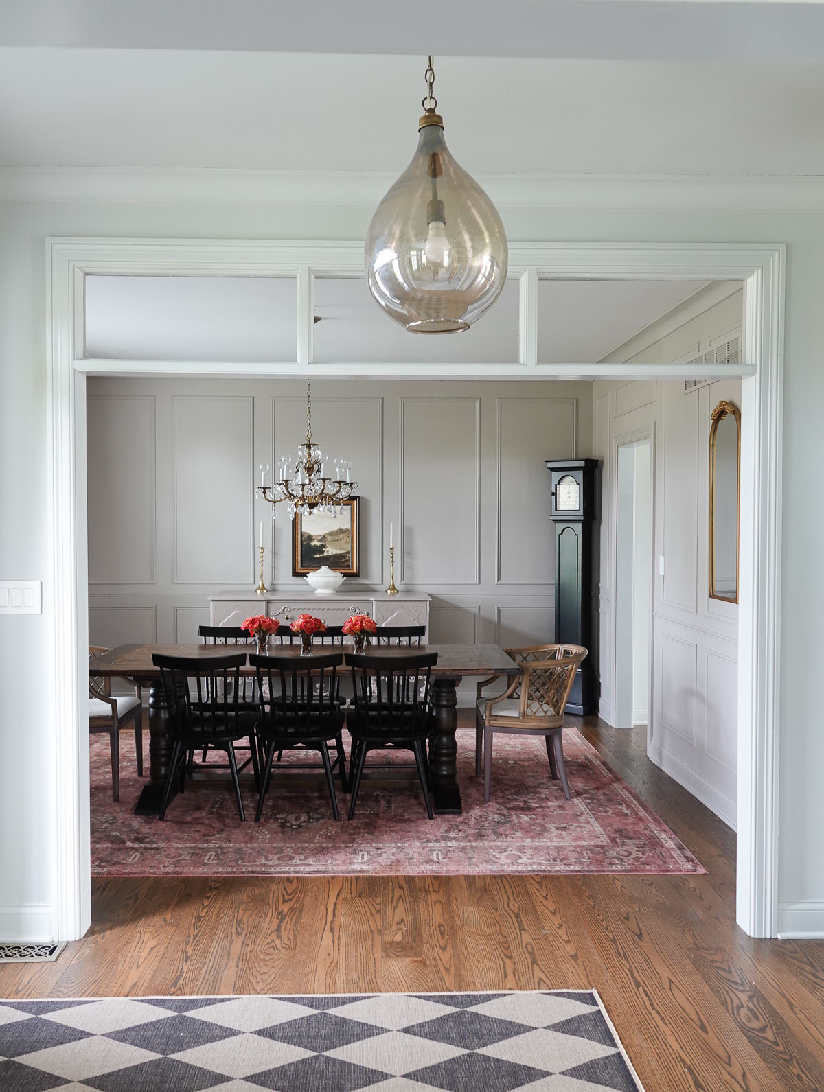
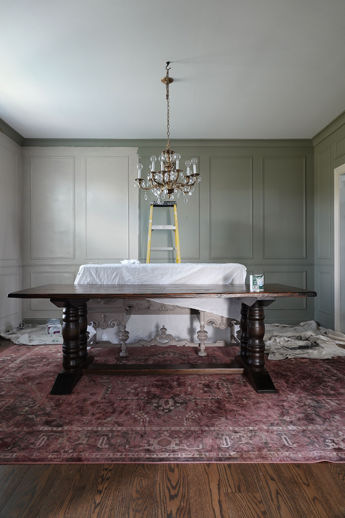
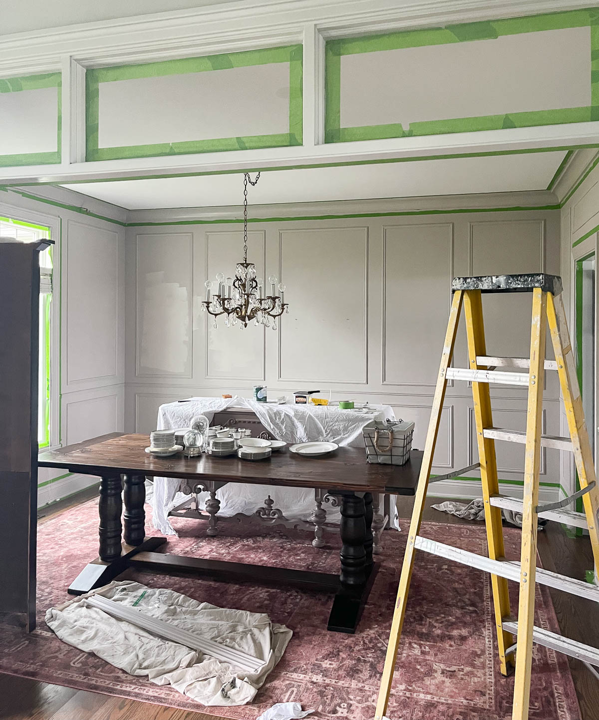
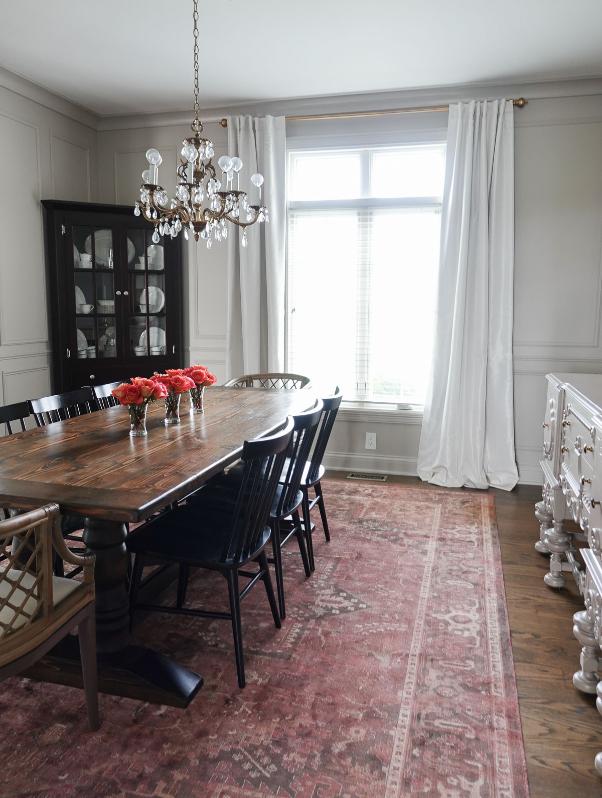
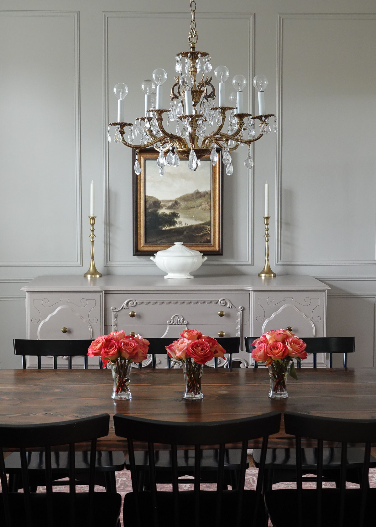
The dining room is painted in Dutch Boy® Paints’ Morter and Pestle 406-3DB (with the dining room buffet also painted in Ironside).

The library/office is painted in Dutch Boy® Paints’ Rustic Blue 430-4DB, and the entry continues into my navy-painted living room. This gorgeous olive green works beautifully with all three colors.

The foyer is simple and sophisticated now.

Thanks to paint, the foyer looks like a completely new space.

Here is a view of the office/library Rustic Blue with Ironside and Mortar and Pestle in the background.

I wanted to add more greens to my home, and this color is even more stunning in person.

Where would you use Ironside in your home?


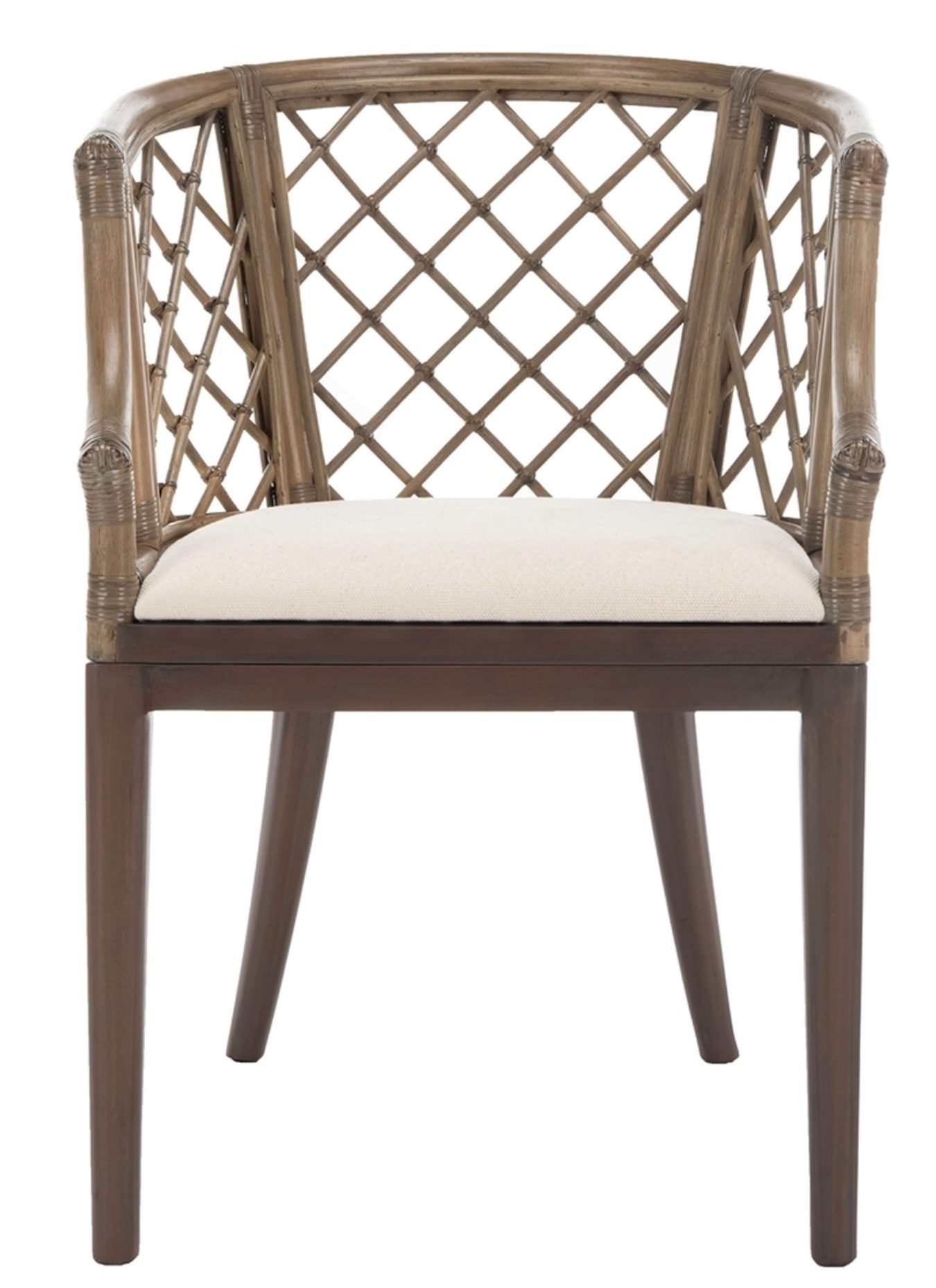
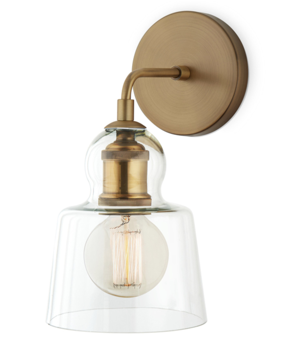
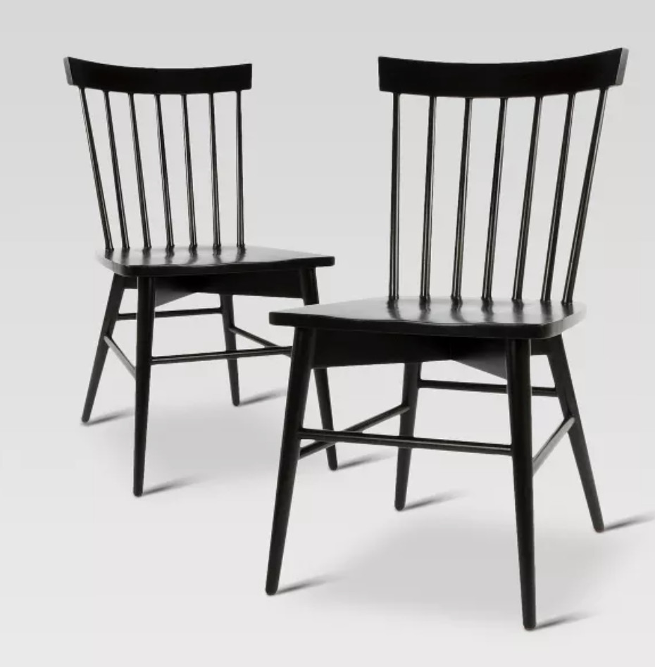
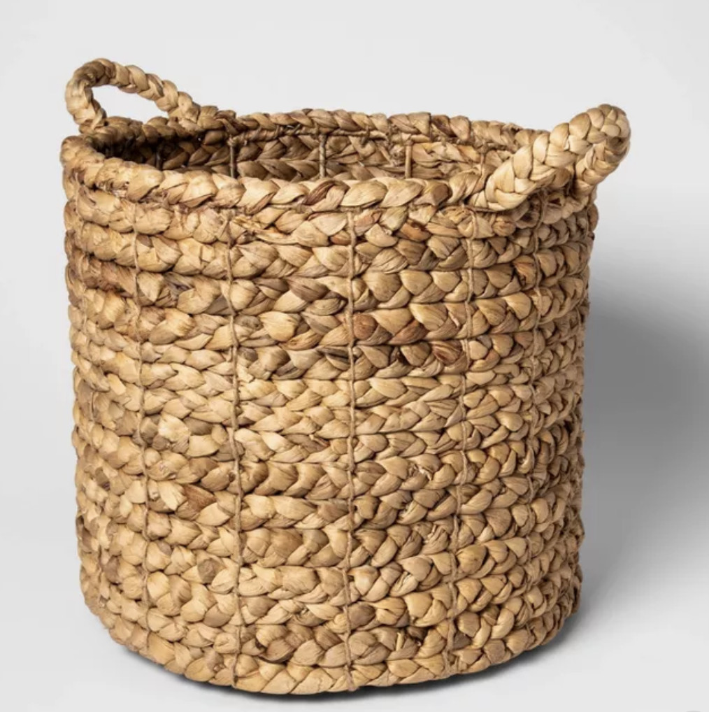
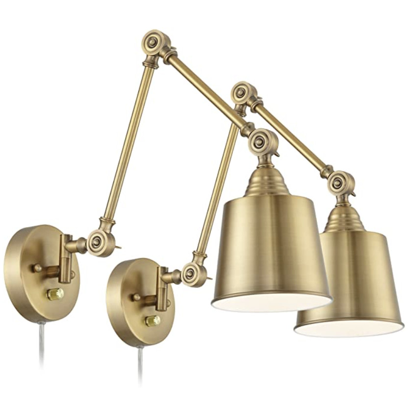
Are you new to my blog? Go HERE to see my home tour and HERE to shop for items I use in our home.


