Paint

Whole House Paint Colors

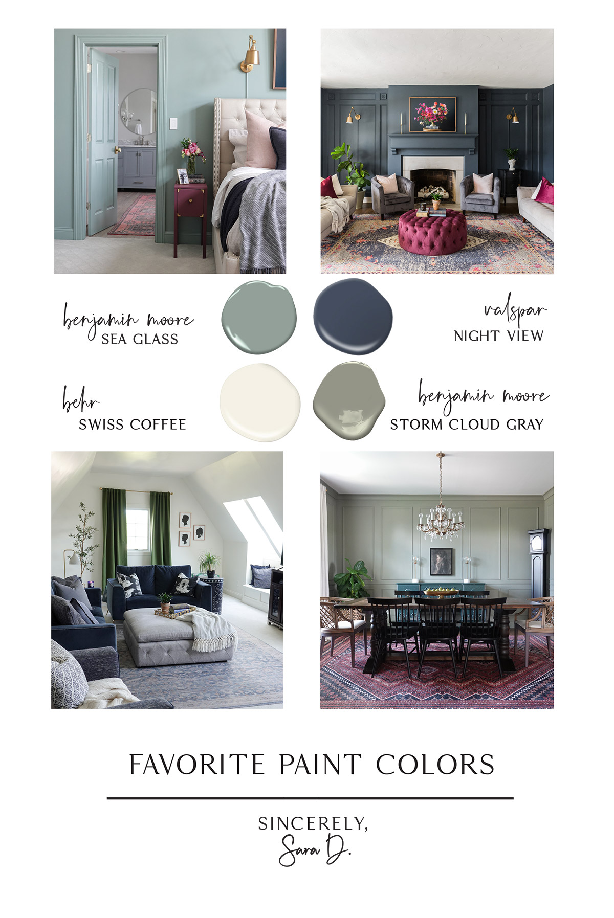
I am always painting our rooms, but I wanted to share our most recent whole house colors.

These are the colors I have used throughout our first floor.

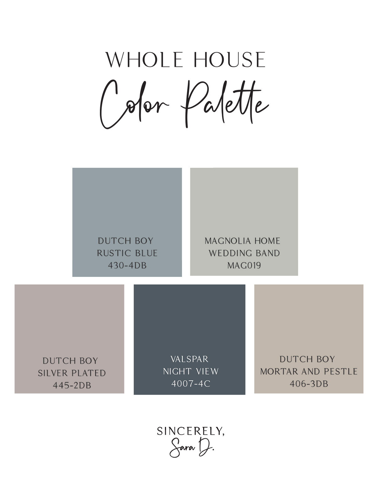
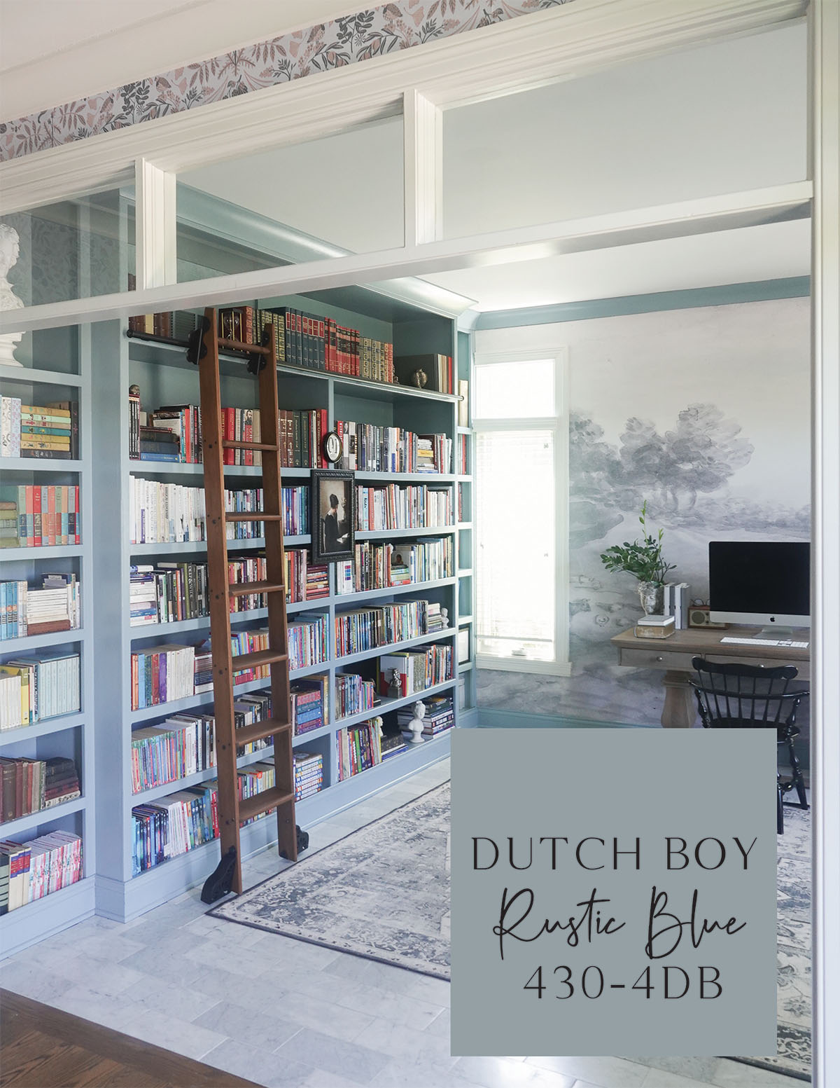
Dutch Boy Rustic Blue 430-4DB (Sherwin Williams Meditative SW 6227)

I painted our bookshelves and trim in Dutch Boy Rustic Blue 430-4DB. It’s a beautiful dusty blue.

If you don’t have Dutch Boy paint available near you, look at Sherwin Williams Meditative SW6227.

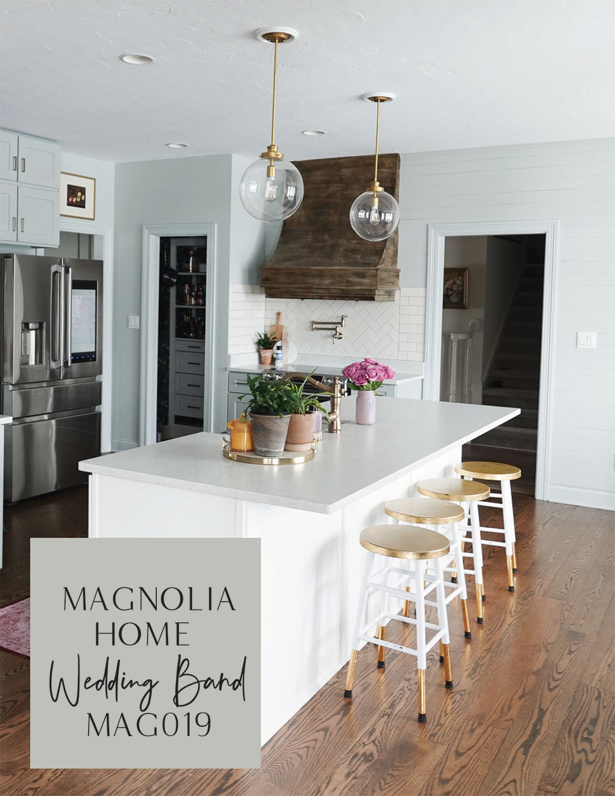
Magnolia Home Wedding Band MAG019

Our kitchen cabinets came prefinished in a greenish-blue gray.

I wanted to extend that color onto our walls and found that Magnolia Home’s Wedding Band MAG019 was a close match. It’s hard to photograph, and in person, it’s lighter.

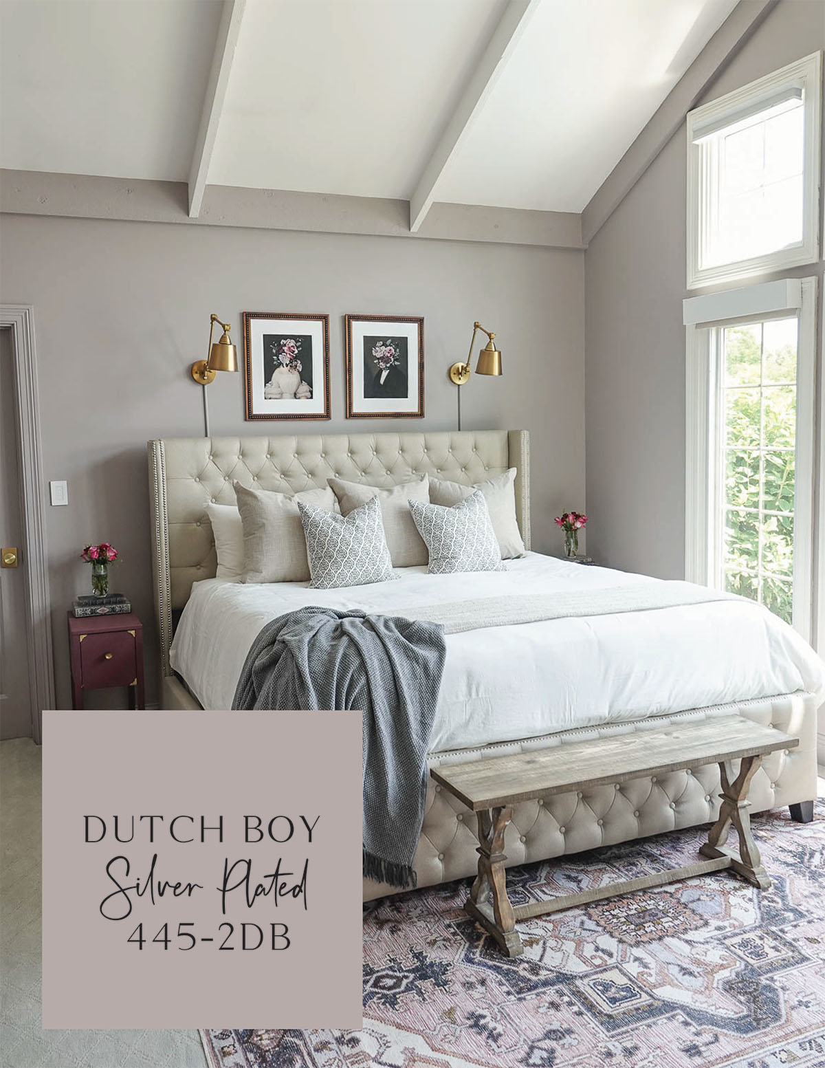
Dutch Boy Silver Plated 445-2DB (Sherwin Williams Flexible Gray SW6010)

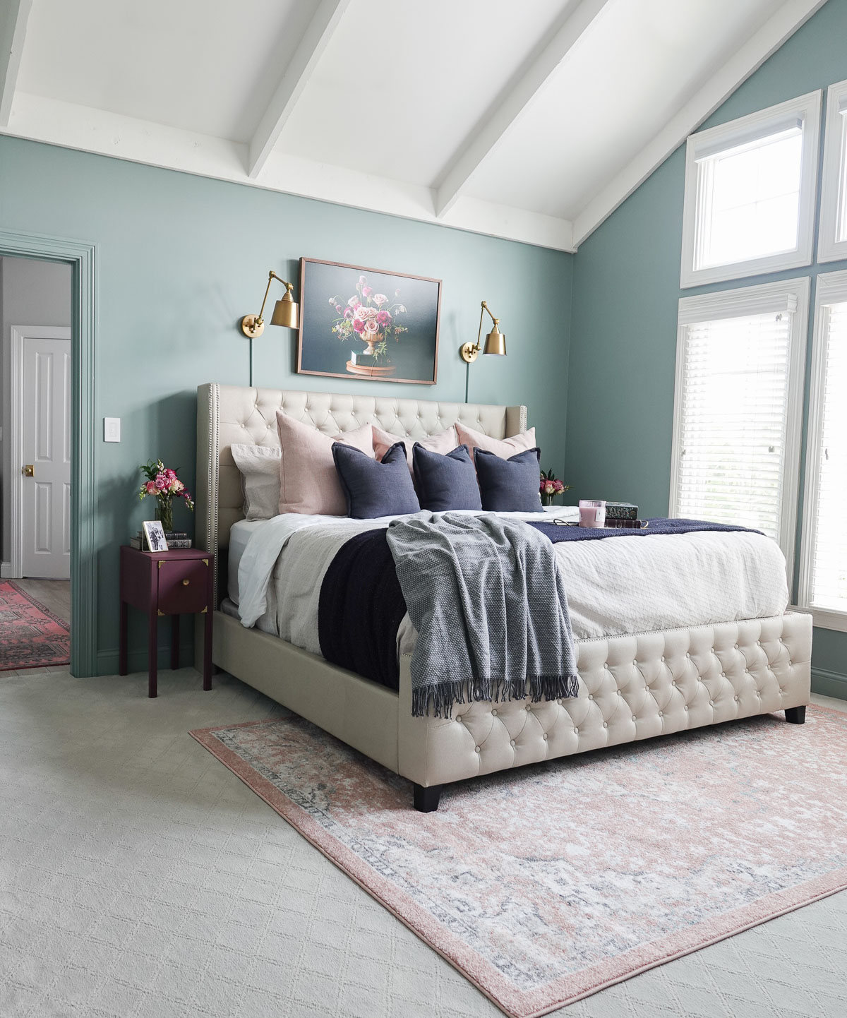
I wanted to try something new in our primary bedroom, so I found this beautiful dusty lavender. It is Dutch Boy in Silver Plated 445-2DB.

I love it because although it is a color, it acts as a neutral. If you can’t find Dutch Boy paint near you, check out Sherwin Williams Flexible Gray SW6010.

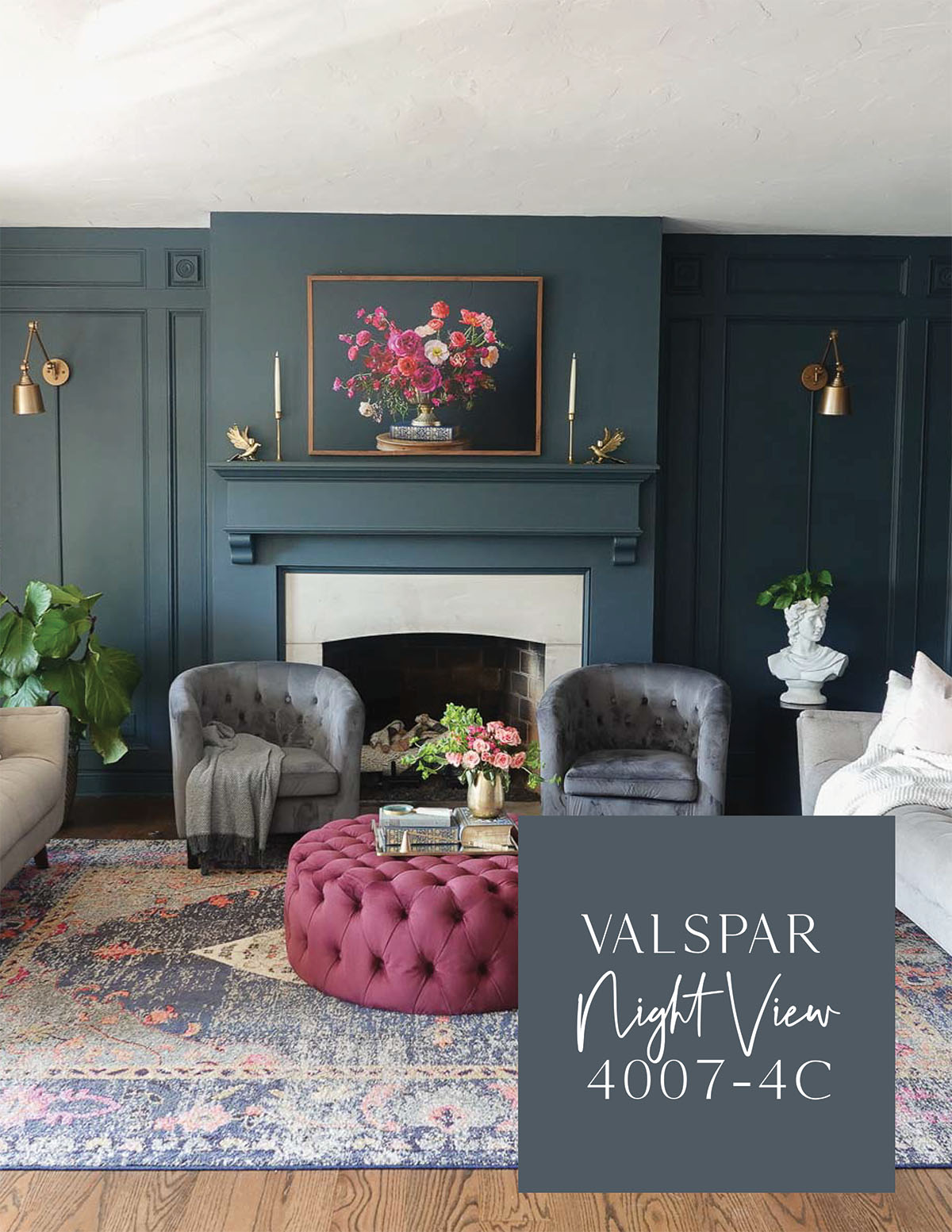
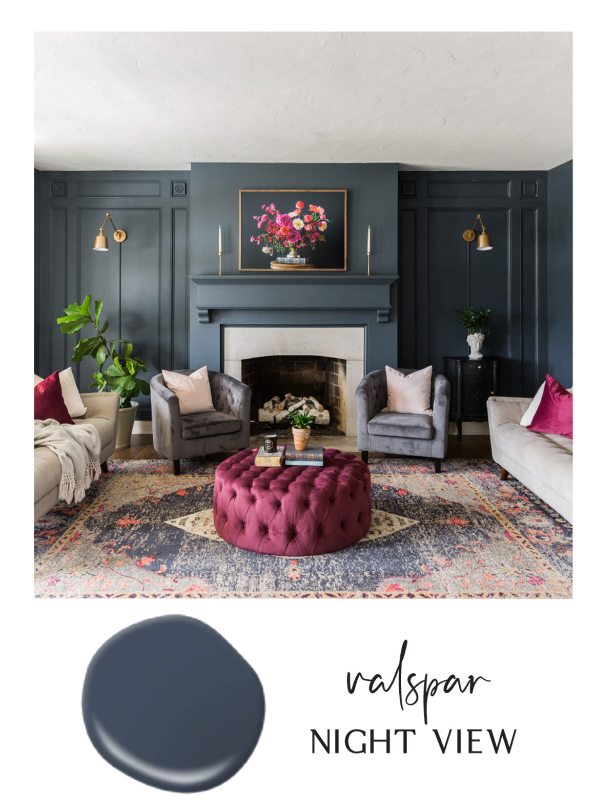
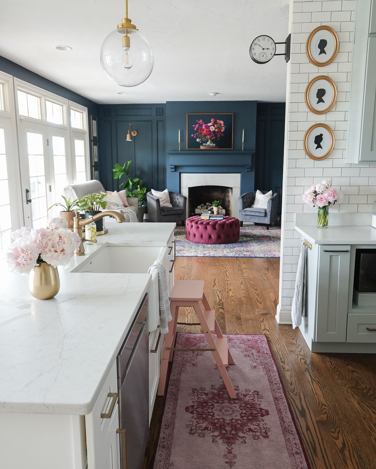
Valspar Paint Night View 4007-4C

I have had this deep navy in our family room for years, and I LOVE it. It’s moody and elegant and the perfect shade of navy. It is Valspar in Night View 4007-4C.

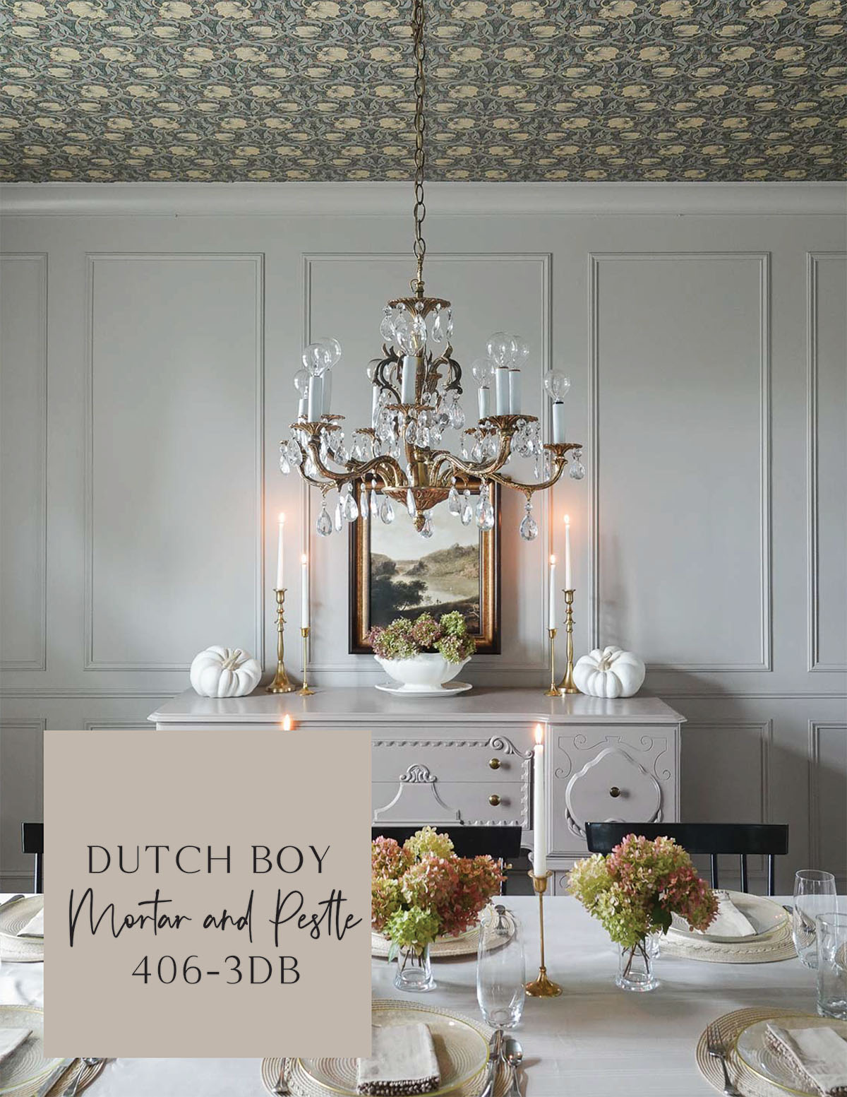
Dutch Boy Mortar and Pestle 406-3DB (Sherwin Williams Perfect Greige SW 6073)

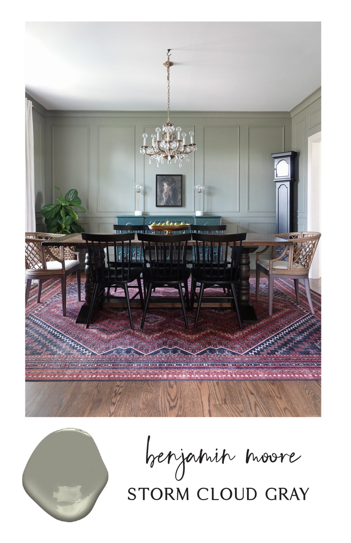
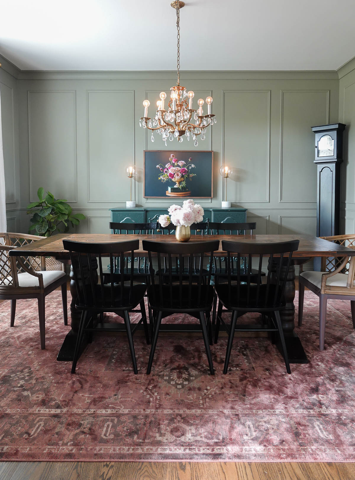
I wanted a beige with a slight pink undertone for our dining room, and I found it in Dutch Boy Mortar and Pestle 406-3DB.

If you don’t have Dutch Boy paint available near you, check out Sherwin Williams Perfect Greige SW 6073.

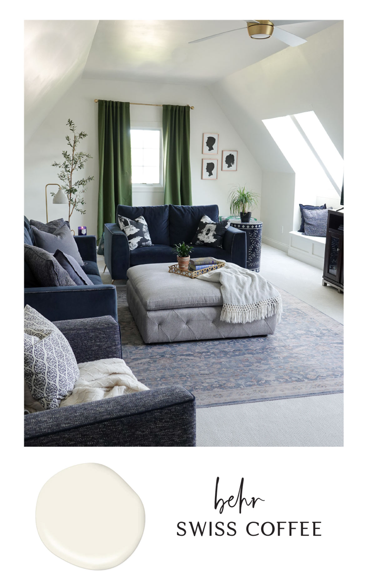
It is really difficult to photograph paint colors and they appear in real life. Make sure to always test a color before committing to painting an entire room.

I’ve made the mistake of seeing another influencer’s online images and running out to buy the paint color they used. Since lighting is different in every space, the color can appear very different.

Happy Painting!

Are you new to my blog? Go HERE to see my home tour and HERE to shop for items I use in our home.

Find me on Facebook | Instagram | Twitter Pinterest


Paint

Favorite Interior Paint Colors

I appreciate and admire warm, neutral home decor, but I personally crave and use bold color in our home. Today I’m sharing my current favorite interior paint colors and the color palette in our home.

Favorite Interior Paint Colors:

  • Sea Glass by Benjamin Moore
  • Night View by Valspar
  • Swiss Coffee by Behr
  • Storm Cloud Gray by Benjamin Moore

Sea Glass by Benjamin Moore

This color doesn’t photograph well – it is much more beautiful in person. It is a tricky color in that it changes from looking more blue in the evening and more green with lots of natural light. It is, however, a very relaxing color and perfect for a bedroom or bathroom. It also makes a great accent color, and I’ve noticed similar colors are being announced as next year’s color of the year.

Night View by Valspar

I have had Night View in our living room for years, and it is the perfect navy. It is sophisticated and rich and looks beautiful paired with deep pinks and burgundy. This color really would work well in any space, but make sure you have plenty of natural light unless you are okay with a darker space.

Swiss Coffee by Behr

Swiss Coffee is the perfect warm white and a beautiful neutral paint color. It isn’t stark but it also isn’t cream and provides a neutral backdrop. It is welcoming and adds warmth to any space. I have it in our family room, stairway, and all throughout hallways. This color would also work well on trim and cabinetry and can be used with any accent color.

Storm Cloud Gray by Benjamin Moore

Despite the name, Storm Cloud Gray has strong green undertones. If you love moody colors, this paint color is for you. It is a very sophisticated color and works well in dining rooms and bedrooms. I like to pair it with other shades and pops of greens as well as pinks and burnt reds.

Have you used any of these paint colors in your home? What color trends are you loving right now?

Go create something!

Are you new to my blog? Go HERE to see my home tour and HERE to shop for items I use in our home.

Find me on Facebook | Instagram | Twitter Pinterest

Shop the Post
Paint

Favorite Paint Colors

I am excited to be partnering with ACE Hardware to share my favorite paint colors.

ACE Hardware has over 5,000 stores around the world and everything you need to tackle paint projects of all sizes.

Their Paint Studio is a great resource to check out online, and they have a color visualizer where you can upload a photo of your room or project to see how the project will look with fresh colors! It is a fun creative escape.

They also offer expert advice in-store and will go the extra mile for you.

Clark + Kensington Paint + Primer in One is paint exclusive to Ace Hardware, and they offer the most gorgeous color palette for your home. I’ve selected the 6 best paint colors that are inspired by the colors I use in my home, and I hope to inspire you to incorporate color into your home.

PINE GROVE: 31A-5

This may be my favorite color right now – it is a deep green with some blue undertones which work well with all the blues I use in my decor. I recently painted our dining room buffet in it, and it is gorgeous with a smooth finish! It would also make a beautiful accent wall.

SILK AND SATIN: N-C27

Silk and Satin is the perfect neutral hue, and I love the warmth it brings to a space. I used something very similar in our hallway landing.

BLACK TRUFFLE: N-C24

I love a bold black for the elegant statement it makes, and Black Truffle definitely makes a statement. I used a similar black on our library bookshelves.

SILENT WHITE: CW-C1

I have always been a fan of a creamy white, and Silent White is just that! It is warmer that a true white and is perfect for any space. I used a similar color in our home office.

DOT DOT DOT: 36A-5

I love the look of navy walls, but it is hard to get the perfect shade of navy. Dot Dot Dot is deep and elegant and perfect for almost any space. I used a similar shade in our living room.

PURE ZEN: 06A-2

I love to add pops of pink throughout our home, and Pure Zen is a beautiful accent color. I painted our kitchen stool a similar color.

Whether you are looking to add a little color and a fresh look to your space by painting a piece of furniture or looking to paint the walls in a room, one (or all) of these hues are great accents for your home. I hope they provide inspiration for your next project!

I want to know – what is your favorite Clark + Kensington paint color? Go find the perfect color for your next project and pick up a gallon of paint. It’s amazing what a fresh coat of paint does!

This is a sponsored post written by me on behalf of Ace Hardware. All opinions are 100% mine.

Are you new to my blog? Go HERE to see my home tour and HERE to shop for items I use in our home.

Find me on Facebook | Instagram | Twitter Pinterest

Shop the Post
Paint

Selecting Paint Colors

I recently partnered with Clare, and if you are looking for a way to simplify paint shopping, then I have the easiest solution for selecting paint colors! Clare has created an easier way to paint the space you love with premium Zero VOC paint, designer-curated colors, and the best painting supplies—all delivered right to your front door.

When it comes to color (or anything honestly), too may choices is overwhelming. Clare’s founder is an interior designer who reviewed nearly 600 formulas and cut through the color clutter to create the perfect palette of 55 timeless colors.

Clare has made testing colors a paint-free and easy process – just peel-and-stick! You can get 5 swatches for just $5 and Clare will cover shipping (use code 5FOR5 at checkout).

The paint samples are large, so you can actually see what the color looks like in your space.

Besides beautiful paint colors, Clare also has paint products to help you complete your job.

I ended up selecting Timeless for both my walls and trim. It is the most gorgeous off-white, and it looks perfect in our new home office.

Since my walls were a deep green, I used Clare’s primer and followed up with two coats of Clare’s eggshell paint.

I used their coordinating trim paint and was incredible happy with both the quality and coverage.

We absolutely love the updated space!

You can see more on this remodel home office HERE! We are in love with the new space.

Go create something!

Are you new to my blog? Go HERE to see my home tour and HERE to shop for items I use in our home.

Find me on Facebook | Instagram | Twitter Pinterest

This is a sponsored post written by me on behalf of Clare. All opinions are 100% mine.

Shop the Post