Decor

Decorating with Green

Decorating with green has been a design favorite for centuries – the Victorians favored deeper green tones like sage and brunswick green for their interiors. In the 1950’s, aqua and mint green were paired with baby pink to achieve the ideal Americana aesthetic for kitchens and Cadillacs. In the 1970s, avocado became the height of fashion and enjoyed immense popularity (even in appliances).

I partnered with Amy Howard Home to share their Color of the Month. This is a new monthly subscription where Color of the Month subscribers will receive a new color every month exclusive to the club. This month’s Color of the Month is Hunt and Polo, and it is a beautiful, deep green – which is why we’re talking about all things green!

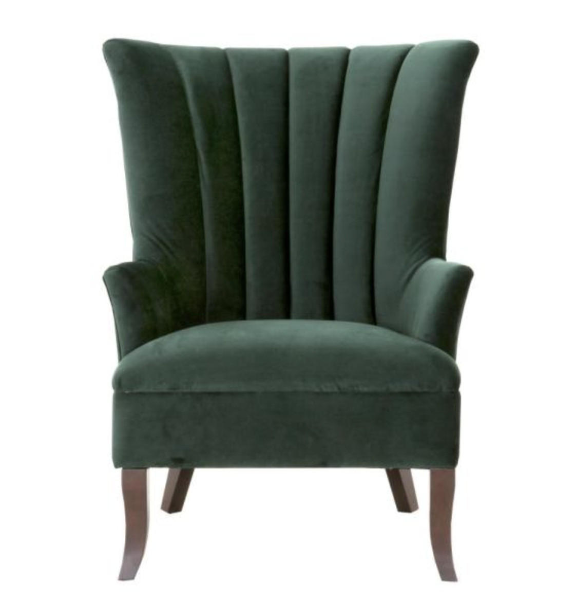
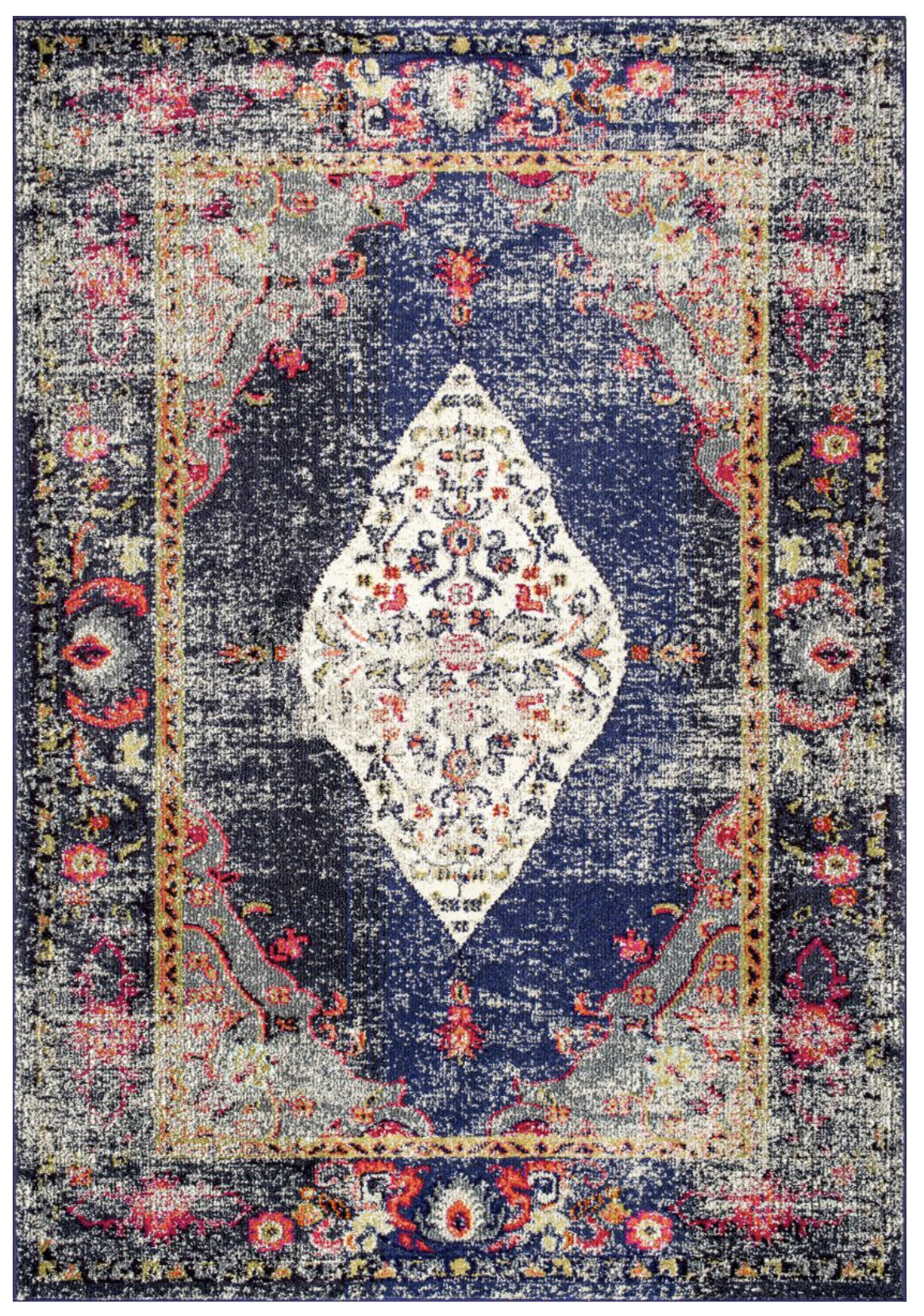
I transformed a $10 thrift store find this month’s One Step Paint color, and the result is so elegant!

It looks perfect in my office – I love the green with the raw wood and blues and grays.

And now, we’ll go back to talking about decorating with green, and why it’s such a great color to use in your home…

Green is a color of balance and harmony. It lends us a clearer sense of right from wrong since green incorporates a balance of both the logical and emotional. Green is one of the most-seen colors in nature reflecting life, rest, and peace. It is also a sign of growth, whether that’s in a physical object like plants or in our income and wealth.

COLOR THEORY

On the visible spectrum, green sits between blue and yellow. In painting and printing, green is a secondary color, meaning that it is created by mixing two primary colors—yellow and blue.

Primary Colors: Red, yellow and blue
In traditional color theory, primary colors are the 3 pigment colors that cannot be mixed or formed by any combination of other colors. All other colors are derived from these 3 hues. 

Secondary Colors: Green, orange and purple
These are the colors formed by mixing the primary colors.

SHADES AND TINTS OF GREEN

Green can vary in both shades (in which the green is mixed with black for a darker green) and tints (which are mixed with white, to produce a paler result). But, there are also a broad range of green varieties that are mixed with other colors, such as yellow, blue, gray, and brown.

  • Yellow-greens such as chartreuse (named after the French liquor which shares the distinctive color) and lime green have a lively, energetic feel.
  • Blue-greens such as sea green, aqua and teal have a more subtle energy which helps designs to feel calmer and more chic. These colors are associated with emotional healing.
  • Gray-greens like seafoam and sage are wintery and more somber than their yellow- and blue-green relations.
  • Brown-greens like dark olive have a formal and dignified air, which explains why they are often selected for military uniforms. Olive green is the traditional color of peace.

Overall, if you’re looking to portray health, rest, and to relieve stress, green is your color. It is the most restful color for the human eye; it can improve vision. While green does have minor negative aspects like over-possession and materialism, it has a more positive affect than most other colors.

COLORS THAT GO WITH GREEN

  • monochromatic green color scheme uses tints, tones, and shades to create an entirely green palette.
  • complementary green color scheme incorporates red. Green’s cousins, yellow and blue, are complementary to purple and orange respectively.
  • An analogous green color scheme uses the colors bordering green on either side of the color wheel. In this case, yellow and blue.
  • triadic green color scheme includes orange and purple since they are equidistant from green on the color wheel.

One Step Paint Color Palettes:

The first is monochromatic (I used two greens), but I also incorporated a complimentary shade:

In this next palette, I added a toned down complimentary color (pink) and a creamy neutral – I love using creams and off-whites in our home.

In this last palette, you’ll see the analogous color (Lady Singing the Blues) which is similar in boldness to Hunt and Polo. I added a lighter neutral (Luxe Grey) to add some softness.

Just a random tidbit for you, centuries ago, many of the chemicals used to create thes green pigments were in fact extremely poisonous, with the famous example of Napoleon having apparently been slowly poisoned by the arsenic-rich green wallpaper used in his room in St. Helena. Although the wallpaper has since been proven not to have been the sole cause of his death, deadly pigments did little to dissuade consumers from the joys of green in their homes.

Go create something!

This image has an empty alt attribute; its file name is saradlogojpgrgb-01.jpg

*This post contains affiliate links and is a sponsored post by Amy Howard at Home. I take pride in reviewing only products that fit my brand and will be beneficial to my readers. And while this post is sponsored, all the opinions are my own.

Are you new to my blog? Go HERE to see my home tour and HERE to shop for items I use in our home.

Find me on Facebook | Instagram | Twitter Pinterest

Shop the Post
Join the Conversation

This site uses Akismet to reduce spam. Learn how your comment data is processed.

We're On Instagram
I love this chair and side table from @zgallerie that I decided to try it in my office/library. I’m not sure where I love it more - here or my bedroom! It adds so much elegance and charm to the spaces. Use my code SY5 at checkout for 5% off your entire purchase.
Shop My Favorites by commenting LINKS or through the link in my bio #ZGallerie #MyZgallerie #Zgallerie #ModernLuxury #LuxuryInterior

...

26 11
We waited 13 years for this - and our house looks happier with her glow-up!

We went from a drafty single door (with a 90s glass inlay I poorly covered up) to double doors that allows in more light and feel right for our home.

What do you think?

...

89 38
My patio is all ready for warmer weather thanks to the new launch with @livabliss + @galeyalix! I’m LOVING the checkerboard outdoor rug. Comment “PATIO” and I’ll send you the links! #Livabliss #LivablissHome #GaleyALixxLivabliss #HomeDecor #Rugs

...

40 16
I’ve been slowly refreshing our bedroom and recently added this beautiful swivel chair and side table from @zgallerie! They add the perfect elegant modern touch to the space. Use my code SY5 at checkout for 5% off your entire purchase. Shop My Favorites by commenting “LINKS” or through the link in my bio. 
#gifted #ZGallerie #MyZgallerie #Zgallerie #ModernLuxury

...

20 16
What started as a leak turned into my dream bathroom ✨ I partnered with @wayfair and found everything - from checkerboard tile to the vanities, mirrors, and faucets. Comment “LINK” and I’ll send you all my favorite finds! *Shower glass coming soon! #ad #wayfaircreator #homereno

...

70 34
@wayfair is helping us turn a disaster into something beautiful ✨A leak from our upstairs shower led to a full remodel, and I can’t wait to show you the AFTER! Bathroom remodel reveal coming soon. Comment “LINKS” and I’ll send all my Wayfair favorites! #ad #wayfaircreator #wayfair #homereno

...

48 15
*TWO THINGS that make wallpaper removal easy* Wallpaper has come a long way and there’s no need to be scared of it anymore! Before I hang wallpaper, I size the walls and often use pre-pasted SureStrip wallpaper that is activated with water! Comment WALLPAPER for easy to remove wallpaper links!

...

41 29
What a difference pattern can make in a space! 

Are you ready to try wallpaper in your home?

...

131 46
2016 didn’t seem that long ago until I dug through my blog for old home photos. 😳

...

112 13
Dreaming of spring days while winter does its thing.

...

63 14