Decor

Decorating with Red

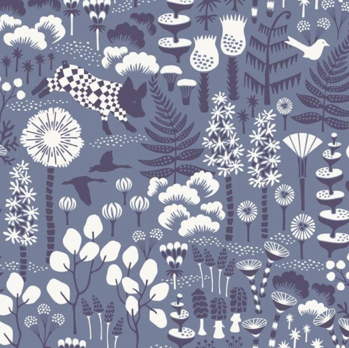
Today we’re discussing decorating red because it is such a powerful accent color. Red captures attention and is the color of extremes. It’s the color of passionate love, seduction, violence, danger, anger, and adventure. Our prehistoric ancestors saw red as the color of fire and blood – energy and primal life forces – and most of red’s symbolism today arises from its powerful associations in the past.

It is one of the most visible colors, second only to yellow – which explains why it is used on fire engines and stop signs to trigger alertness.

This post contains some affiliate links for your convenience. Click here to read my full disclosure policy.

I partnered with Amy Howard Home to share their Color of the Month.

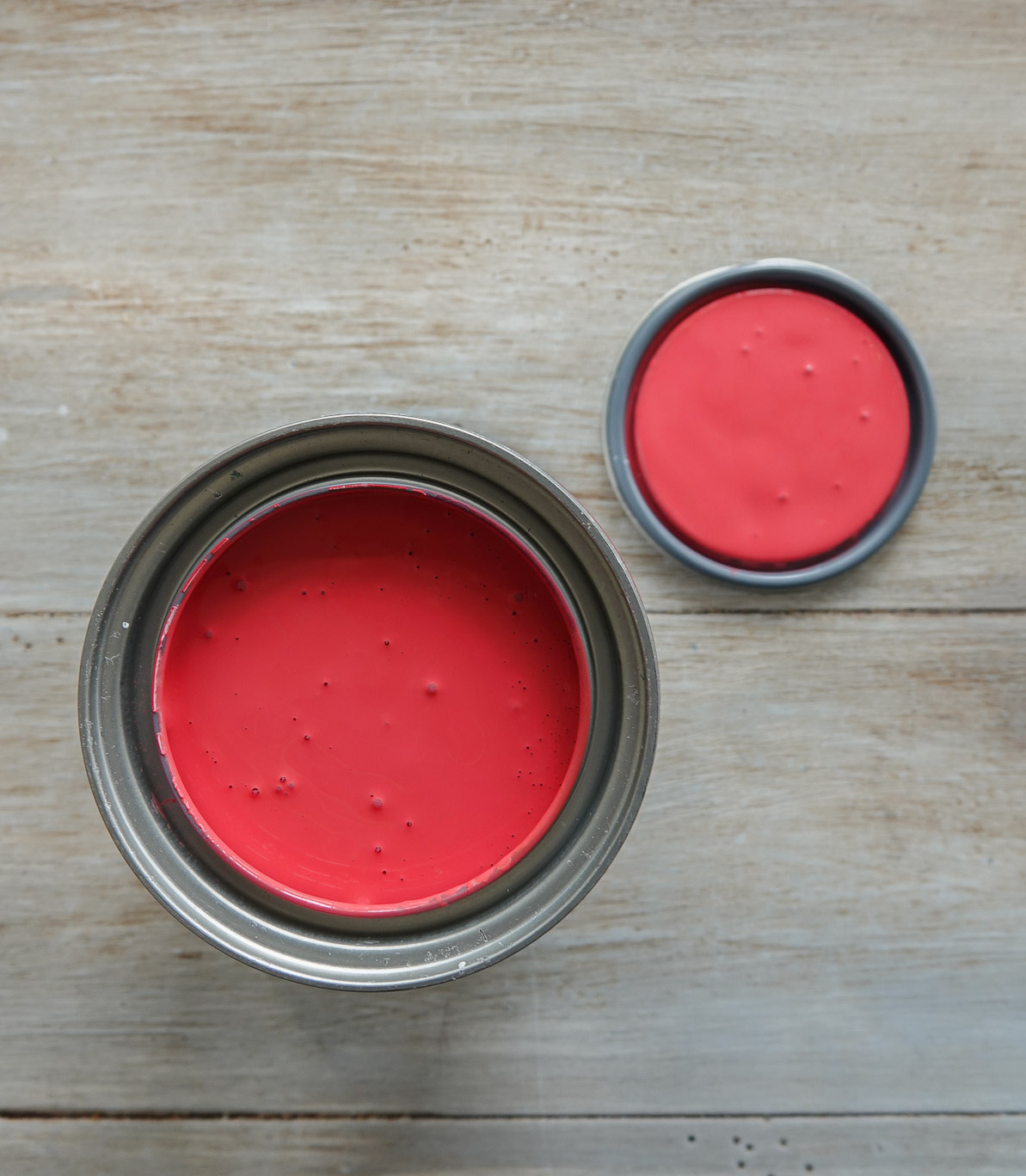
This is a new monthly subscription where Color of the Month subscribers will receive a new color every month exclusive to the club. This month’s Color of the Month is When in Doubt Wear Red,  and it is a beautiful deep red with blue undertones perfect for fall – which is why we’re talking about all things red!

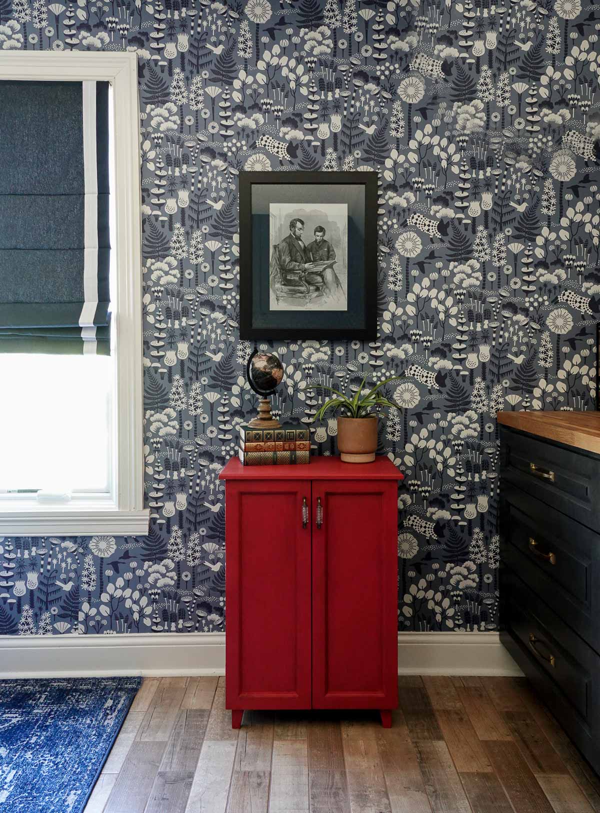
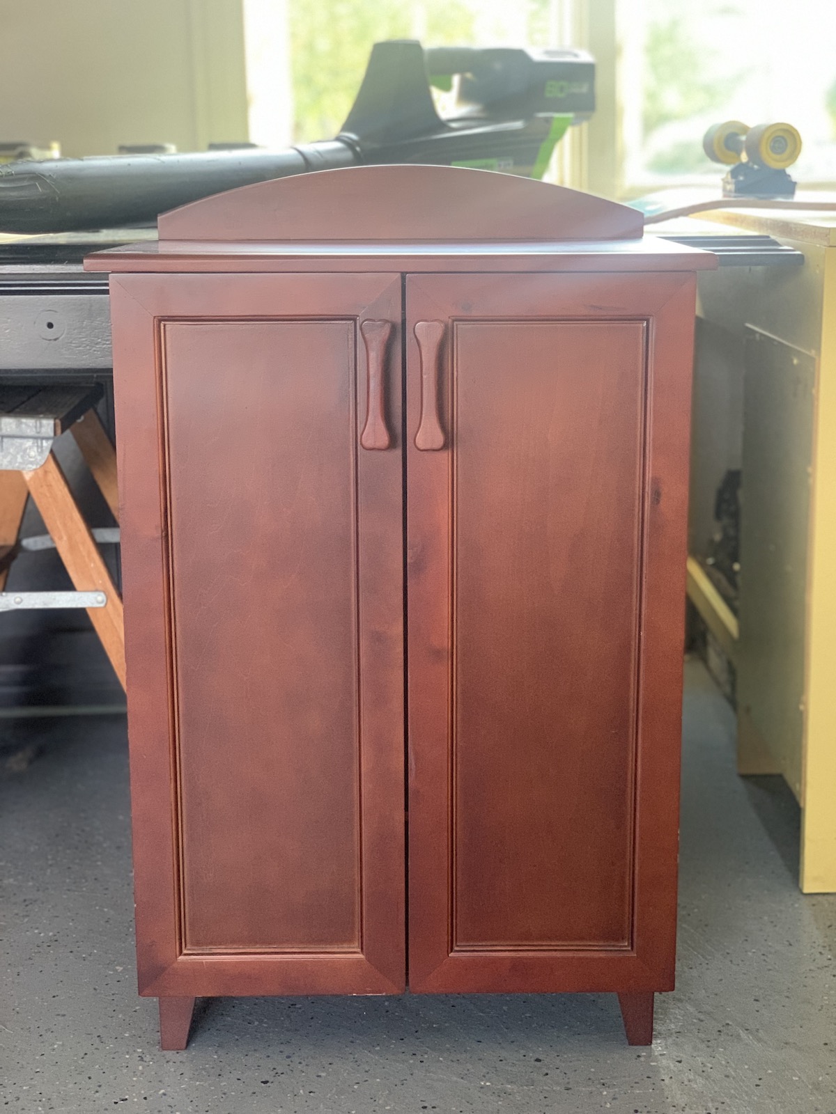
The cabinet I showed earlier is one I found at a roadside sale for $10. It’s amazing what some paint can do (and new hardware):

RED COLOR THEORY

On the color wheel, red is a warm, primary color and sits between blue and yellow. Primary colors are the 3 pigment colors that cannot be mixed or formed by any combination of other colors. All other colors are derived from these 3 hues.

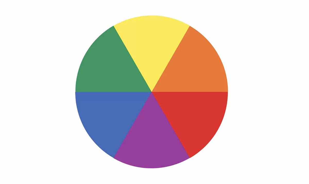
The three secondary colors (colors created when primary colors are mixed) are green, orange, purple. And there are six tertiary colors, which are colors made from primary and secondary colors, such as blue-green or red-violet.

Warm colors include red, orange, and yellow (and variations of these three colors). Warm colors are the color of fire, fall leaves, sunsets and sunrises, and are generally energizing, passionate, and positive.

Generally speaking, the most complementary colors are those that stand opposite each other in the color wheel, such as red and green, blue and orange, purple and yellow.

Red has the longest wavelength of any color. It’s the first color babies can see, and it’s the very first color to vanish as the sunsets.

Red is the opposite of blue (read all about decorating with blues here). While blue calms, red can speed up our heart rate and is a physical stimulant.

Red calls us to action, gets us motivated, and wearing red lets people know we feel confident. Red is associated with luxury – think about a red Ferrari.

Red also has negative connotations in that it can indicate anger and red is associated with financial loss.

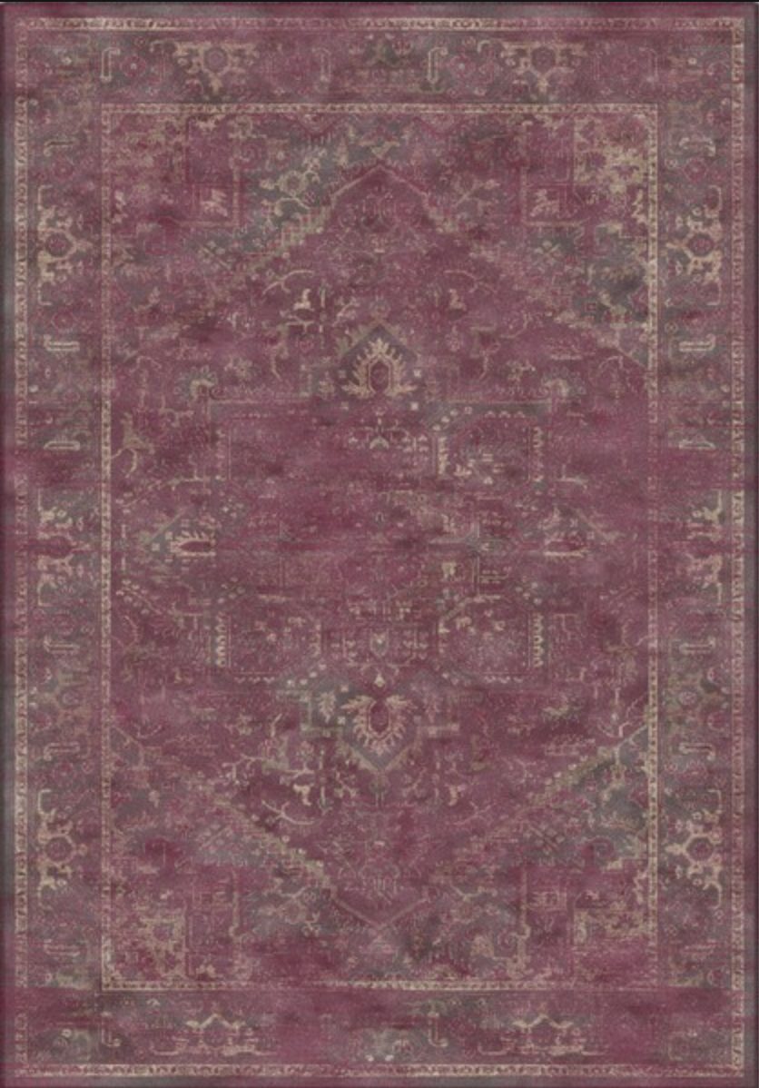
SHADES AND TINTS OF RED

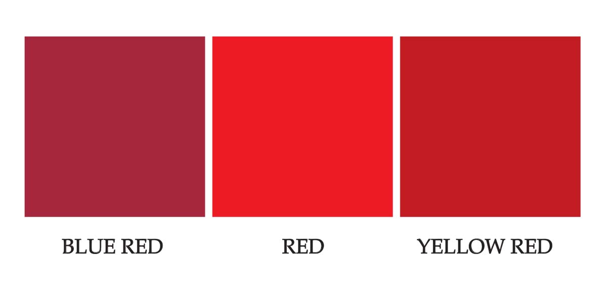
  • Blue-based reds are berry reds.
  • Yellow-based reds are tomato reds.

Generally, females are more attracted to blue reds while males prefer yellow reds.
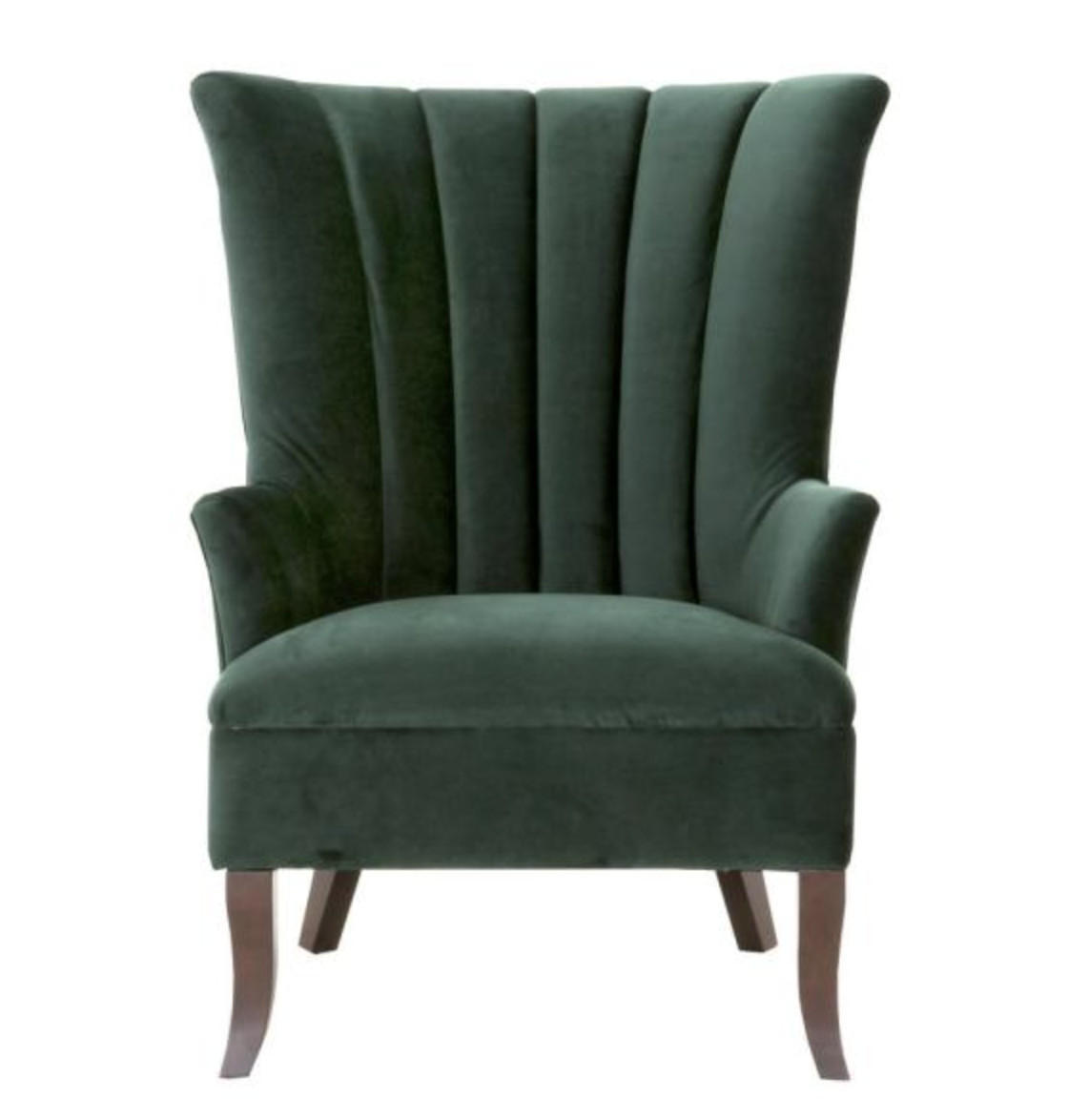
DECORATING WITH RED

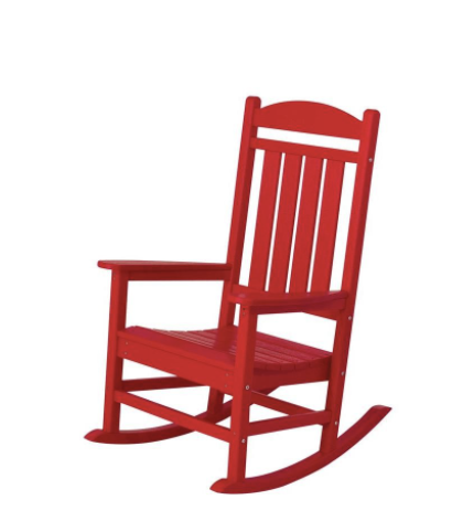
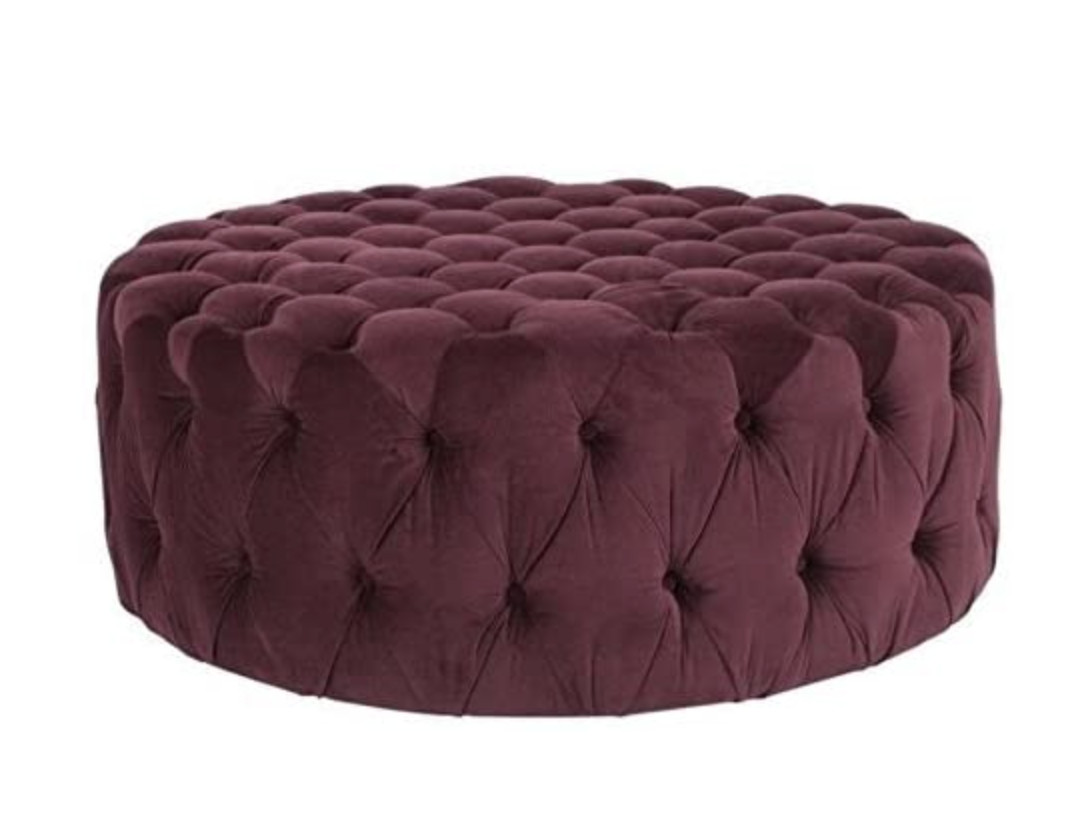
In design, red can be a powerful accent color. It can have an overwhelming effect if it’s used too much in designs, especially in its purest form. It’s a great color to use when power or passion want to be portrayed in the design. Red can be very versatile, though, with brighter versions being more energetic and darker shades being more powerful and elegant.

LESS IS MORE WITH RED

Red is the perfect way to add a splash of color to any space and is a beautiful accent color. Use it to enhance a room by painting a piece of furniture or adding it as a decorative piece (think artwork, vases, and throw pillows).

COLOR SCHEMES THAT WORK WITH RED

All of the colors I share below are from Amy Howard at Home’s One Step Paint Line.

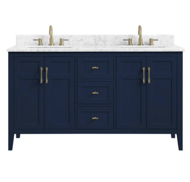
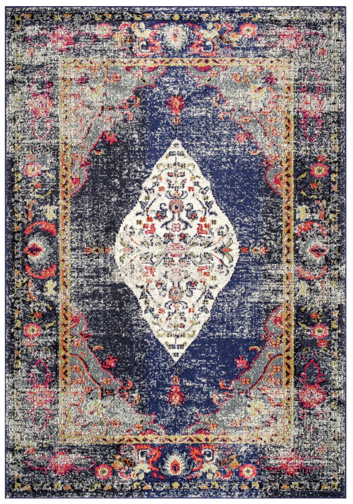
Red, Navy, and White

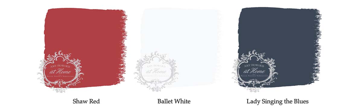
There’s a reason so many flags are red, white, and a deep, navy blue. Red, white, and blue is a classic combination, but because red and blue are both primary colors, the combination can be overwhelming. A more sophisticated combination is primary red and a deep navy blue.
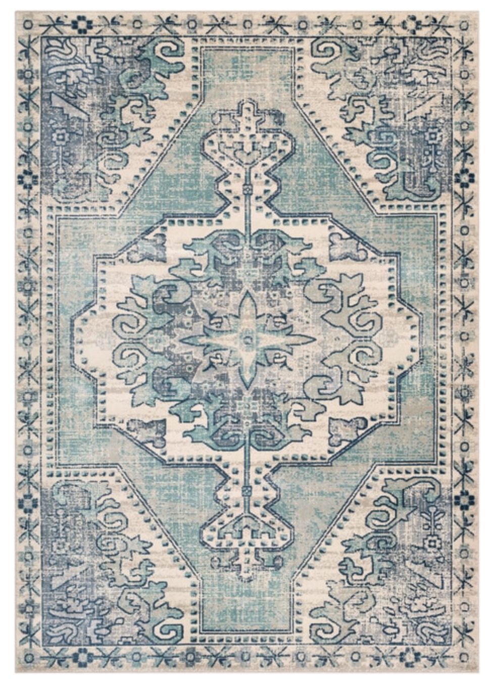
Red and Turquoise

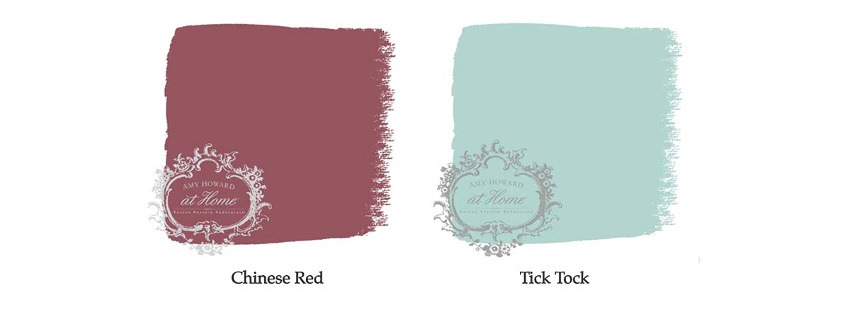
Red and turquoise the perfect combination for people who want bold decor. These two vibrant shades are loud on their own but somehow, they neutralize each other when styled together. Turquoise is an example of a tertiary, and they tend to work well with red.

Red and Green

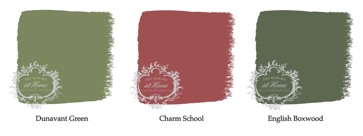
Since red and green are complementary colors, it’s only natural that they pair nicely in your home. The colors create levels of high contrast but be careful to not make your space look too jolly. Try mixing several different greens versus only the primary green.

Red and Orange

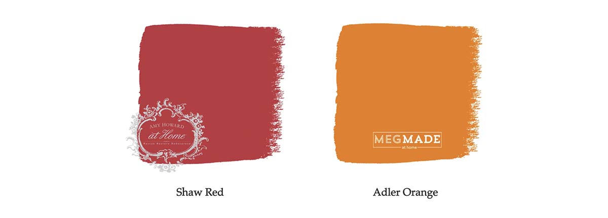
Try mixing colors with red on the same color spectrum – like orange. The result is warm and inviting.

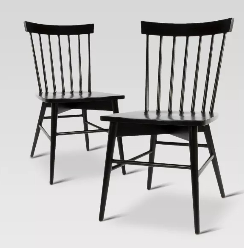
Red, Black, and White: Retro Classic

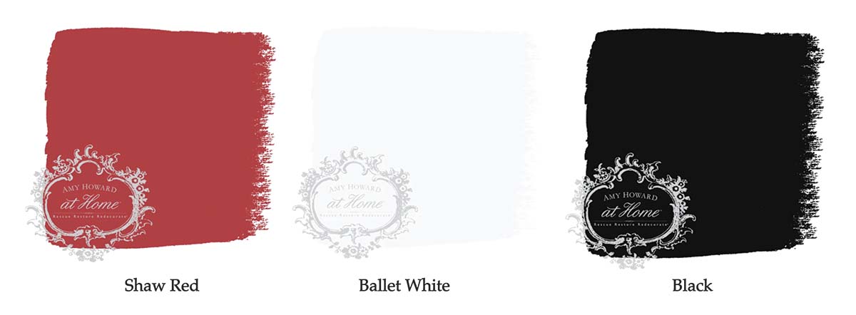
Black, white, and red is a reliable color combination that results in a sweet, retro attitude. It is a classic approach to decor.
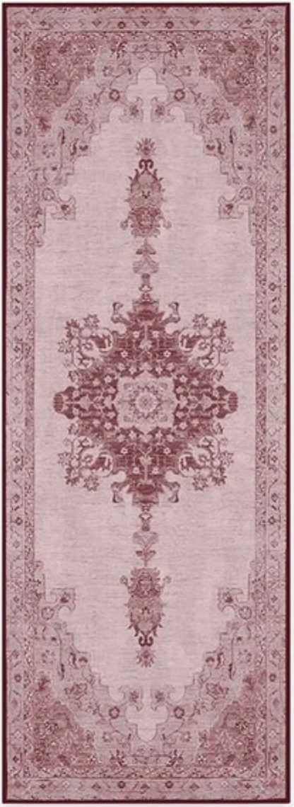
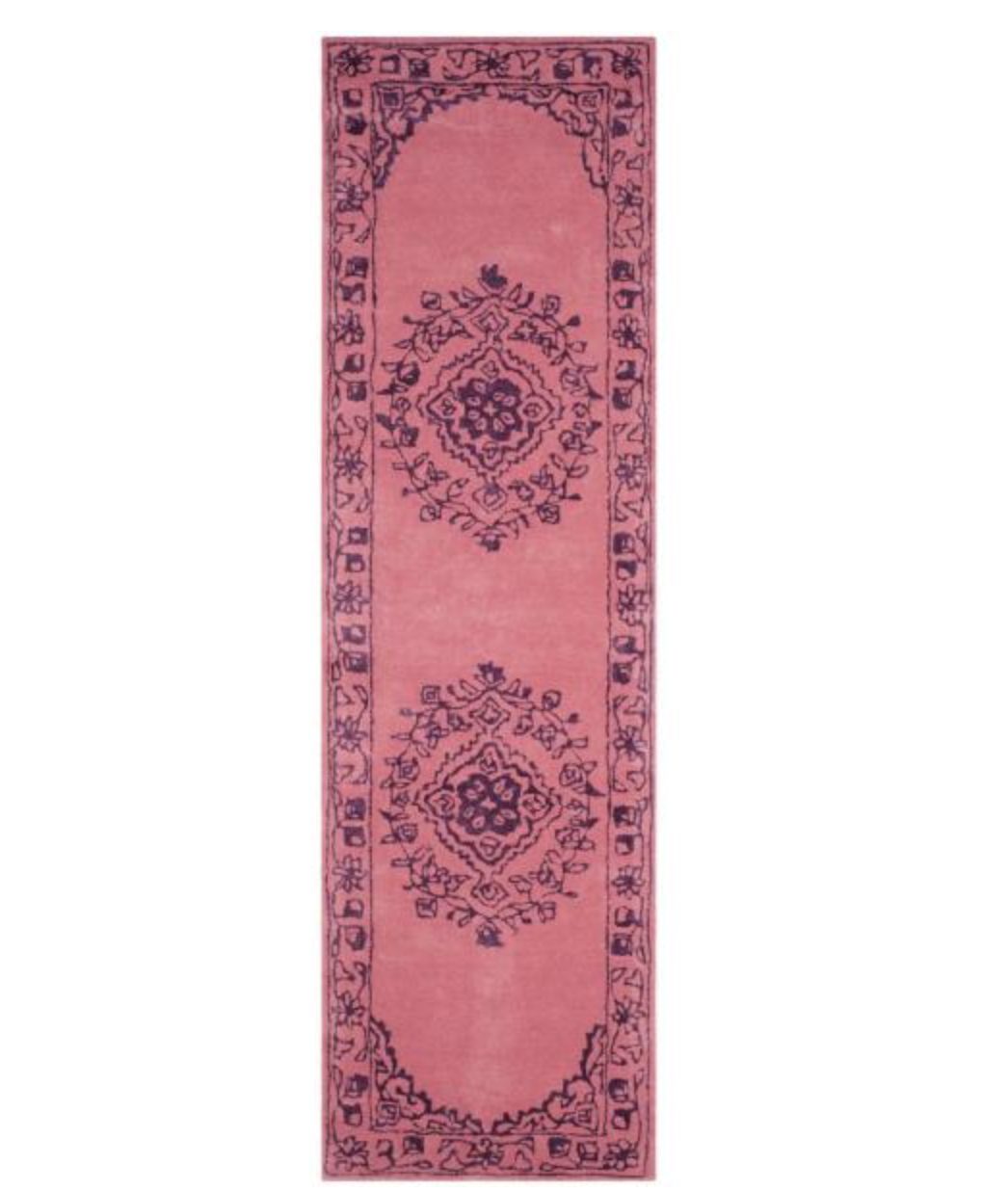
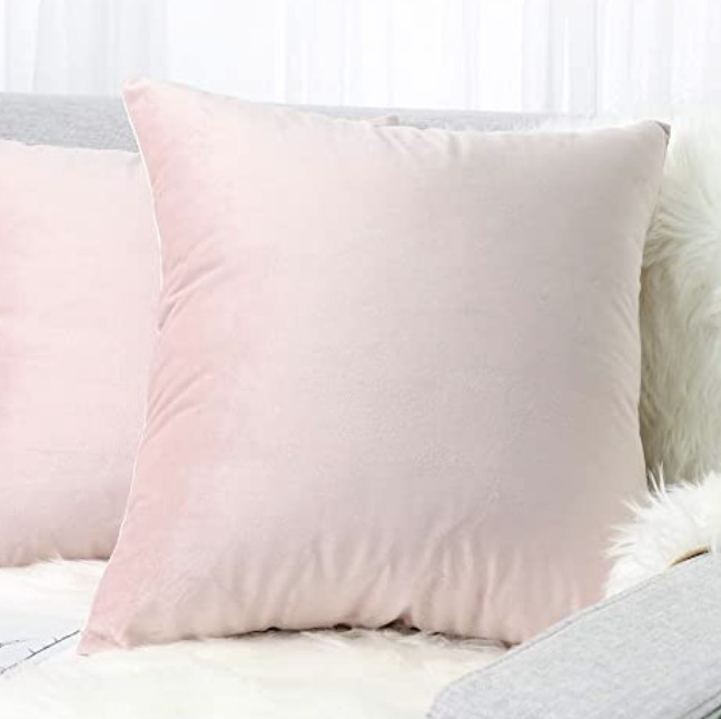
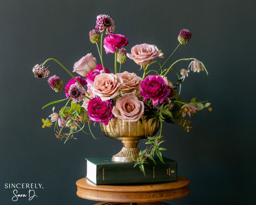
Red and Blush

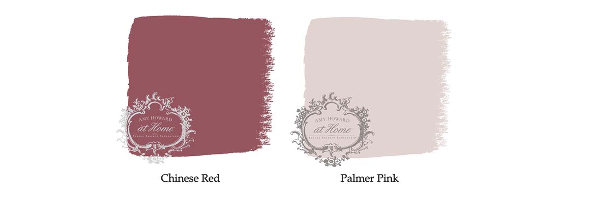
If you want a modern decor look, try mixing red and a subtle blush. The blush acts as a neutral so the red stays the center of attention.
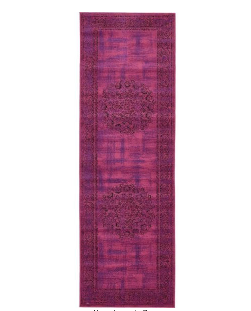
Red and Purple

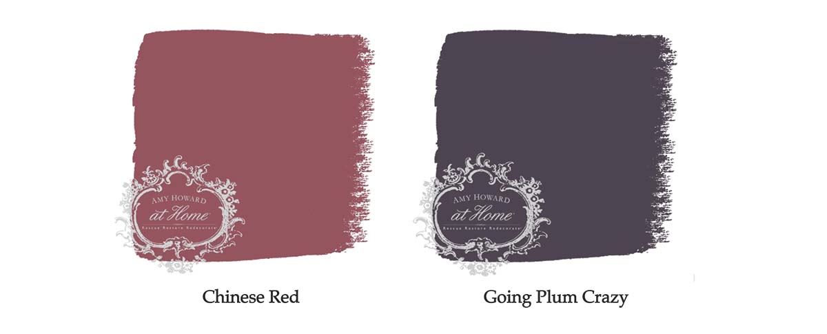
Located on the opposite ends of the color spectrum, red and purple aren’t the first two colors you’d think to put together. This unlikely duo can really work but make sure the two colors are in the same tone range. If you select a red and purple with the same saturation, it will look balanced in the room.

What is your favorite combination with red? Want to learn more about the color of the month club or check out all of Amy Howard at Home’s

Go create something!

Are you new to my blog? Go HERE to see my home tour and HERE to shop for items I use in our home.

Shop the Post
Join the Conversation

This site uses Akismet to reduce spam. Learn how your comment data is processed.

We're On Instagram
#DutchBoyPartner This bathroom leaned a little cool, so I warmed it up with Sandstone Tint by @dutchboypaints and it completely changed the look of the space.

No major reno. No new cabinets. Just paint.

Save this if you’ve been wanting to try a DIY project

...

51 32
I created this reel two years ago, but since the fields behind our house rotate between corn and beans… it’s a corn summer again. 🌽

The older I get, the more I appreciate these ordinary little rhythms of life. Watching the field change through the seasons has quietly become one of my favorite parts of home.

...

51 8
I love this chair and side table from @zgallerie that I decided to try it in my office/library. I’m not sure where I love it more - here or my bedroom! It adds so much elegance and charm to the spaces. Use my code SY5 at checkout for 5% off your entire purchase.
Shop My Favorites by commenting LINKS or through the link in my bio #ZGallerie #MyZgallerie #Zgallerie #ModernLuxury #LuxuryInterior

...

37 11
We waited 13 years for this - and our house looks happier with her glow-up!

We went from a drafty single door (with a 90s glass inlay I poorly covered up) to double doors that allows in more light and feel right for our home.

What do you think?

...

92 38
My patio is all ready for warmer weather thanks to the new launch with @livabliss + @galeyalix! I’m LOVING the checkerboard outdoor rug. Comment “PATIO” and I’ll send you the links! #Livabliss #LivablissHome #GaleyALixxLivabliss #HomeDecor #Rugs

...

43 16
I’ve been slowly refreshing our bedroom and recently added this beautiful swivel chair and side table from @zgallerie! They add the perfect elegant modern touch to the space. Use my code SY5 at checkout for 5% off your entire purchase. Shop My Favorites by commenting “LINKS” or through the link in my bio. 
#gifted #ZGallerie #MyZgallerie #Zgallerie #ModernLuxury

...

23 16
What started as a leak turned into my dream bathroom ✨ I partnered with @wayfair and found everything - from checkerboard tile to the vanities, mirrors, and faucets. Comment “LINK” and I’ll send you all my favorite finds! *Shower glass coming soon! #ad #wayfaircreator #homereno

...

71 34
@wayfair is helping us turn a disaster into something beautiful ✨A leak from our upstairs shower led to a full remodel, and I can’t wait to show you the AFTER! Bathroom remodel reveal coming soon. Comment “LINKS” and I’ll send all my Wayfair favorites! #ad #wayfaircreator #wayfair #homereno

...

49 15
*TWO THINGS that make wallpaper removal easy* Wallpaper has come a long way and there’s no need to be scared of it anymore! Before I hang wallpaper, I size the walls and often use pre-pasted SureStrip wallpaper that is activated with water! Comment WALLPAPER for easy to remove wallpaper links!

...

42 29
What a difference pattern can make in a space! 

Are you ready to try wallpaper in your home?

...

131 46