Bathroom Remodel: From Shower Leak to a Timeless Checkerboard Tile Bathroom
The Problem That Started It All.
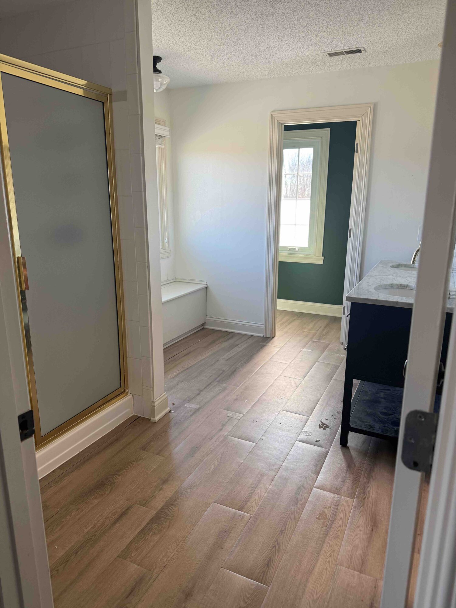
Our upstairs shower leaked straight through to the living room ceiling. There were signs of a lot of water damage. So, we called a contractor, were put on his list, and six months later we began the remodel.
Over the years, we had cosmetically updated the bathroom – vinyl plank floors and a new double vanity. It really didn’t look terrible, but it was disaster under the shower and flooring.
Here’s a photo of the bathroom before:
Starting with the Palette
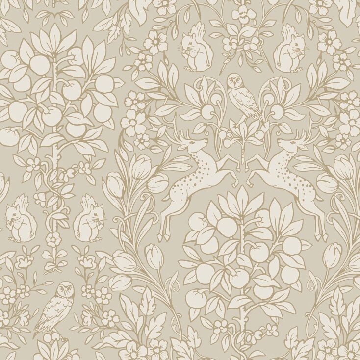
Every good design begins with a palette. For this bathroom, I wanted to stay firmly in the warm neutral family, avoiding anything too cool or overly gray.
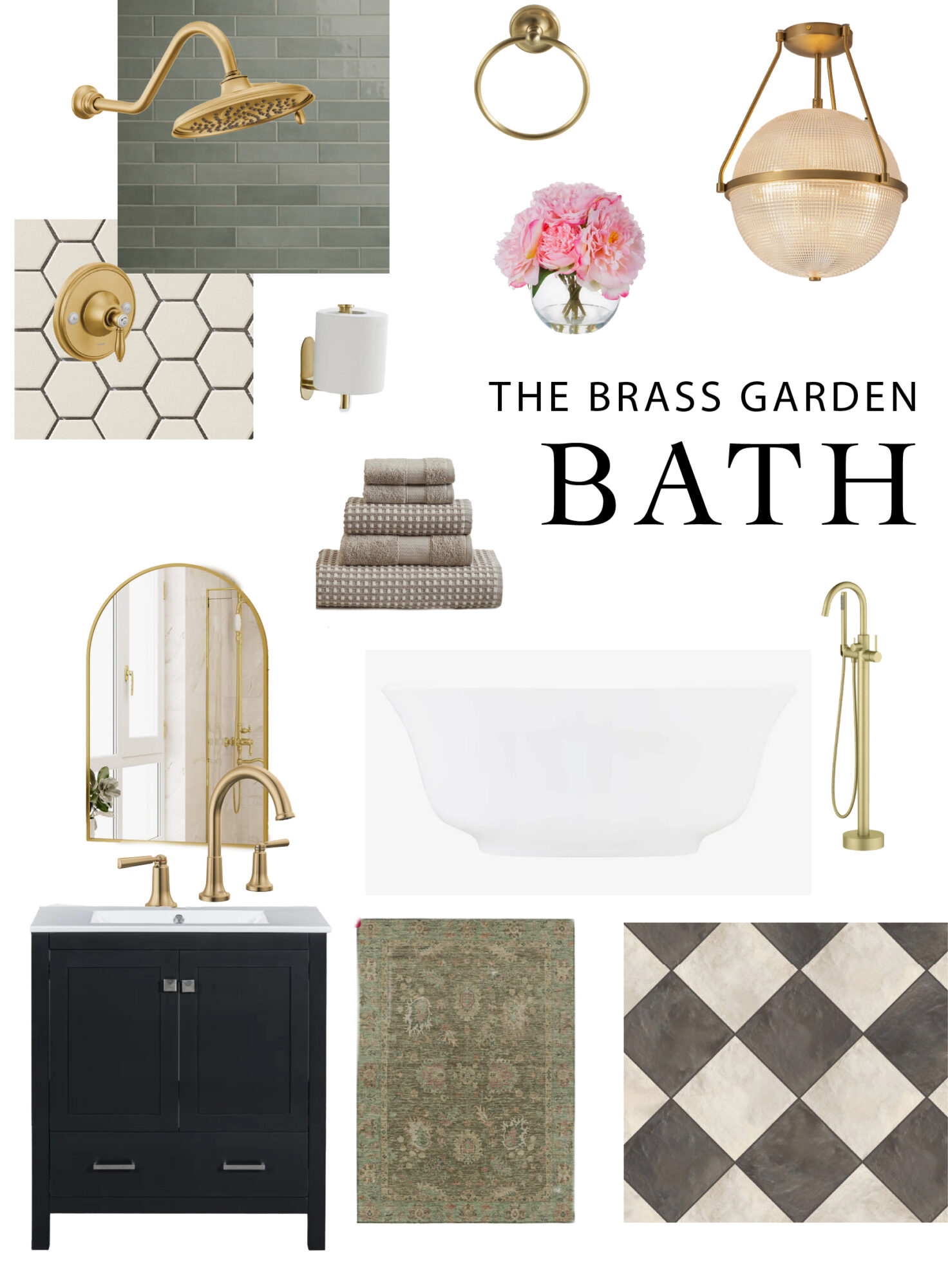
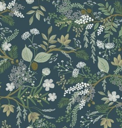
You can shop my design board by going HERE.
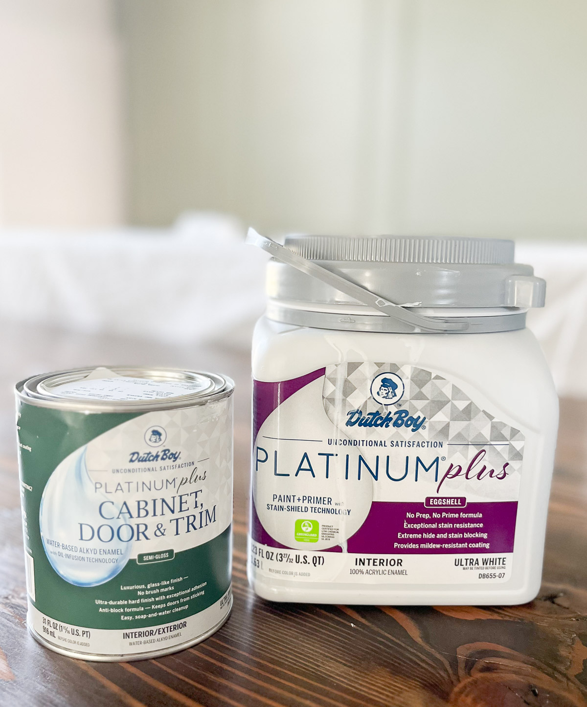
The foundation color is Sherwin Williams Worldly Gray, which works beautifully in a room with east-facing light. In the morning, the space fills with soft natural light. This light keeps the color feeling warm and inviting. It prevents the color from appearing flat or muddy.
Using the same color on both the trim and the walls helps the room feel calm and cohesive. It also allows the other elements — wallpaper, tile, and brass — to really shine.
The Details That Made the Difference
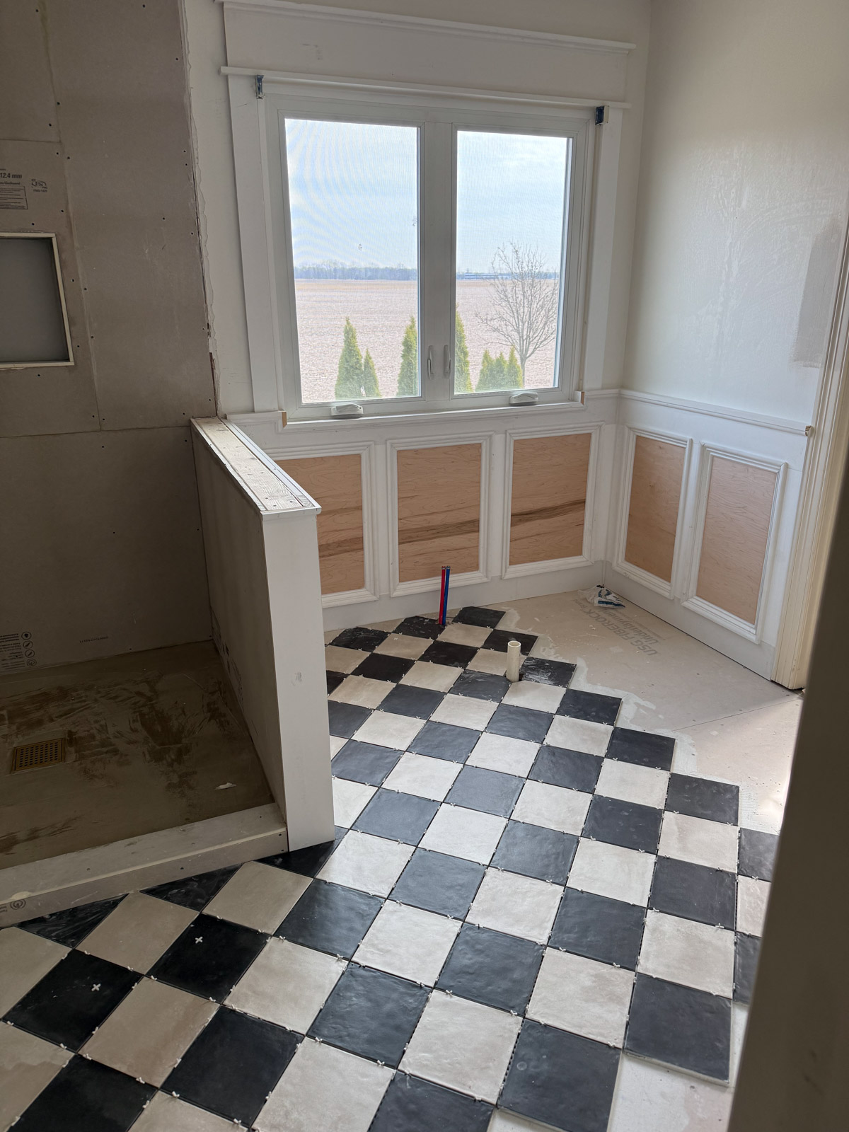
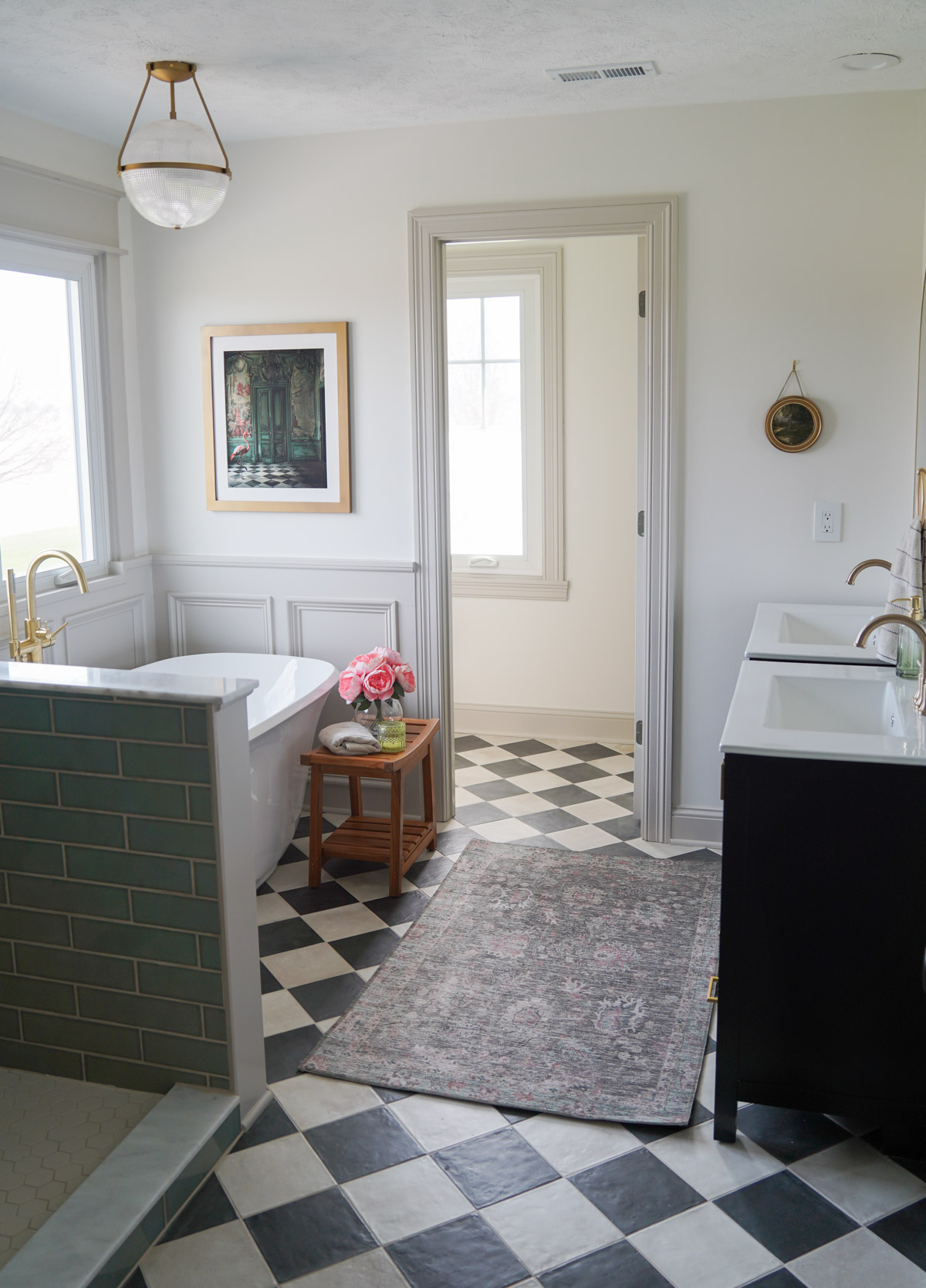
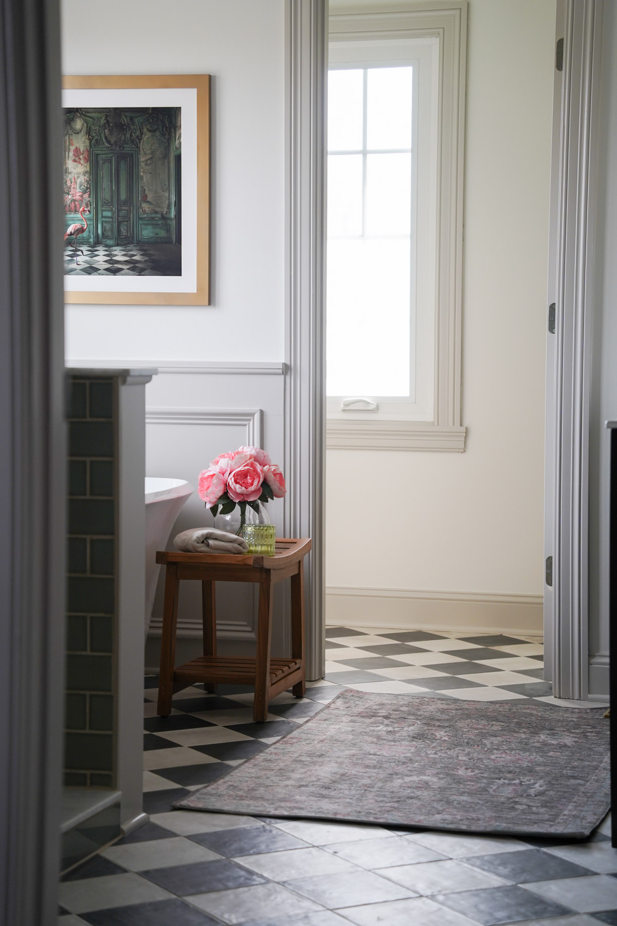
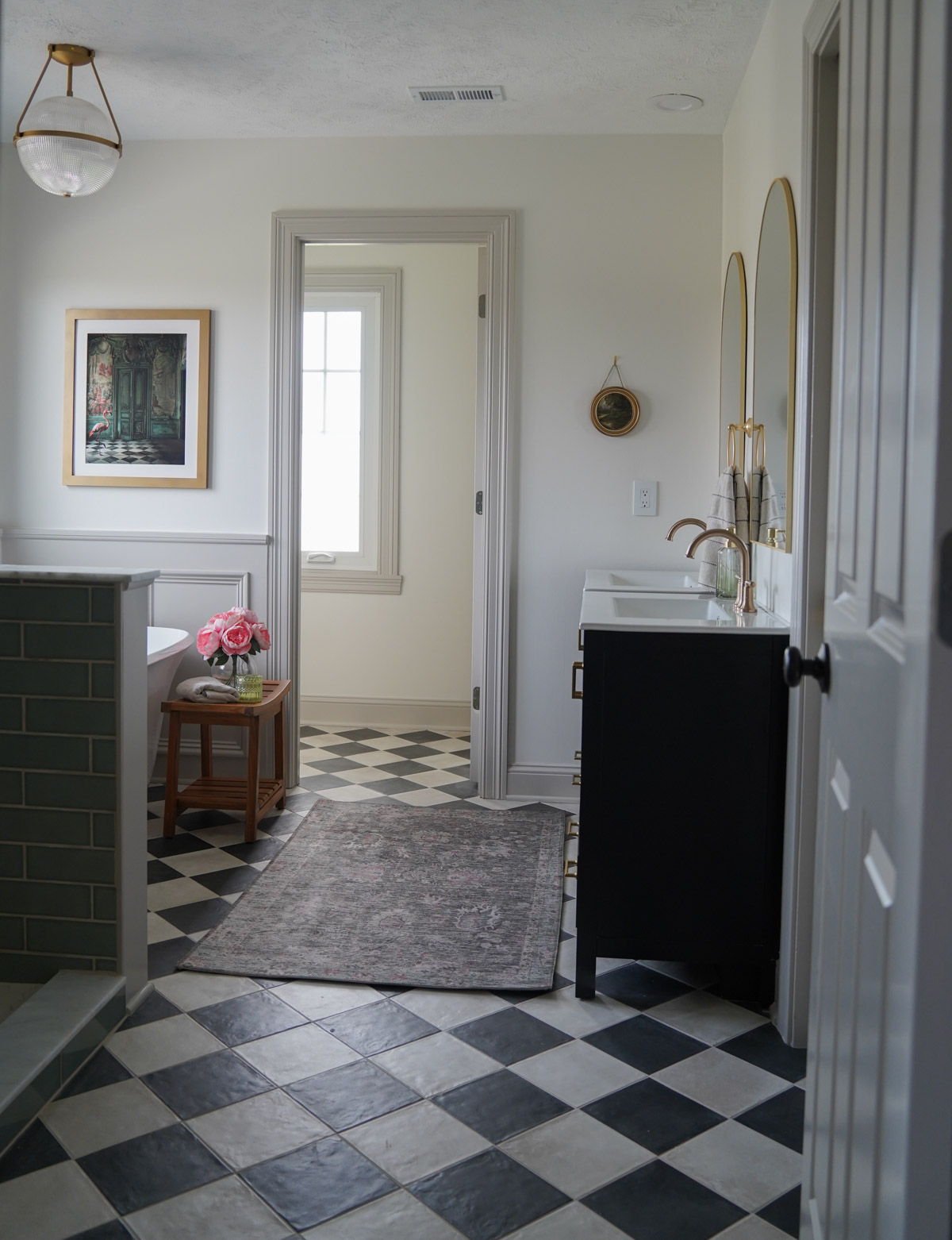
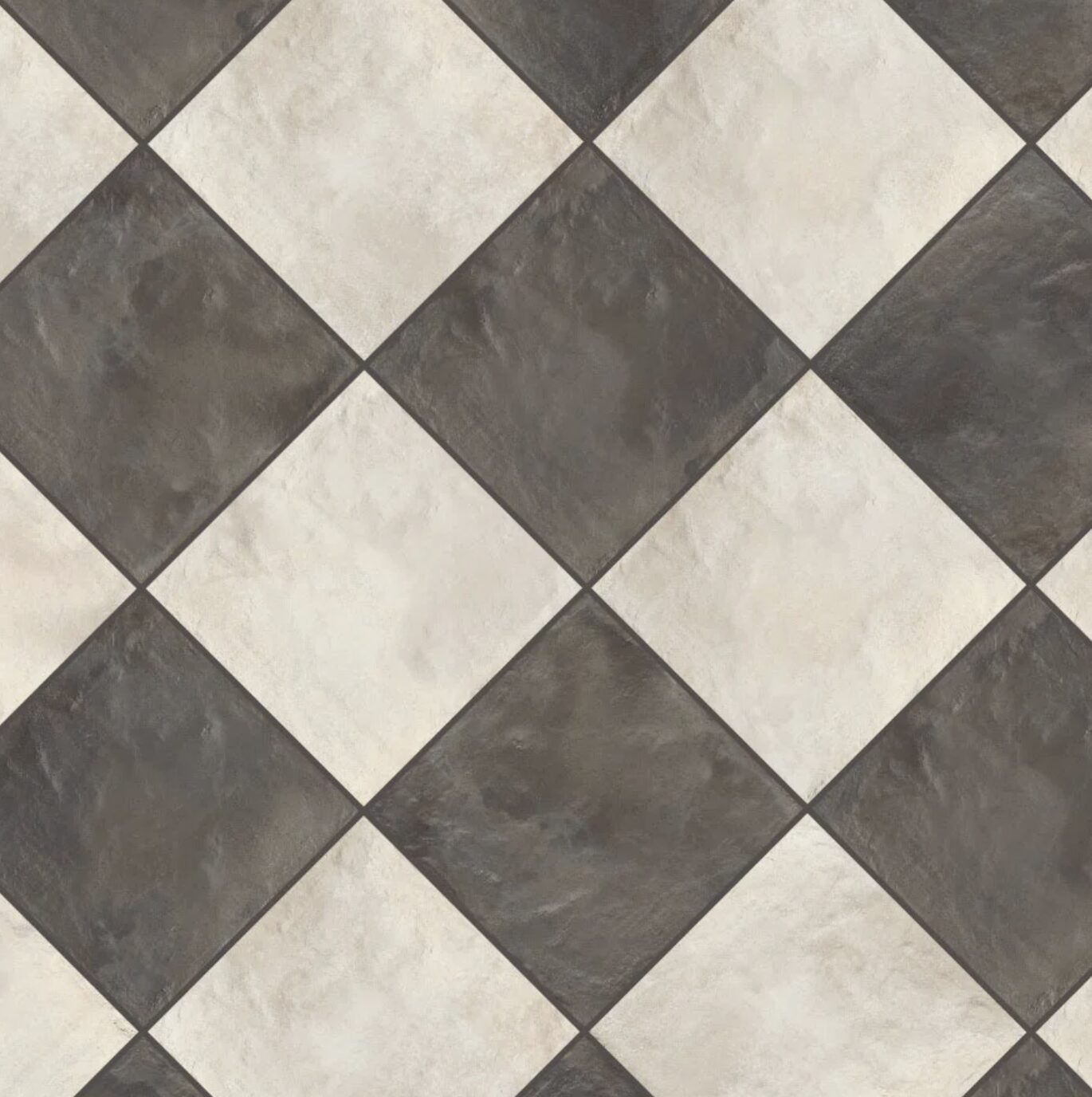
1. Checkerboard Floors
The checkerboard tile instantly gave the space that collected, high-end feel. It’s bold, but still classic—and it grounds everything else in the room.
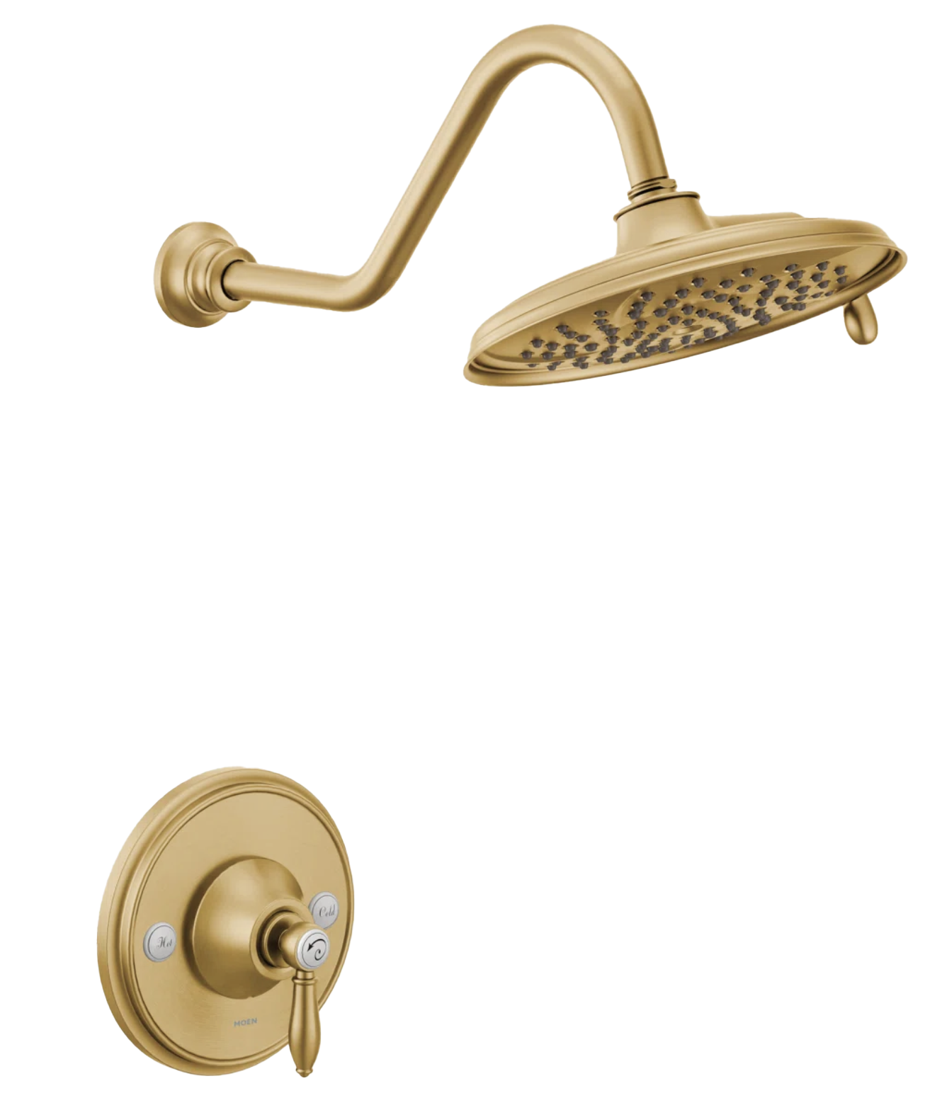
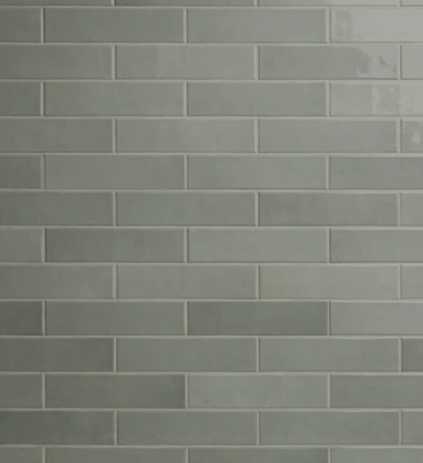
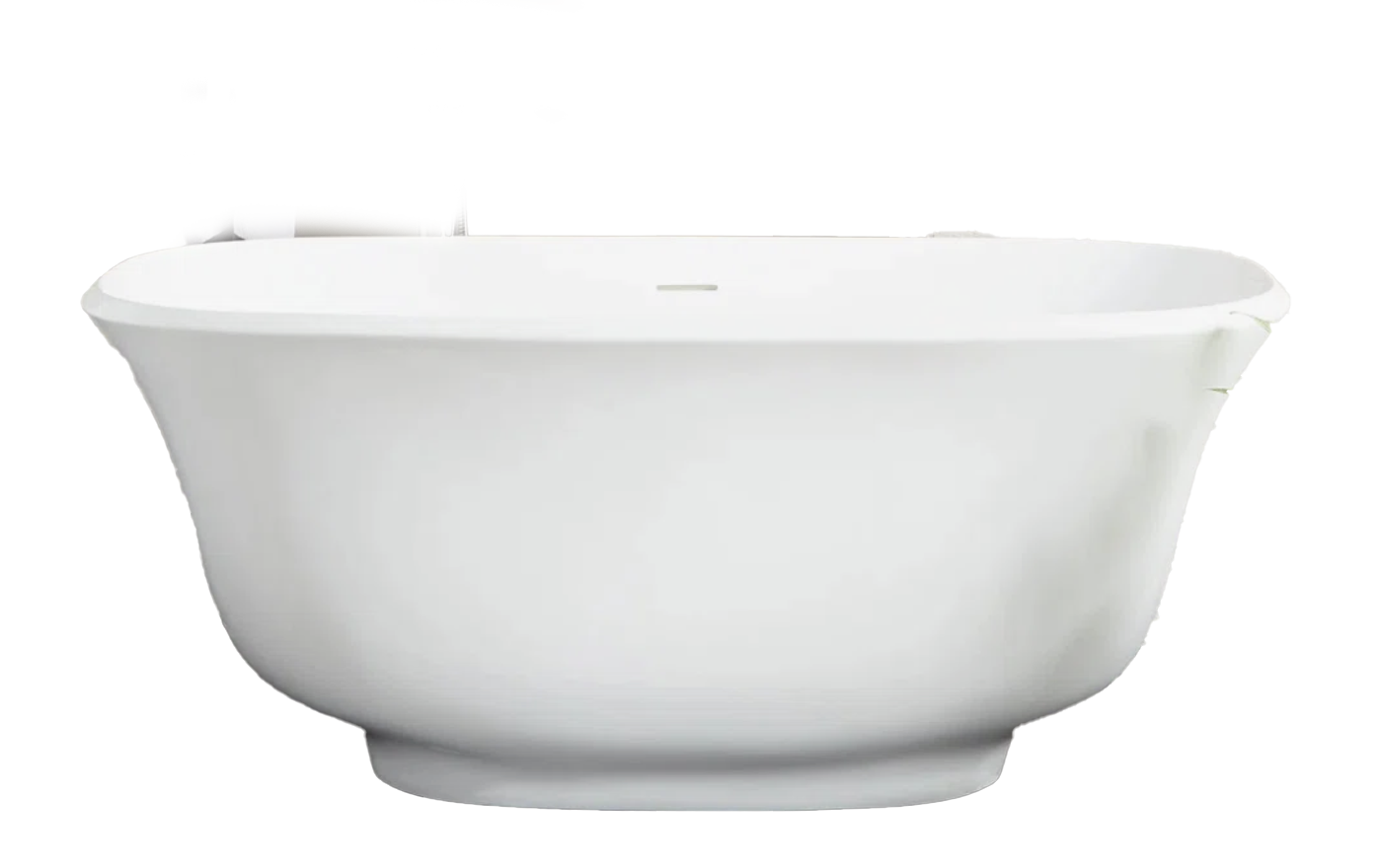
2. A Shower That Actually Works (and Looks Good Too)
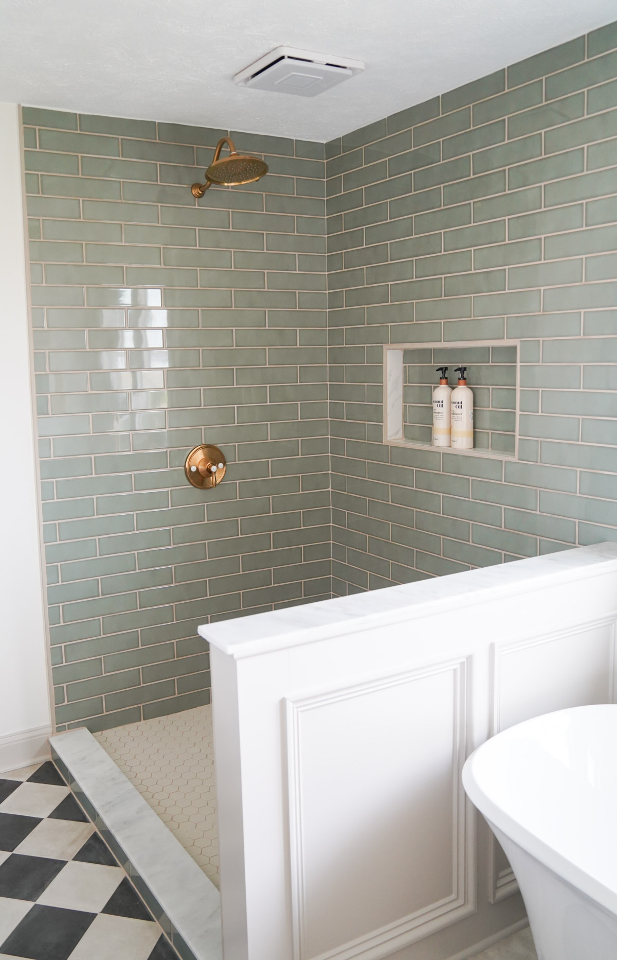
Given how this whole project started… the shower mattered a lot. Our contractor began construction by pouring a concrete base to prevent future leaks.
We selected a soft green tile for the shower walls. It adds color without overwhelming the space. We paired it with brass fixtures to warm everything up.
And yes—there will be glass added (coming soon), which will keep everything feeling open and light.
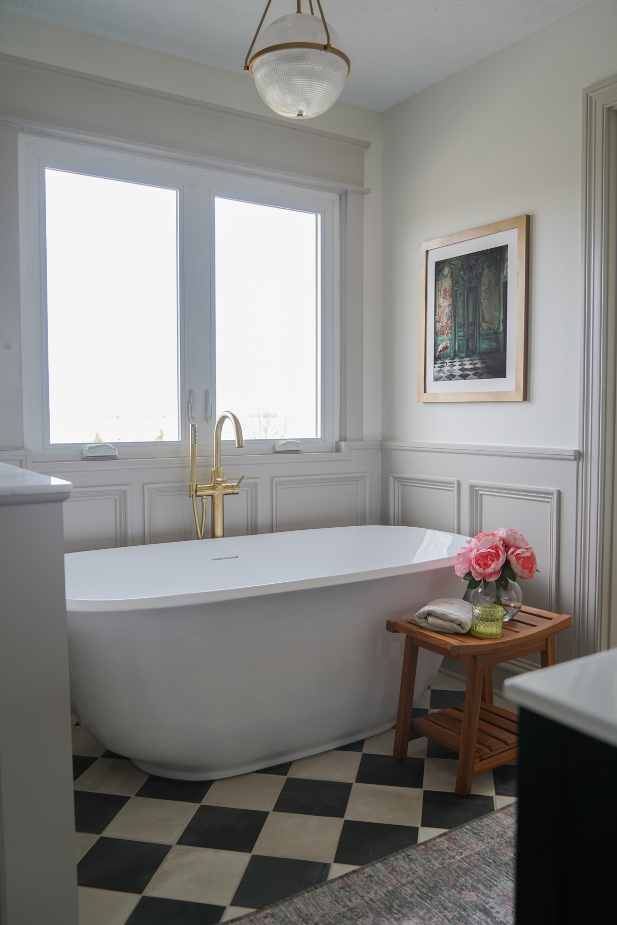
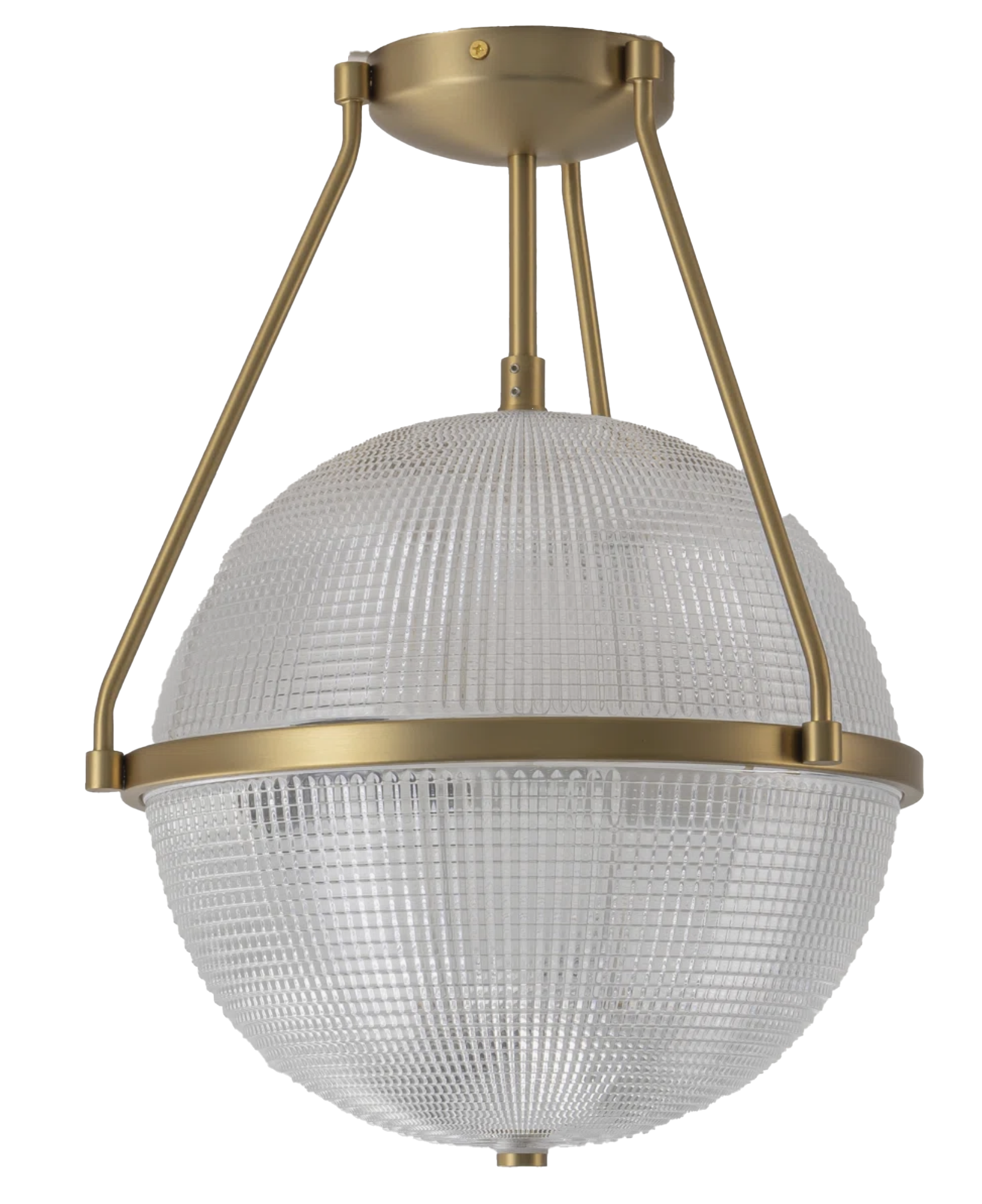
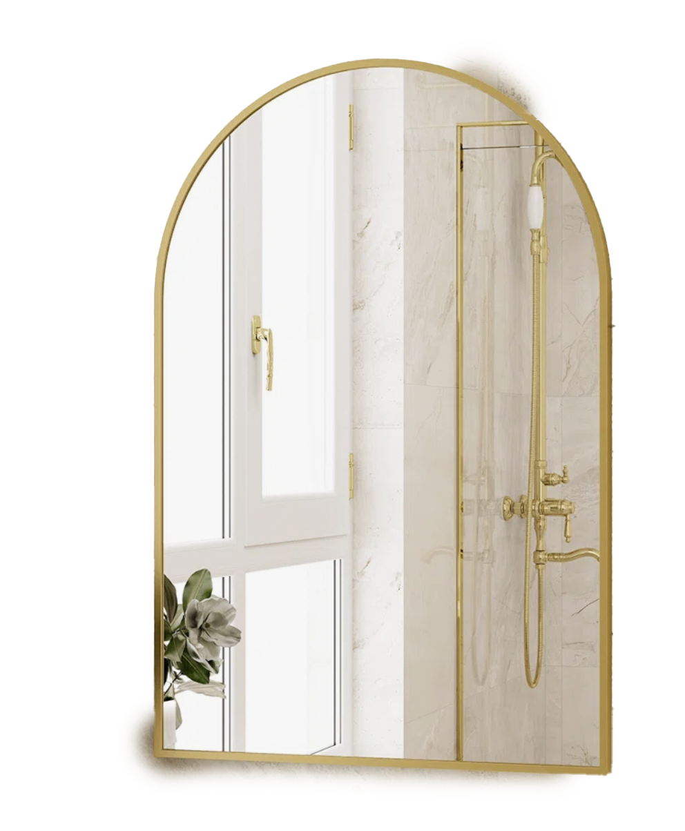
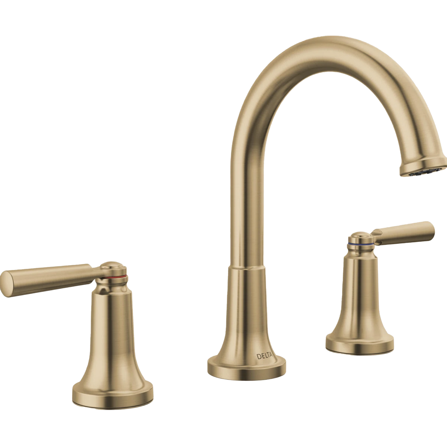
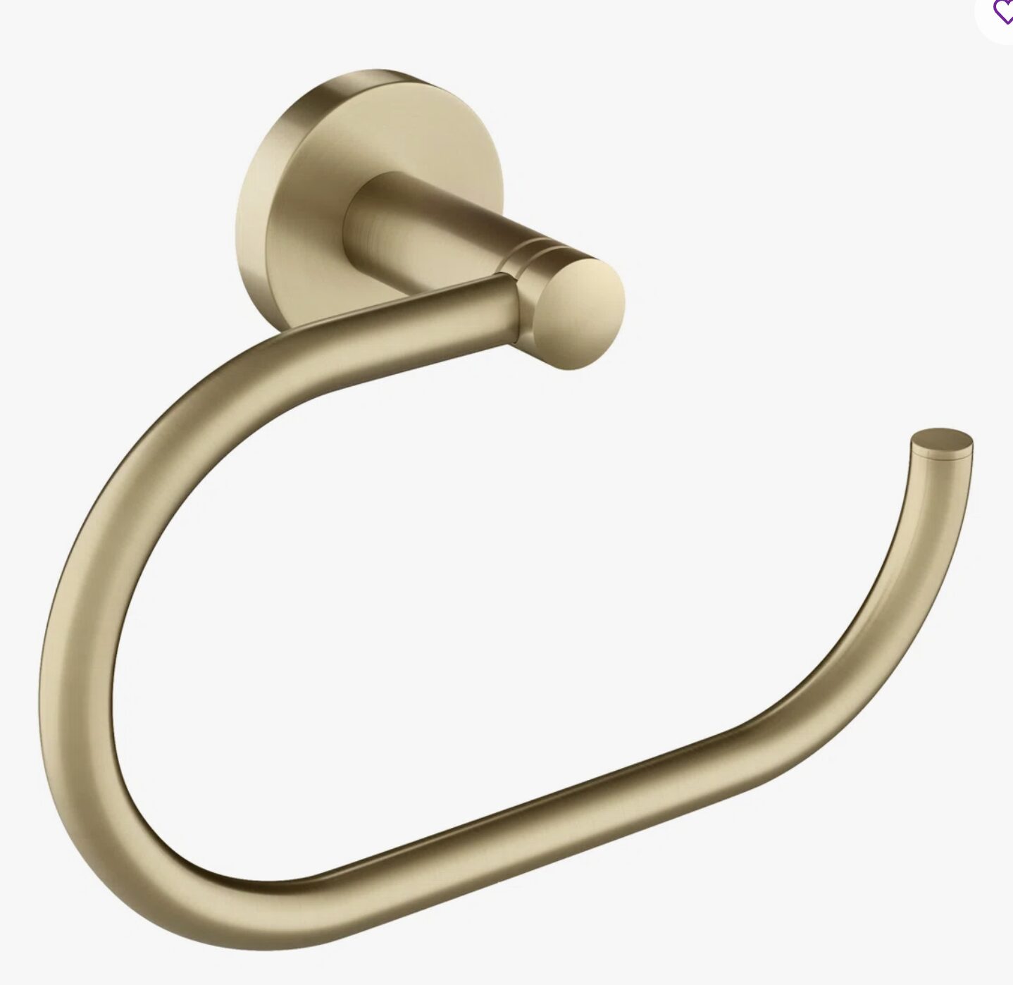
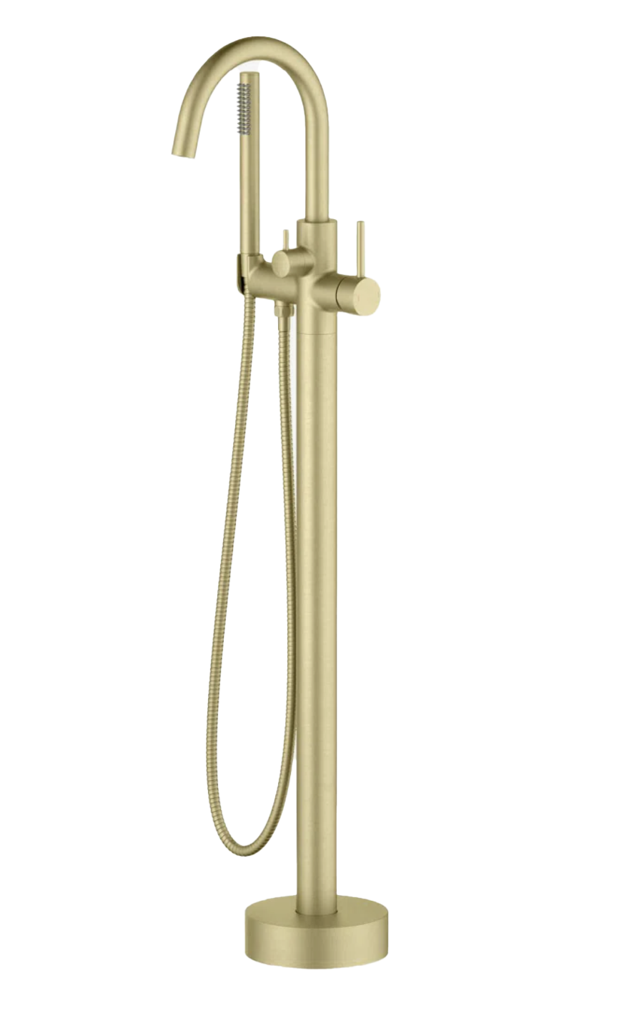
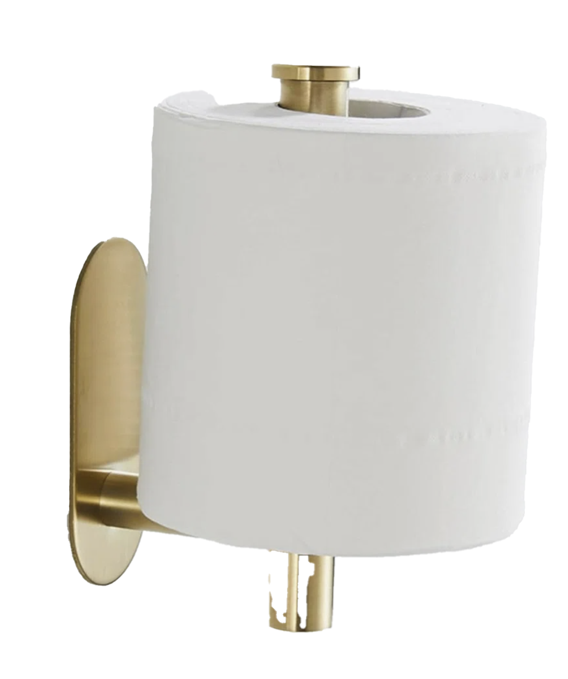
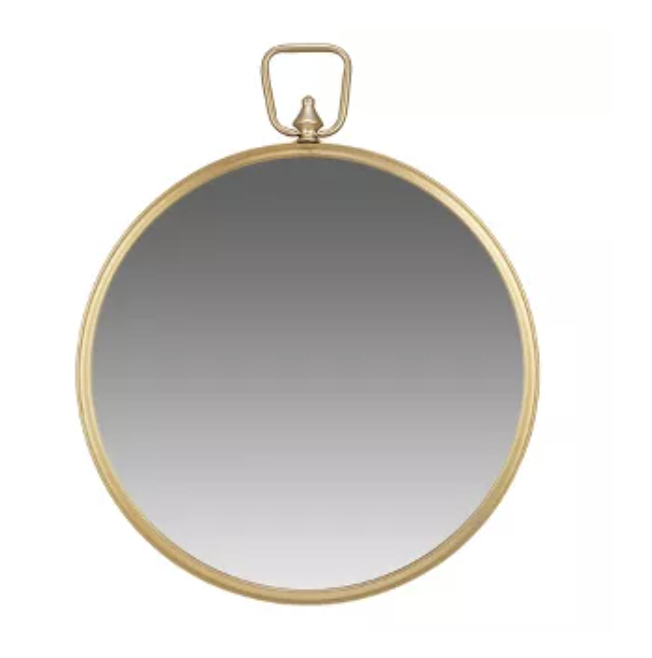
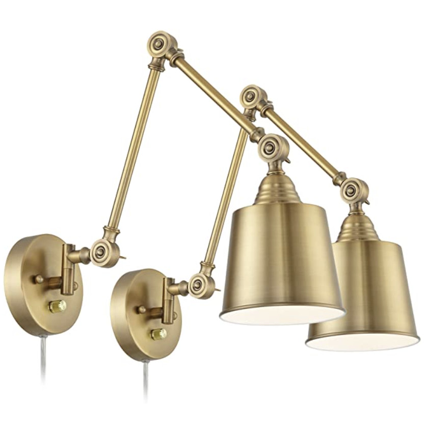
3. Warming Things Up with Brass
One of the biggest shifts from the “before” to “after” is the warmth.
Swapping cooler finishes for brass completely changed the feel of the space. It adds that layer of richness that makes everything feel more intentional and less builder-grade.
What I’d Do Again (and What I’d Tell You)
If you’re planning a bathroom remodel (or unexpectedly thrown into one like we were), here’s what I’d prioritize:
- Invest in the elements you use daily (tile, fixtures, layout)
- Choose timeless over trendy – you won’t regret it.
- Don’t rush the design phase – do you research and create Pinterest boards.
Turning a Setback Into Something Better
This project started with a leak… and ended with one of my favorite spaces in our home.
It’s a reminder that even the frustrating, unexpected home issues can turn into something really good.
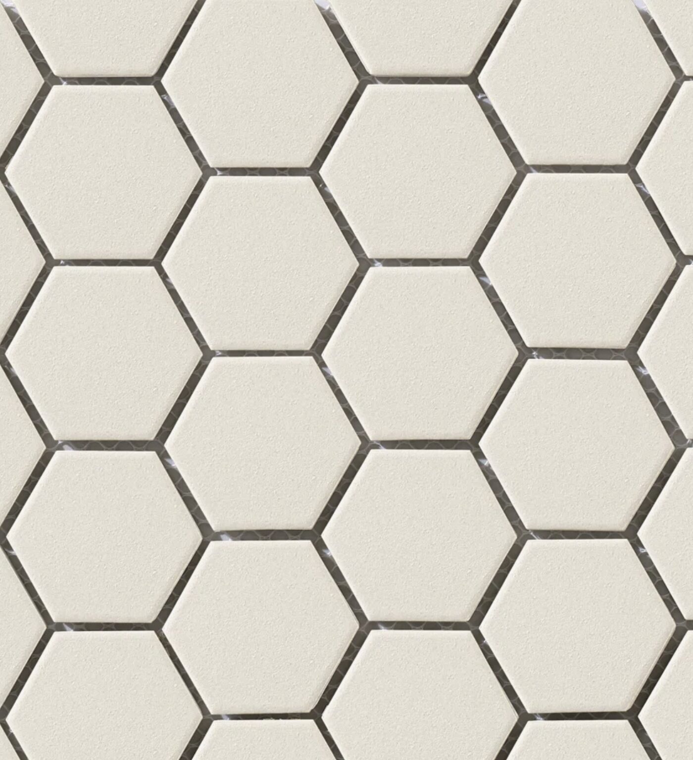
Mixing Classic Tile Patterns
Tile is another place where classic design shines.
This bathroom uses two different tile styles that complement each other without competing:
1. Soft green subway tile in the shower
This adds subtle color and texture while still feeling calm and spa-like.
2. Diamond patterned floor tile
The floor tile brings contrast and visual interest while still staying within a neutral palette.
The key to mixing tile successfully is keeping the color palette cohesive, even if the patterns are different.
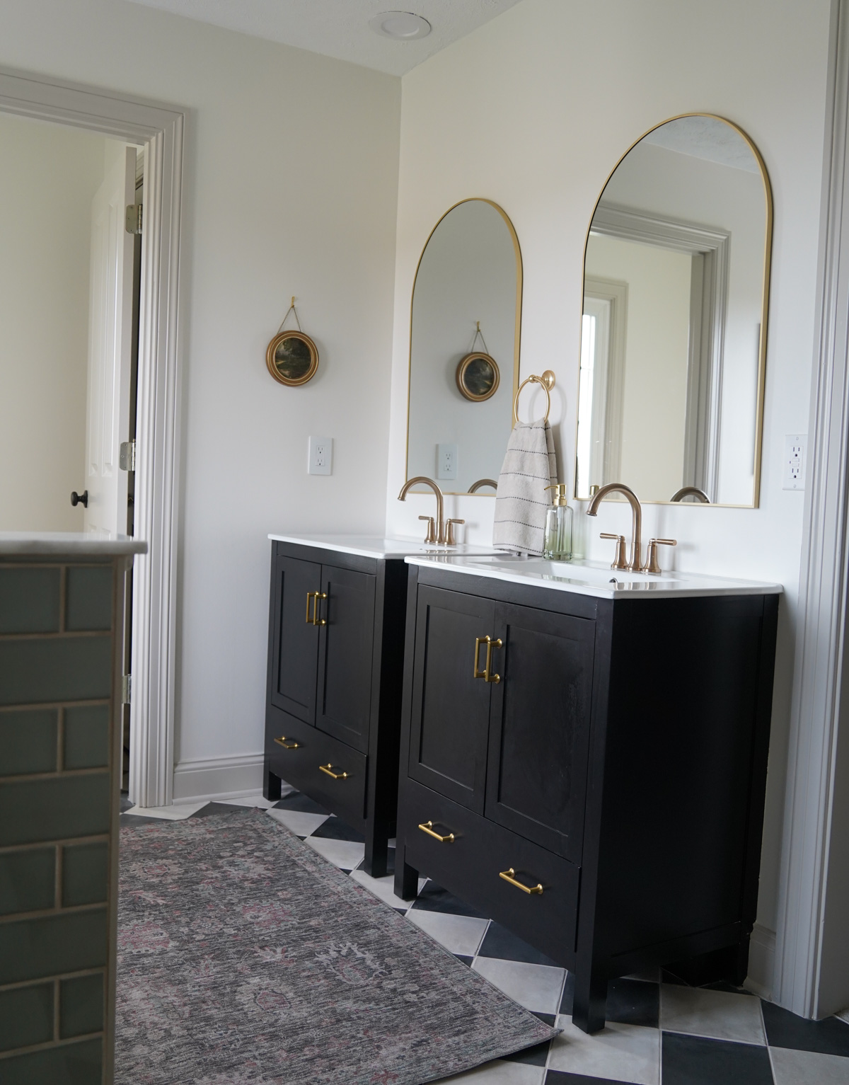
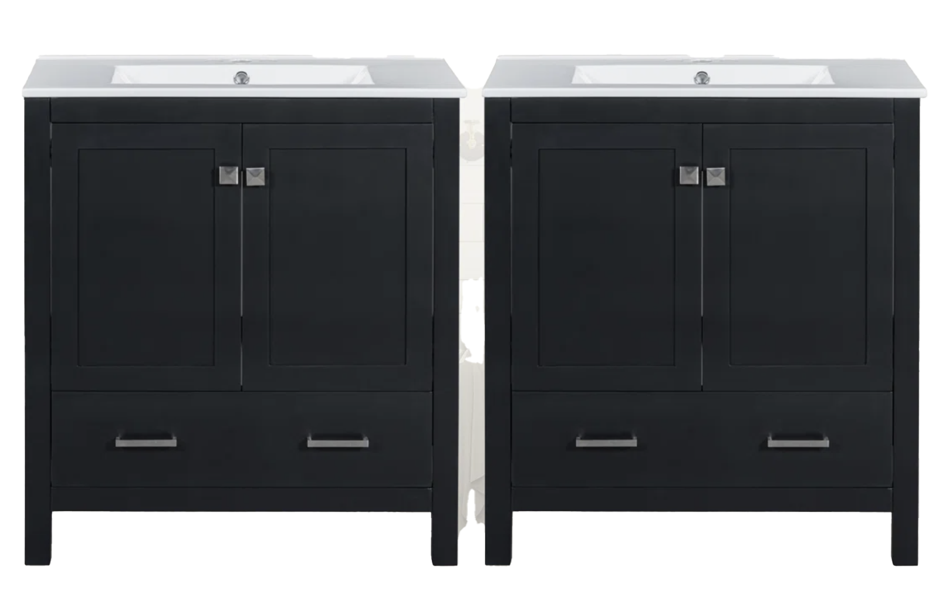
Anchoring the Space with Dark Vanities
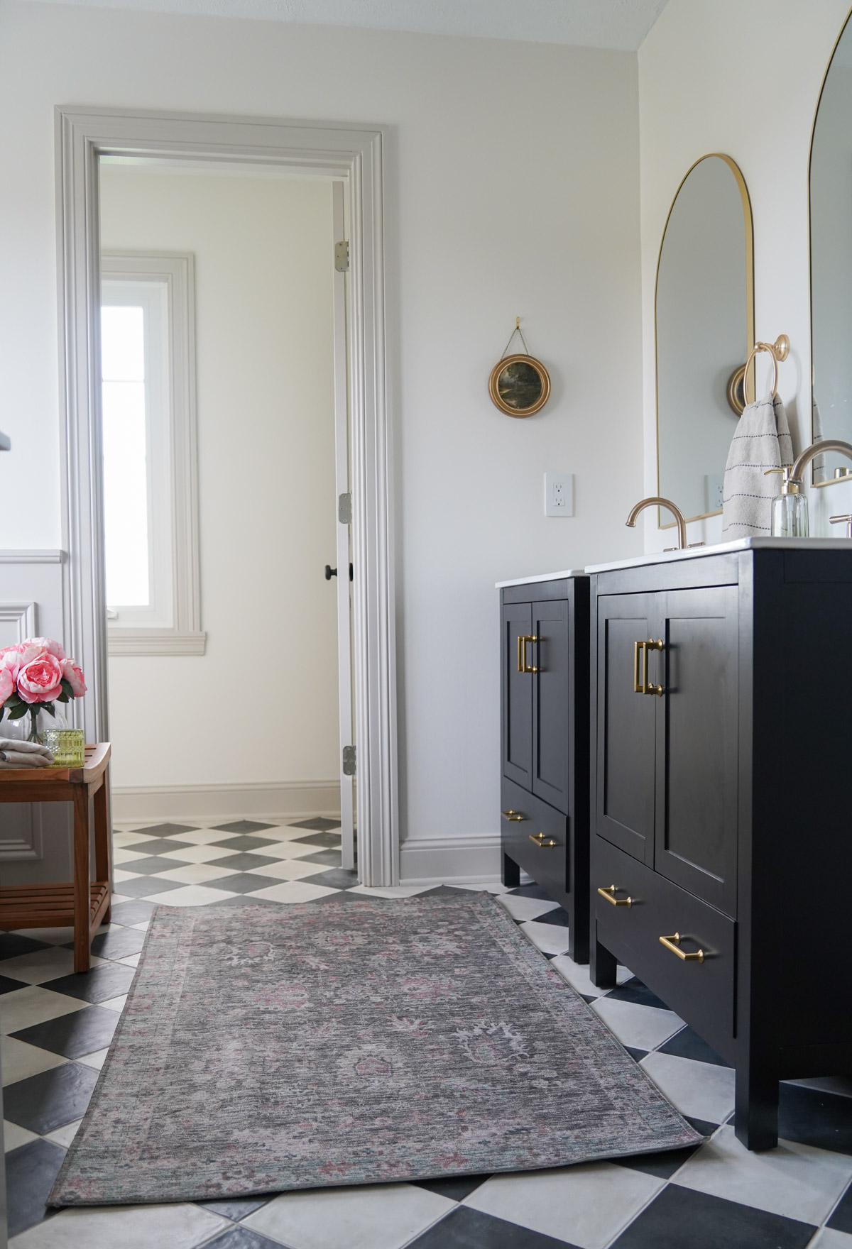
To ground the room, I chose black vanities. Dark cabinetry adds weight and contrast, which helps prevent the space from feeling washed out.
Paired with the brass hardware and faucets, they give the bathroom a slightly tailored, classic feel.
Creating a Bathroom That Feels Timeless
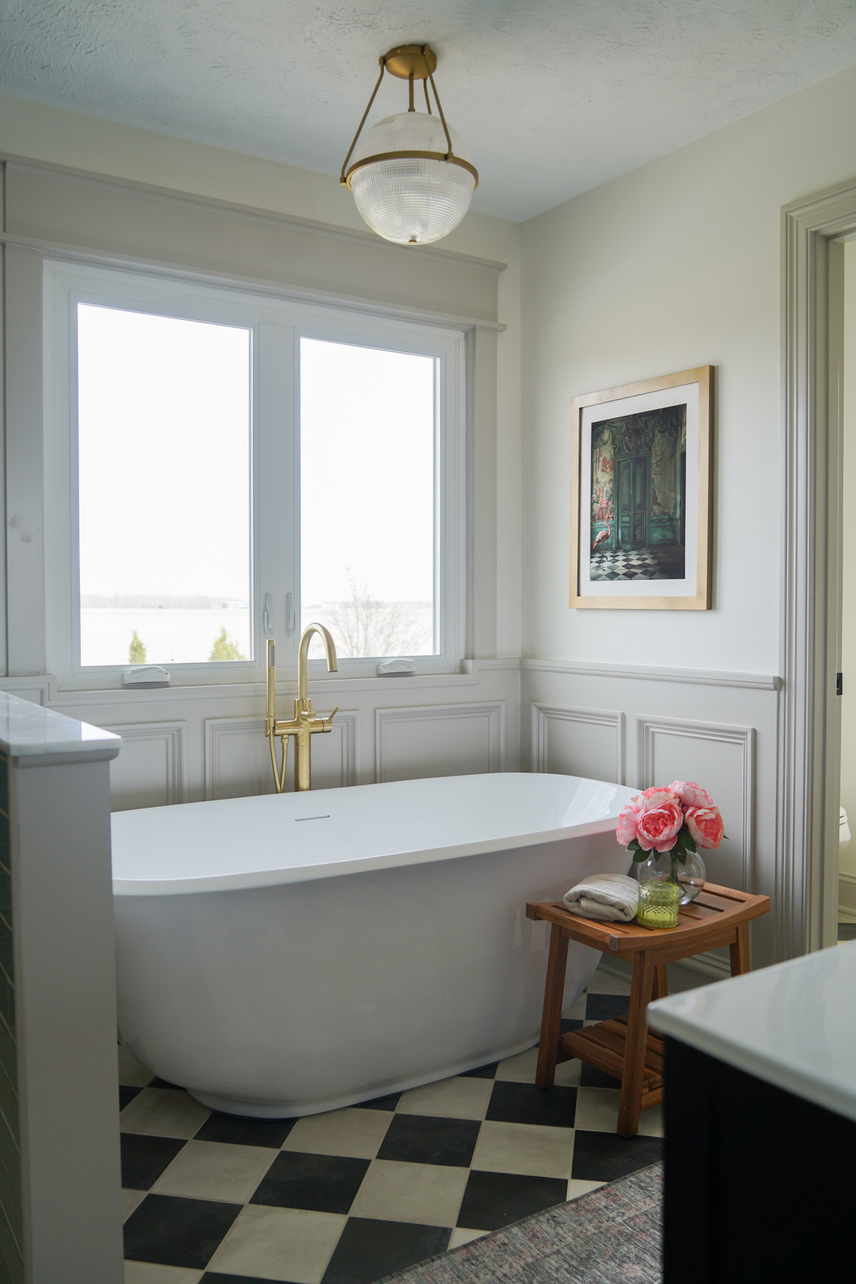
When designing bathrooms, I try to focus on materials and finishes that will still feel beautiful years from now.
For this space, that meant leaning into:
- Warm brass fixtures
- Classic tile shapes
- Soft neutral paint
- Traditional lighting
Together, these elements create a bathroom that feels collected rather than trendy. It’s the space that only gets better with time.
When we first moved into our home, we had a major shower leak in our primary bath. We modeled a lot of the layout after that space, and you can see more HERE.
You can SHOP my bathroom by going HERE!
Sincerely,
Sara 🤍


