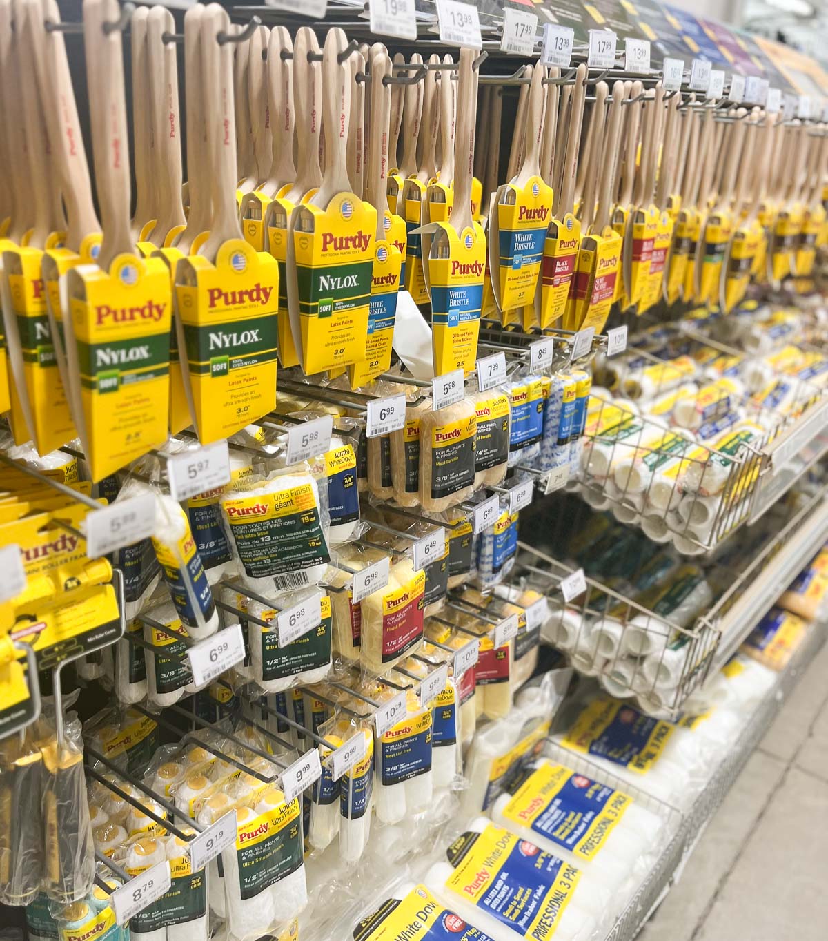
Before we discuss how to clean paintbrushes, the quality of the paint tools you use is just as important as care and technique.
Good quality brushes will cost more than standard-grade brushes, but investing in quality brushes will make a huge difference in a smooth paint job and last longer with proper cleaning and storage.
This post is a sponsored post by Purdy. I take pride in reviewing only products that fit my brand and will be beneficial to my readers. While this post is sponsored, all the opinions are my own.
Paintbrushes come in two main bristle types: Synthetic and Natural.
Synthetic Paintbrushes
Synthetic paintbrushes are best for latex or water-based paints and stains.
Synthetic bristles are made from nylon, polyester, or a combination of both. These bristles are stiffer than natural animal hair and do not absorb water and offer shape retention and a smooth finish.
Natural Paintbrushes
Natural paintbrushes are best for oil-based paints and stains.
Natural bristles have split ends which allow the brush to hold more paint and release it evenly. They readily absorb water which means they can quickly become limp.
It is always best to clean paint brushes (and rollers) as soon as possible post-painting. Paint is harder to clean once it dries, so proper cleaning and storage of paintbrushes are important.
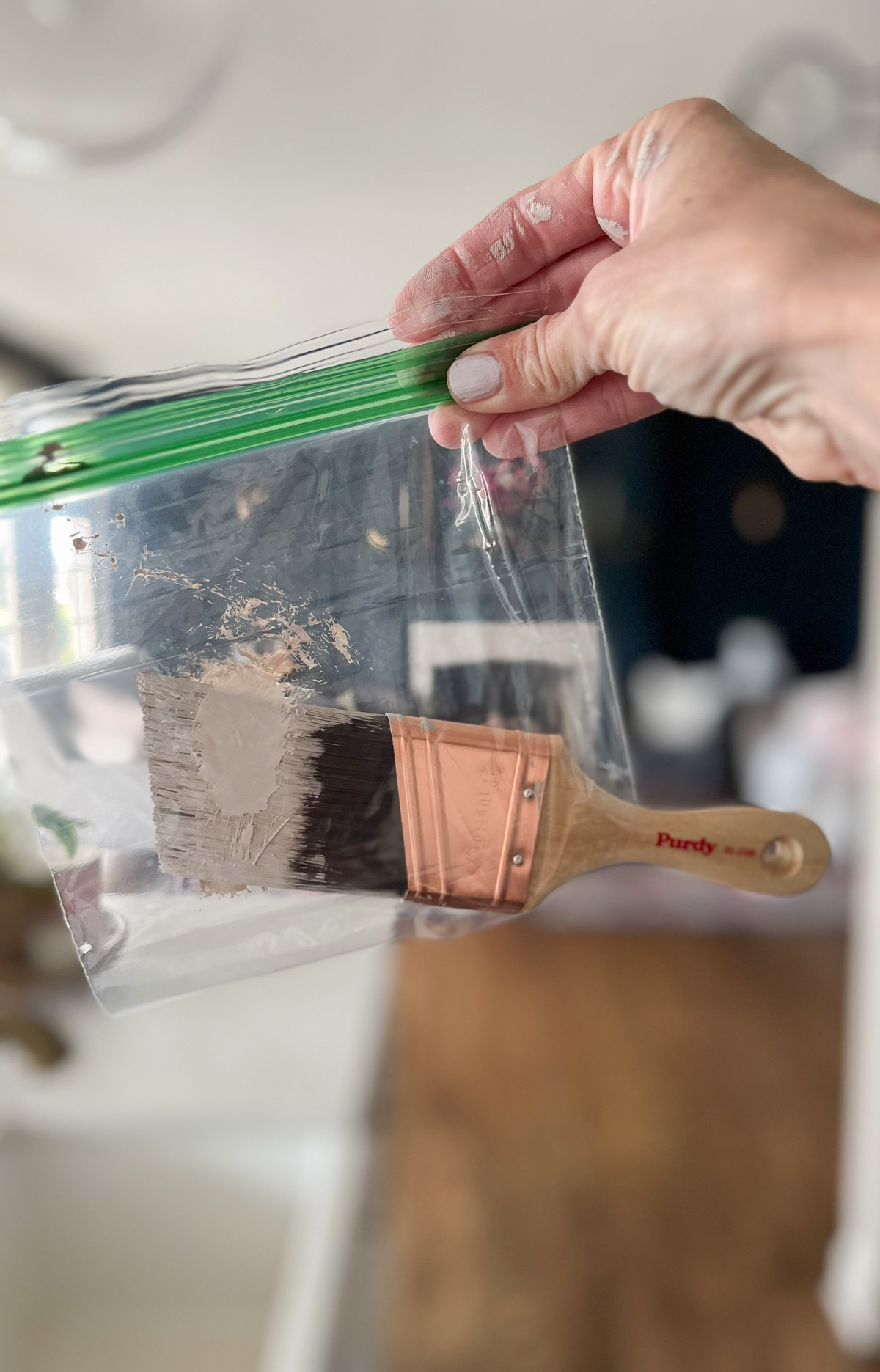
Tip for Storing your Paintbrush in the middle of a paint job:
If you’re not able to wash your brush right away, try wrapping it in cling wrap or put it in a baggie (clip off the corner and stick the handle out). You will avoid the brush drying out.
How to Clean Synthetic Paintbrushes:
Wash Brushes
Use warm water and soap or mild detergent to clean the paint from your brushes, gently working the soap through the bristles until the water runs clear.
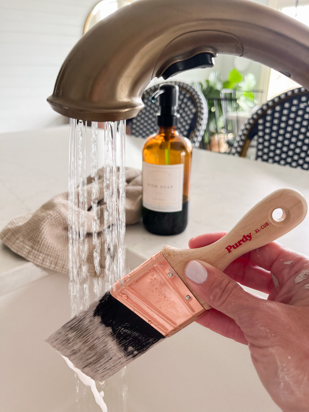
Soften dried-on paint with hot soapy water and work quickly.
Once the dried paint has softened, work the soap or detergent through the brush bristles and rinse. Continue to repeat the process as necessary.
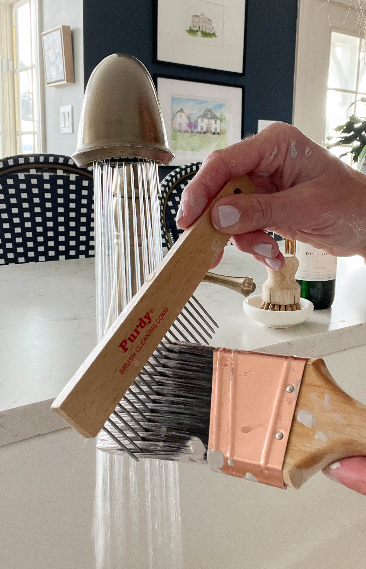
For best results, use a Purdy® Brush Comb or Brush and Roller Cleaner to straighten bristles and place the brush in its protective keeper.
Dry Brushes
Once clean, hang them to dry before reusing or storing them.
Store Brushes
The best way to store paintbrushes is by replacing their original protective cover. This helps keep the bristles intact and helps the brush to maintain its original form.
*You should never use natural bristle brushes for latex or water-based paints and stains. If you make this mistake, clean the brush with warm soapy water and let it dry completely. Then, use a dime-sized amount of linseed oil and work it into the bristles. You may need to repeat this step several times to completely repair the brush. Once soft, comb out the brush and place it in its original keeper until you’re ready to use it again.
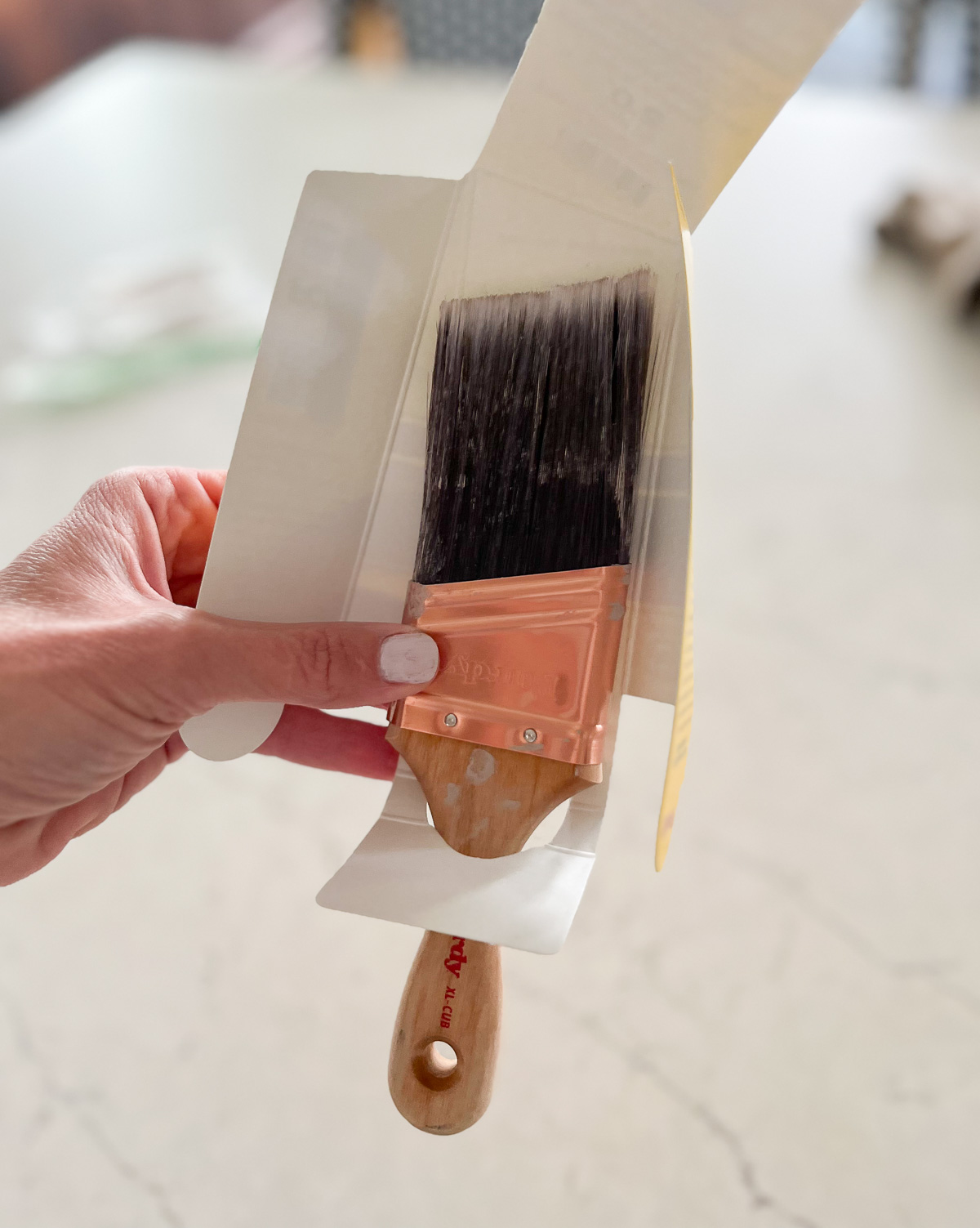
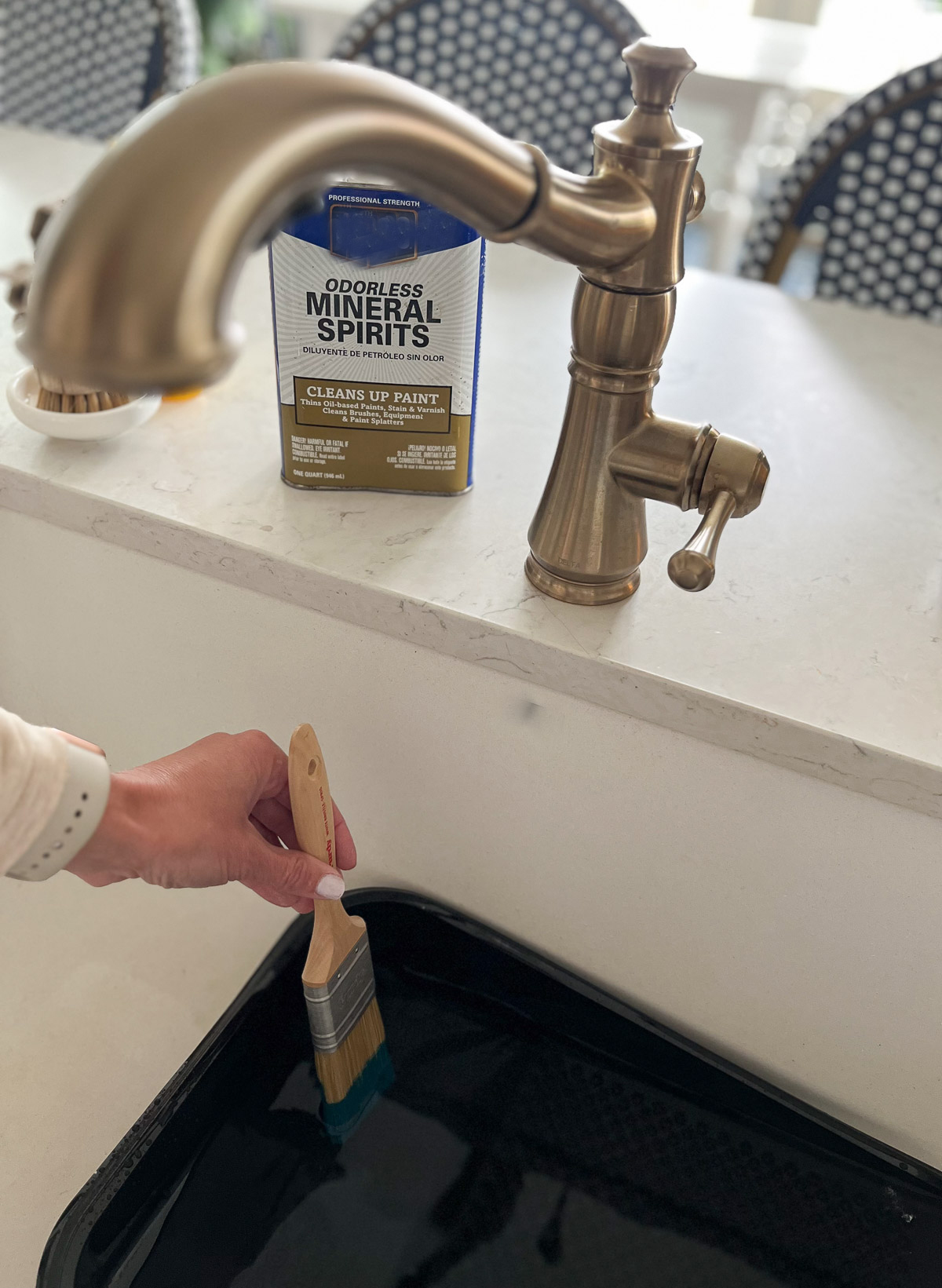
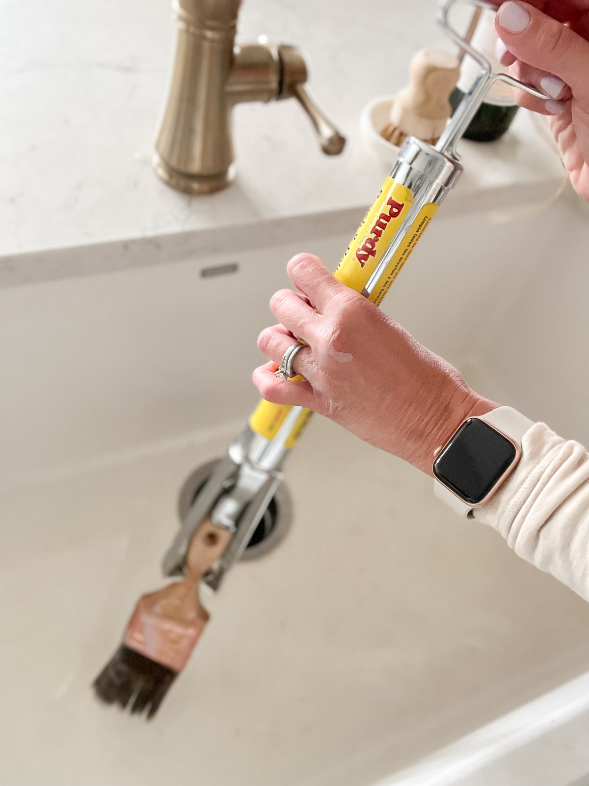
How to Clean Natural Paintbrushes:
Wash Brushes
Clean your paintbrush immediately after use and check the back of the can label for the manufacturer’s recommended *cleaning solution. Using a lined paint tray or another disposable container, work the solution into the bristles to remove the coating by dipping and swirling the bristles against the surface. Change the solution periodically when it gets too dirty and do not soak.
*Read the cleaning solution’s label instructions on how to properly dispose of the used cleaning solution.
Dry Brushes
Once the bristles are clean, use a Purdy Brush Comb or Brush and Roller Cleaner to straighten the bristles and ring out extra water.
Store Brushes
Store your brushes in the sleeve they came in so that the bristles remain flat and protected. Keep the cardboard covers with which costlier brushes are sold and put them back on for storage.
If properly cared for you will get many services from a good brush. Taking the time to clean and store them properly is important to their longevity.

Are you new to my blog? Go HERE to see my home tour and HERE to shop for items I use in our home.


