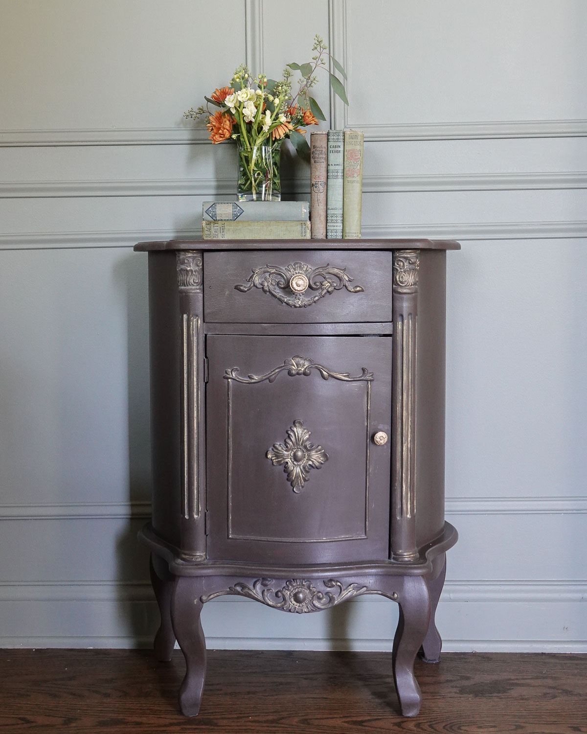
If you are considering using chalk paint on your cabinets, this is a must-read. Don’t make my mistake! Learn from why I repainted my chalk-painted cabinets.

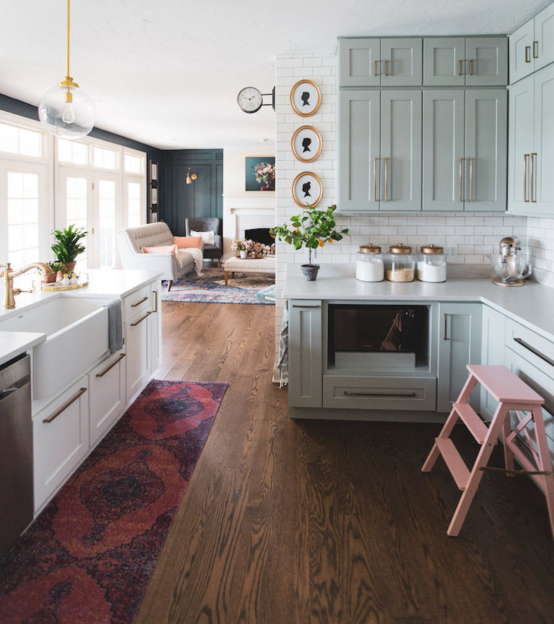
When we first moved into our home, I painted our kitchen cabinets with chalk paint. This is what they looked like before (the first time I painted them):
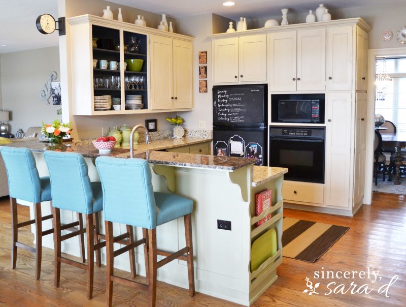
And here is a photo of how our kitchen cabinets originally looked when we first moved into our home:

Why I Repainted our Chalk Painted Cabinets
The chalk paint itself has held up really well. There was little to no chipping. Chalk paint is amazing for DIY projects because it requires no prep work and eliminates the need for priming.
However, I made one mistake. Unfortunately, it was a big mistake – so big that I had to repaint the cabinets.

I used wax as my sealer.

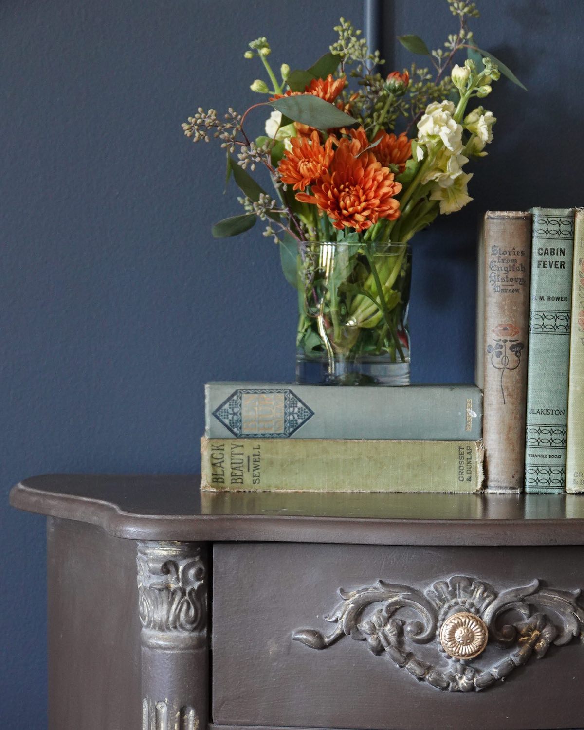
It is hard to see in photos, but the clear wax was next to impossible to clean in the kitchen. Dirt, grease, dust, and grime were getting caught in the crevices, and the wax did not clean up easily.


I had to repaint my cabinets.

I used chalk-type paint again, and I painted right over the previously painted cabinets sealed with wax. I would recommend using sandpaper and/or a coat (or two) of primer if you paint over cured wax. However, most likely you are not painting over the wax and will not need a primer. To apply the paint, I used a brush for the crevices and a roller for the flat areas.

How to Correctly Seal Chalk-Painted Cabinets
I painted everything with two coats of paint (allowing the first coat to completely dry before I added the second coat) and finished with two coats of sealer. I applied the matte sealer the same way I applied the paint, but you can also use a water-based sealer like a polyacrylic (found at any hardware store).
I have already noticed such a difference between the sealer and the wax. Now when my kids sit at the bar, I don’t have to worry as much. All the dirt they kick up can now be easily wiped away!


If you are considering painting your cabinets with chalk paint, don’t make my mistake (which is why I repainted my chalk-painted cabinets).
Use a top coat other than wax in the kitchen.
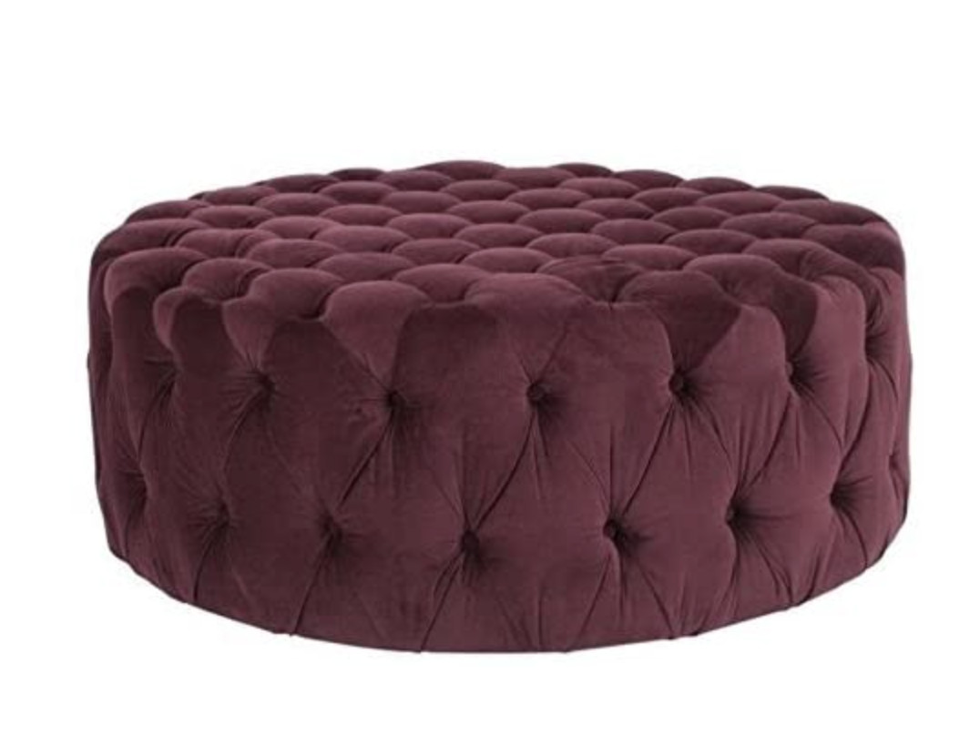
I know people often love the look of dark wax to provide that more lived-in, distressed look. However, try antiquing your cabinet doors with a dark glaze so you don’t have to use wax as your sealant.
Here’s my supply list for this project:
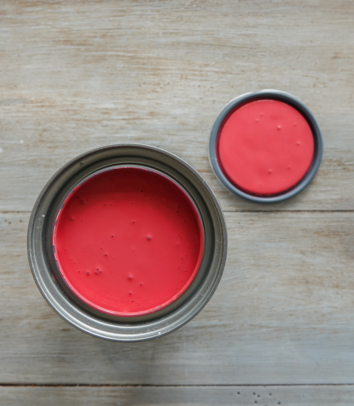
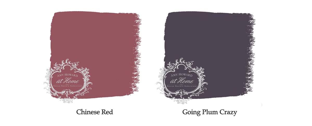
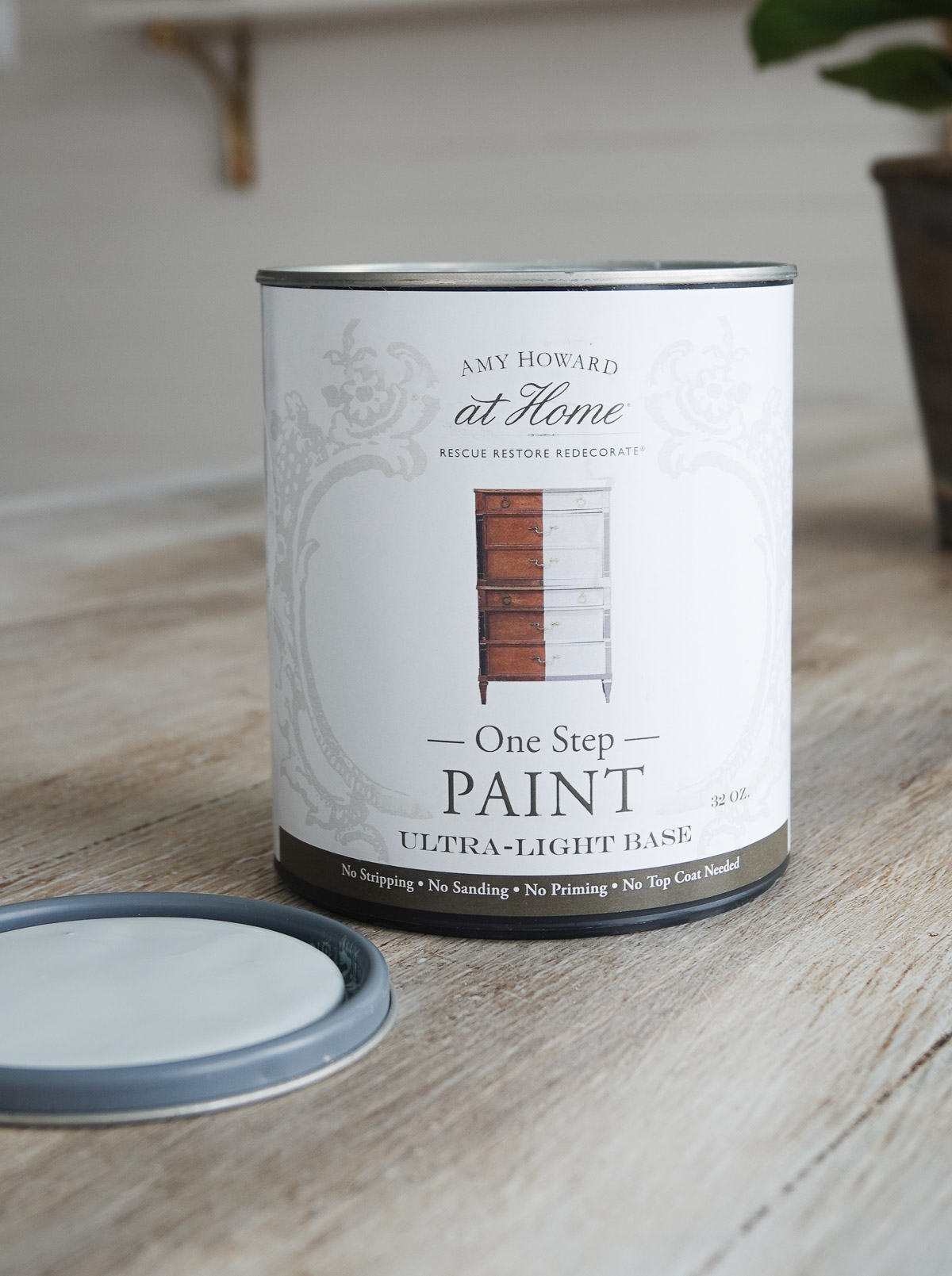
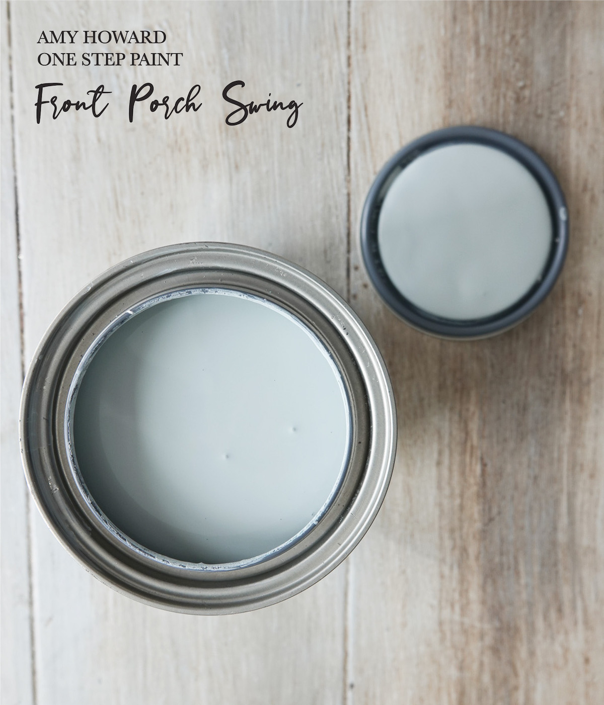
- Amy Howard at Home One Step Paint
- Amy Howard at Home Sealer (I used the matte)
- 2.5″ Flat Brush
- Small Foam Roller
- Painters Tape
- Drop Cloth
- Screwdriver (to remove the hardware and hinges)

Did you know you can also apply chalk paint in a sprayer? I HIGHLY recommend this method when painting cabinetry to avoid brush marks and for a smooth finish.
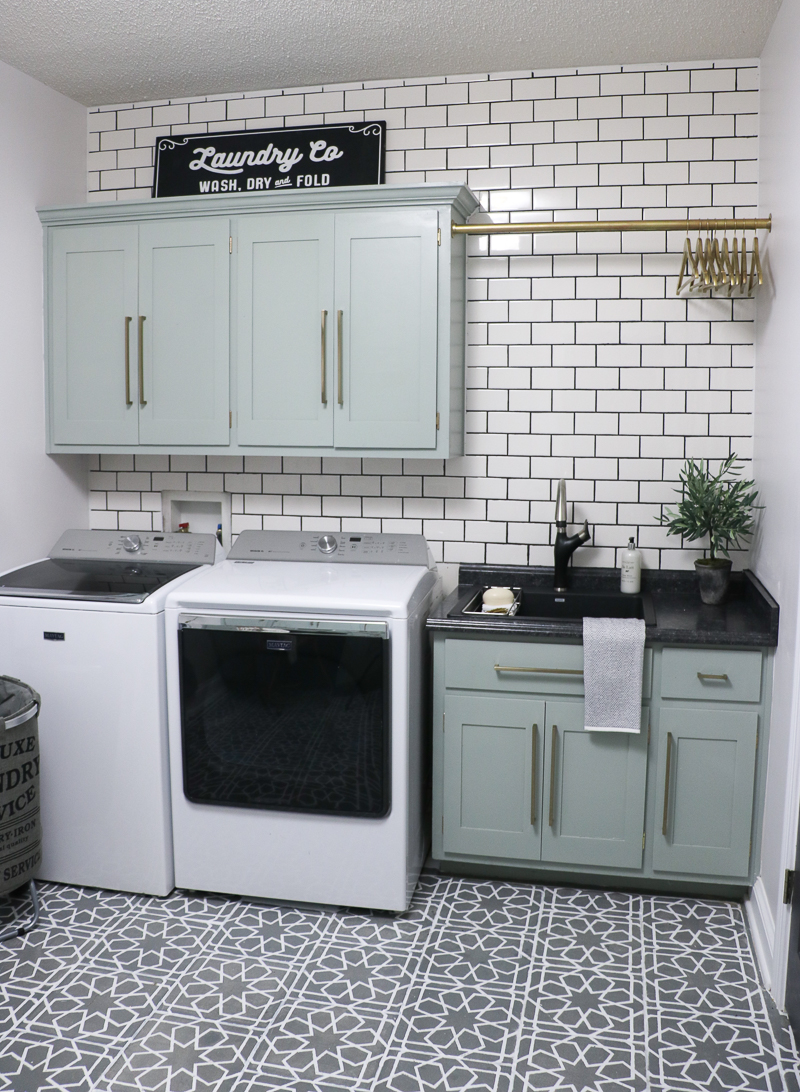
See how my laundry room cabinets turned out by going HERE and for the spraying chalk paint tutorial.
This post was originally published in April of 2016.
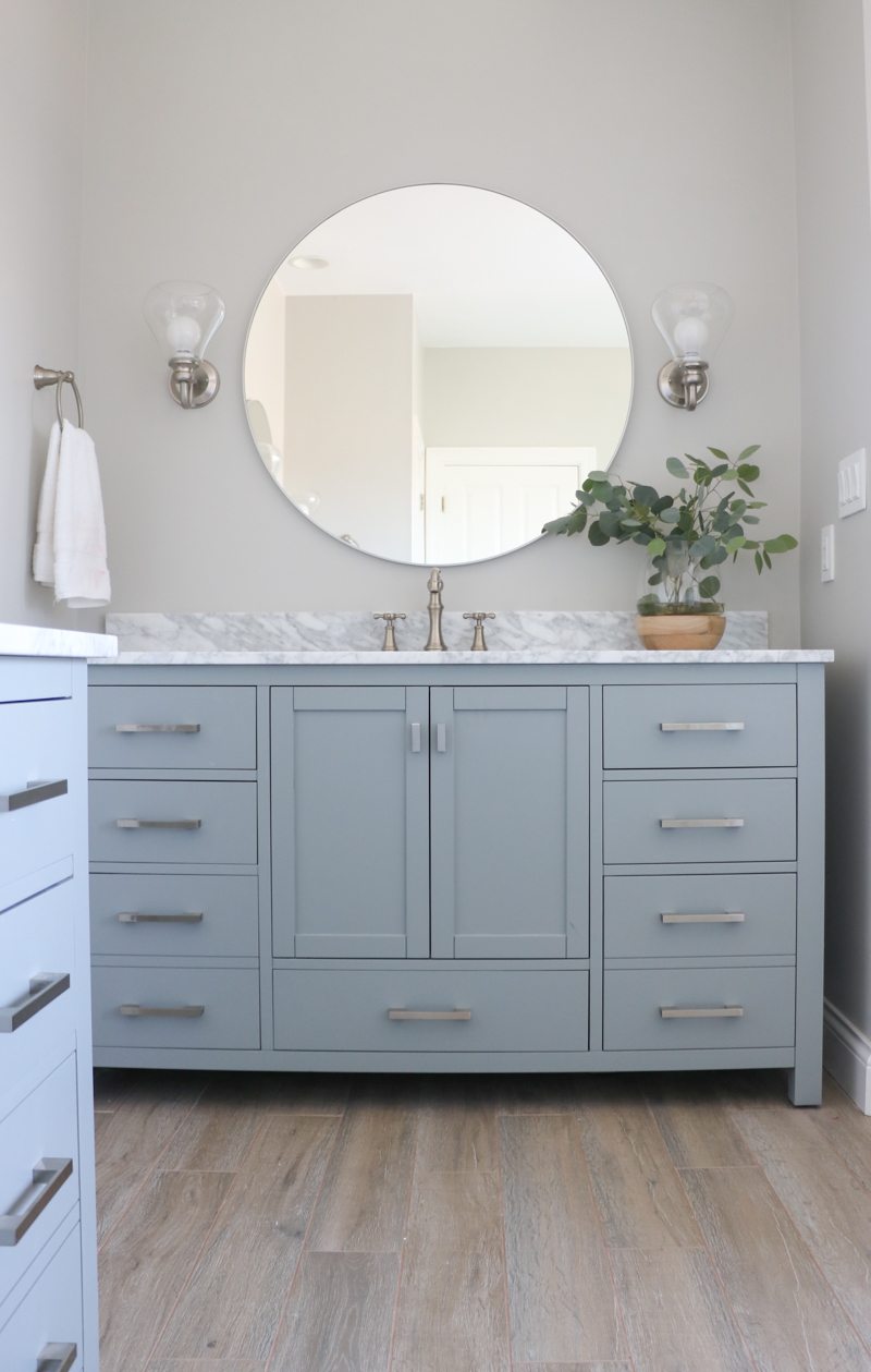
Painting our kitchen cabinets helped me love the space until we could remodel it:
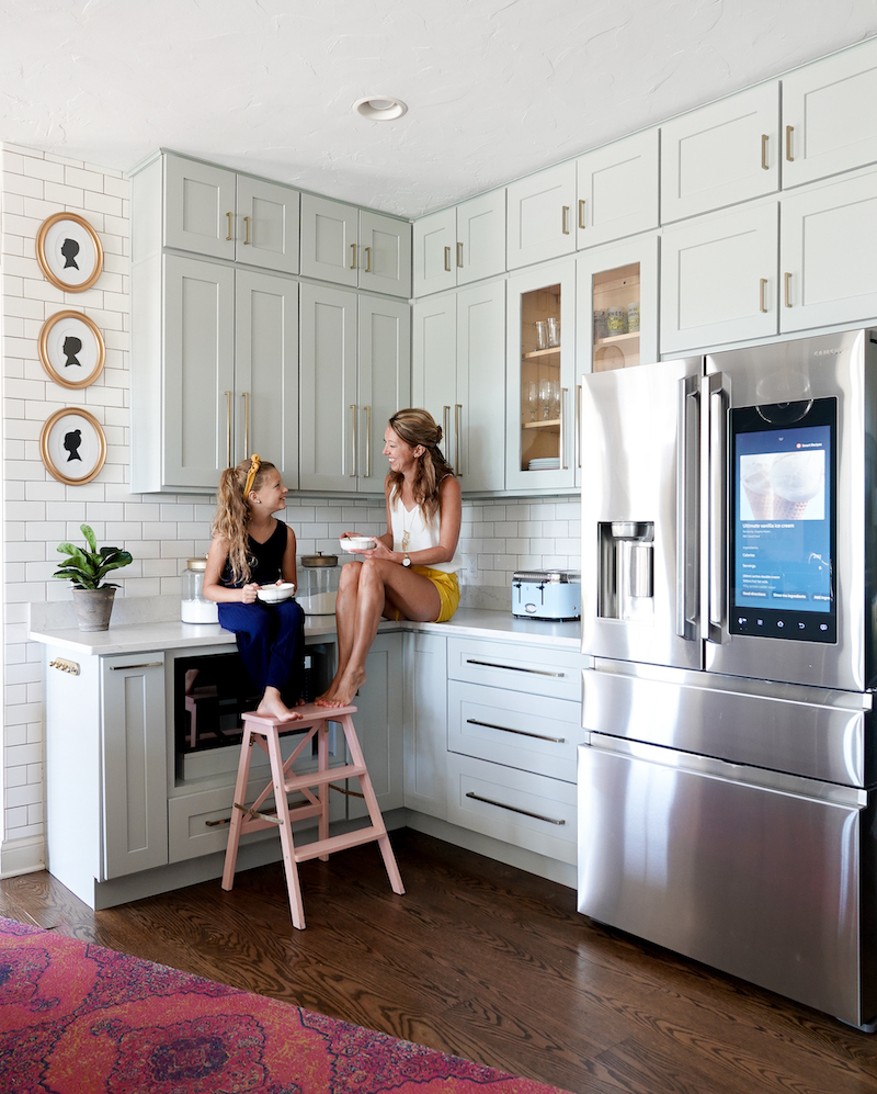
See the full DIY kitchen remodel reveal (and journey) HERE!
Go create something!

Are you new to my blog? Go HERE to see my home tour and HERE to shop for items I use in our home.
Find me on Facebook | Instagram | Twitter | Pinterest
*This post contains affiliate links and is a sponsored post by Amy Howard at Home. I take pride in reviewing only products that fit my brand and will be beneficial to my readers. And while this post is sponsored, all the opinions are my own.


 I don’t know where I’ve been, but I just discovered that you can put chalk-type paint in a paint sprayer!
I have been a fan of chalk-type paint for years and have used Amy Howard’s version (
I don’t know where I’ve been, but I just discovered that you can put chalk-type paint in a paint sprayer!
I have been a fan of chalk-type paint for years and have used Amy Howard’s version ( I was used the Amy Howard paint sprayer on this project, but unfortuntely they no longer sell a sprayer. However, I have two other favorites I have used, and you can see those
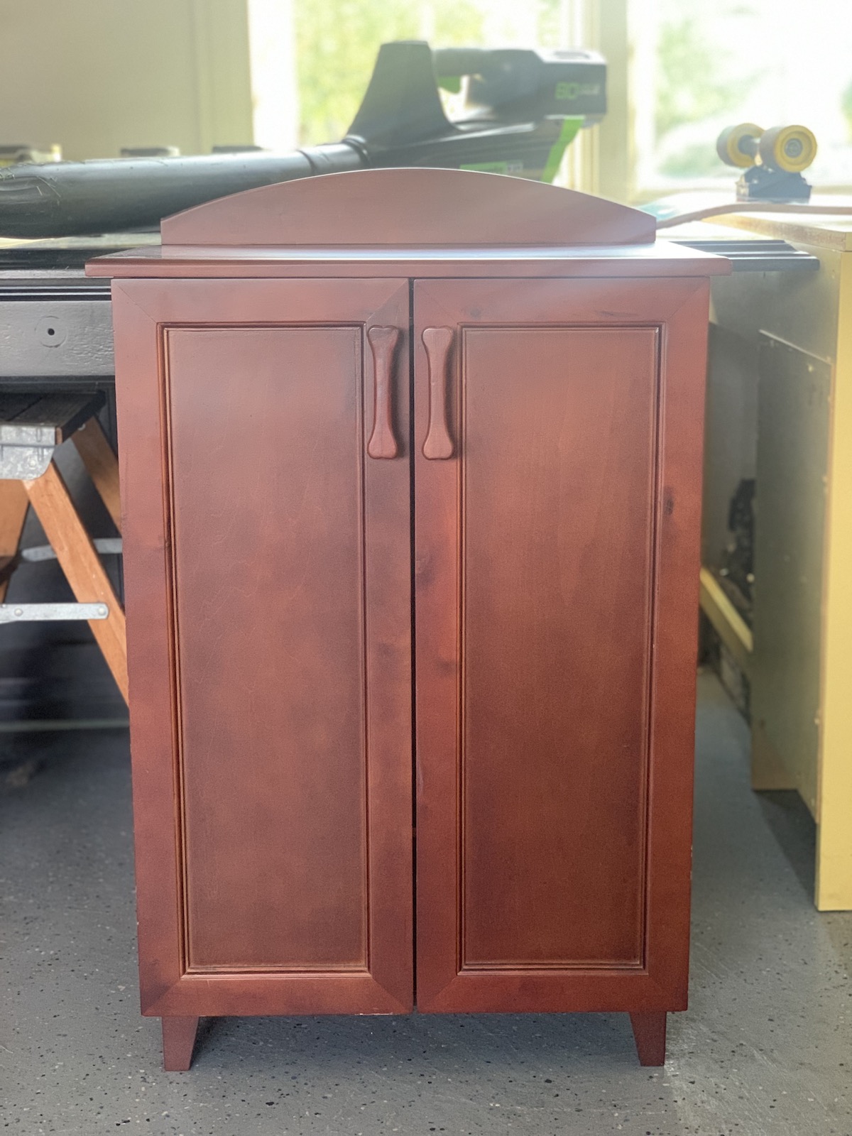
  My cabinets were a very 90’s dark green. In my previous makeover I left the desk area green and only worried about the cabinets people saw from the doorway. I painted the cabinets that were visible cream, and I always regretted the cream next to my very white washer and dryer.
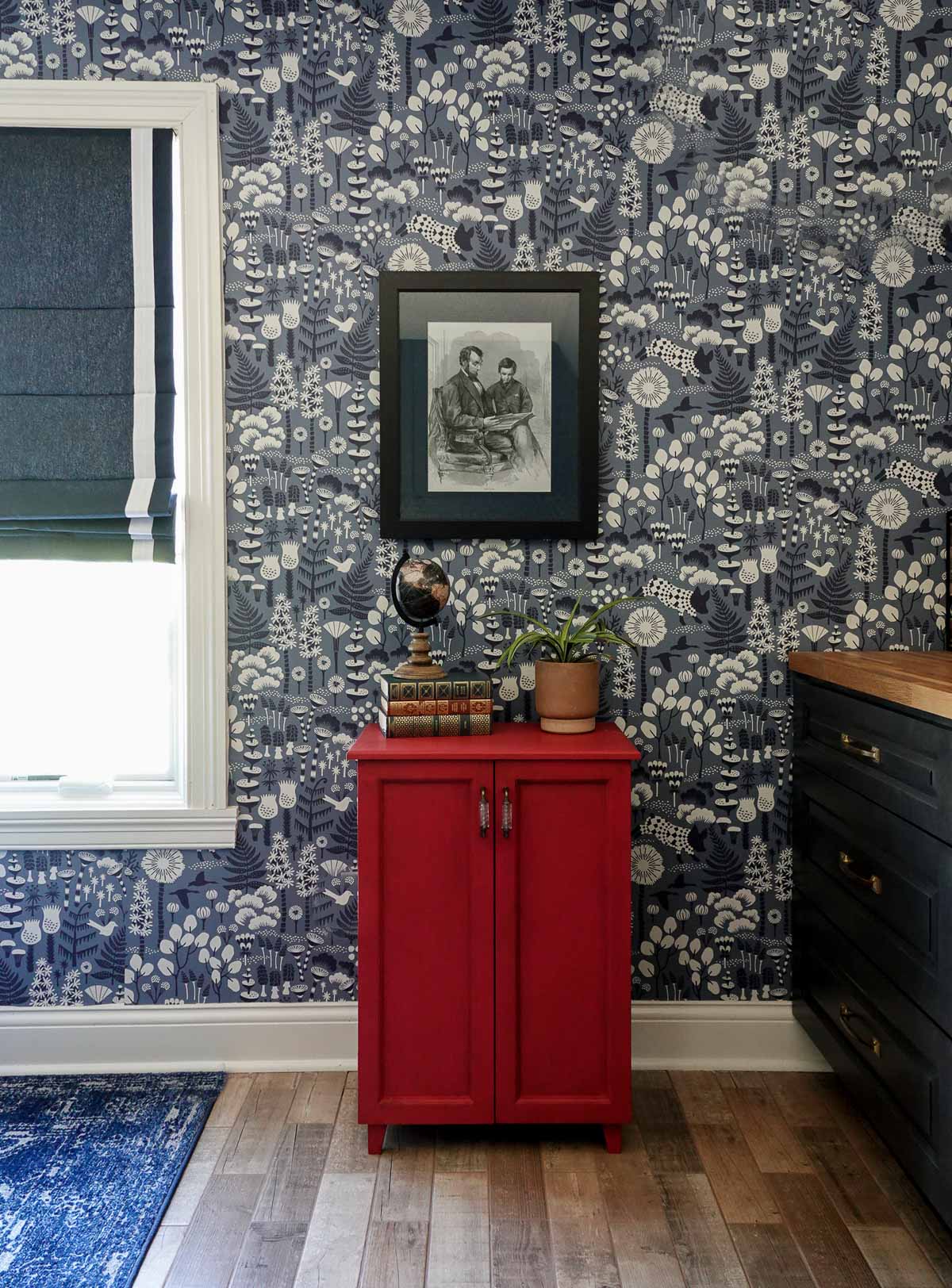
 I decided to paint all the cabinets (including my desk area) a new color.
I sanded the cabinets that I had previously painted cream and didn’t worry about sanding the other cabinets I had never painted.
I decided to paint all the cabinets (including my desk area) a new color.
I sanded the cabinets that I had previously painted cream and didn’t worry about sanding the other cabinets I had never painted.
 This post contains some affiliate links for your convenience.
  All the doors and drawers were painted in my garage.
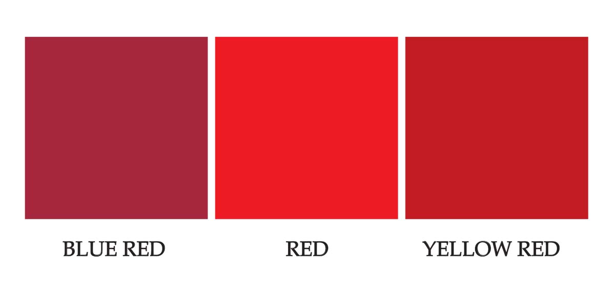
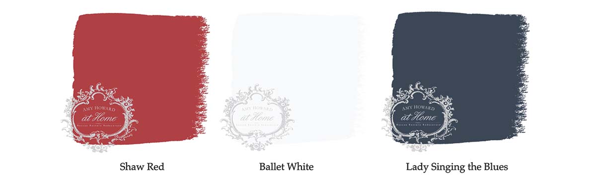
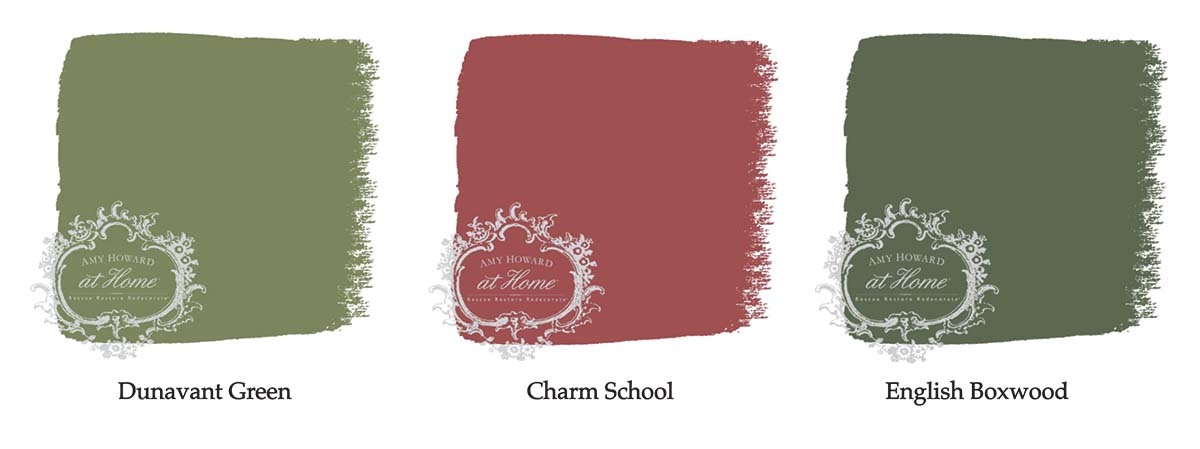
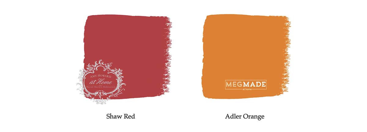
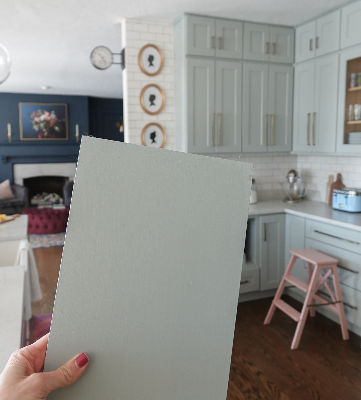
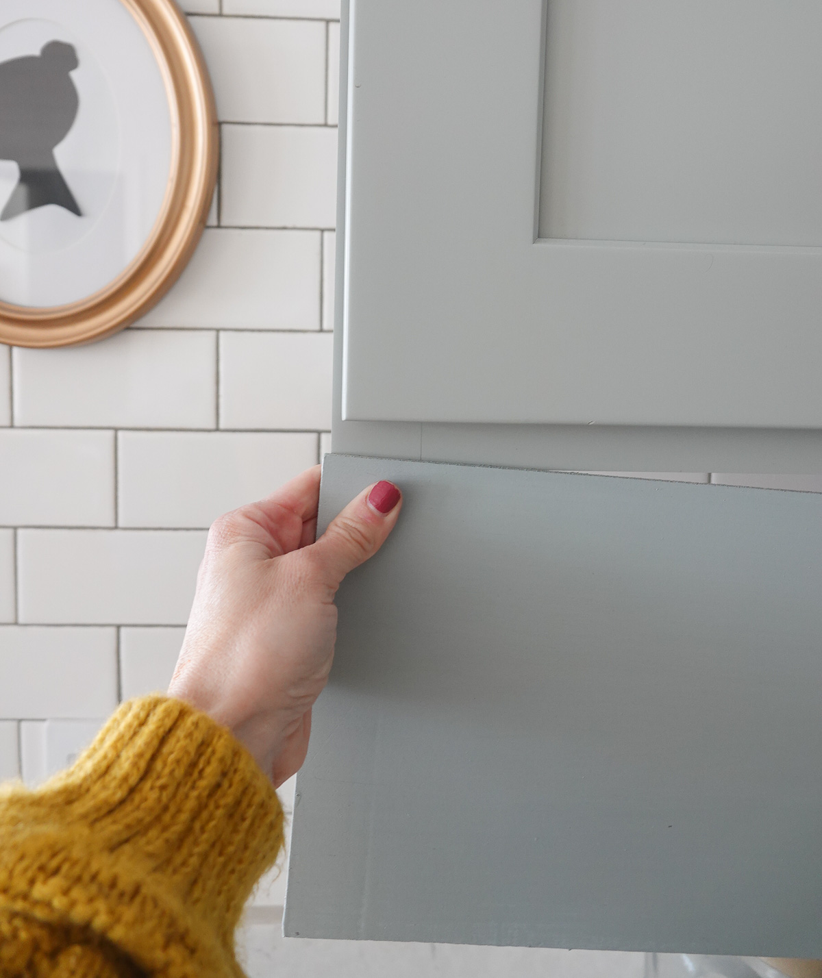
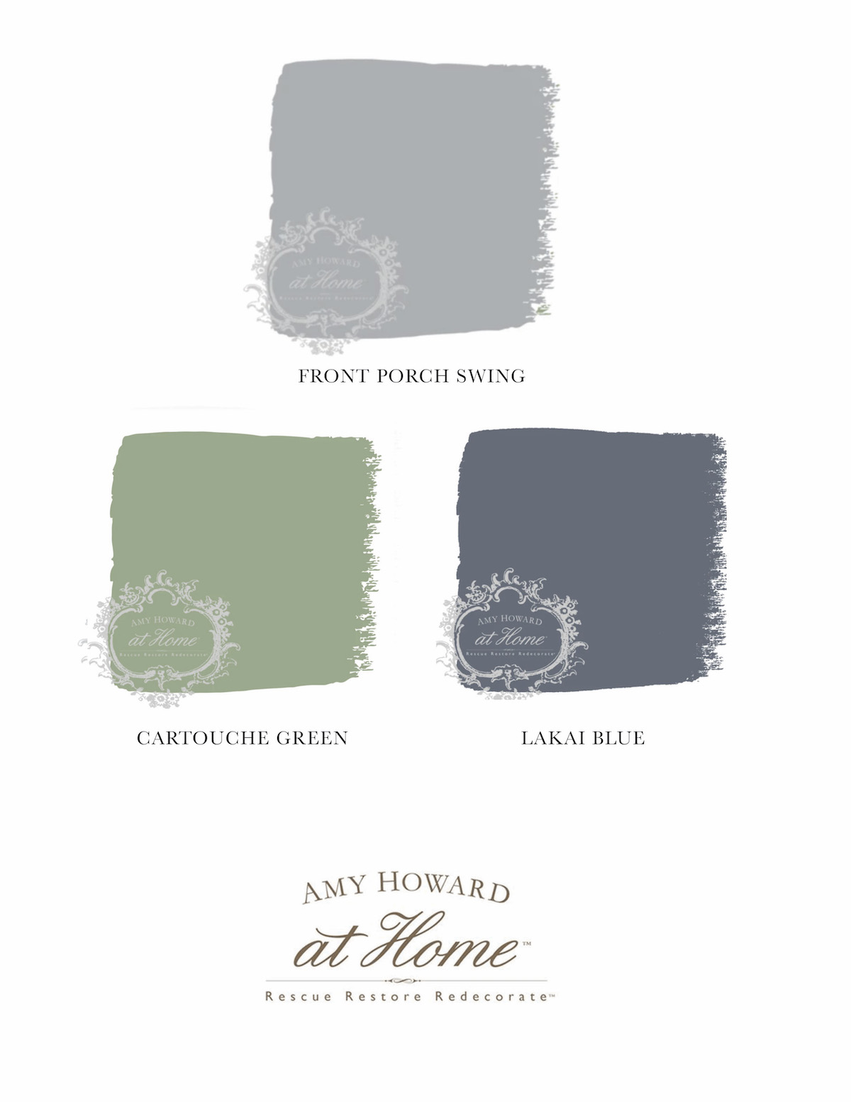
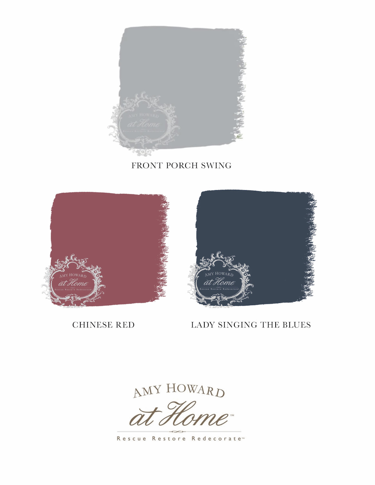
 Early in the design stage, I wanted colorful cabinets and ordered Amy Howard’s
  I decided to mix some colors to create a soft similar color.
I played around with a little paint to get the perfect color. Once I felt confident in my ratios, I used an empty gallon can and mixed a batch large enough for both sets of cabinets in my laundry room.
I used:
I decided to mix some colors to create a soft similar color.
I played around with a little paint to get the perfect color. Once I felt confident in my ratios, I used an empty gallon can and mixed a batch large enough for both sets of cabinets in my laundry room.
I used:
 I used a brush and foam rollers to paint the cabinet frames and sealed the paint with a
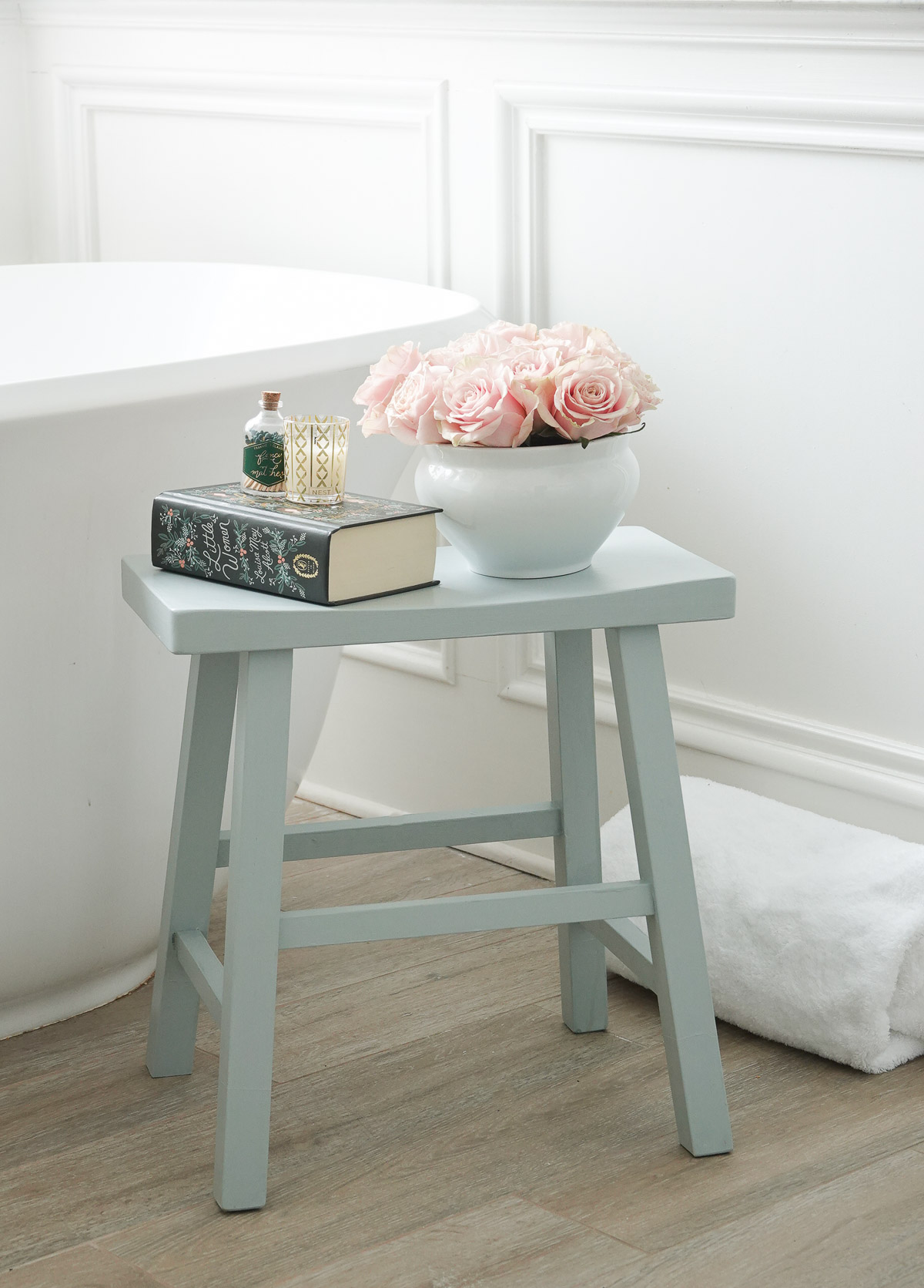
  And after an afternoon of painting, my cabinets were a gorgeous new custom color!
 I used
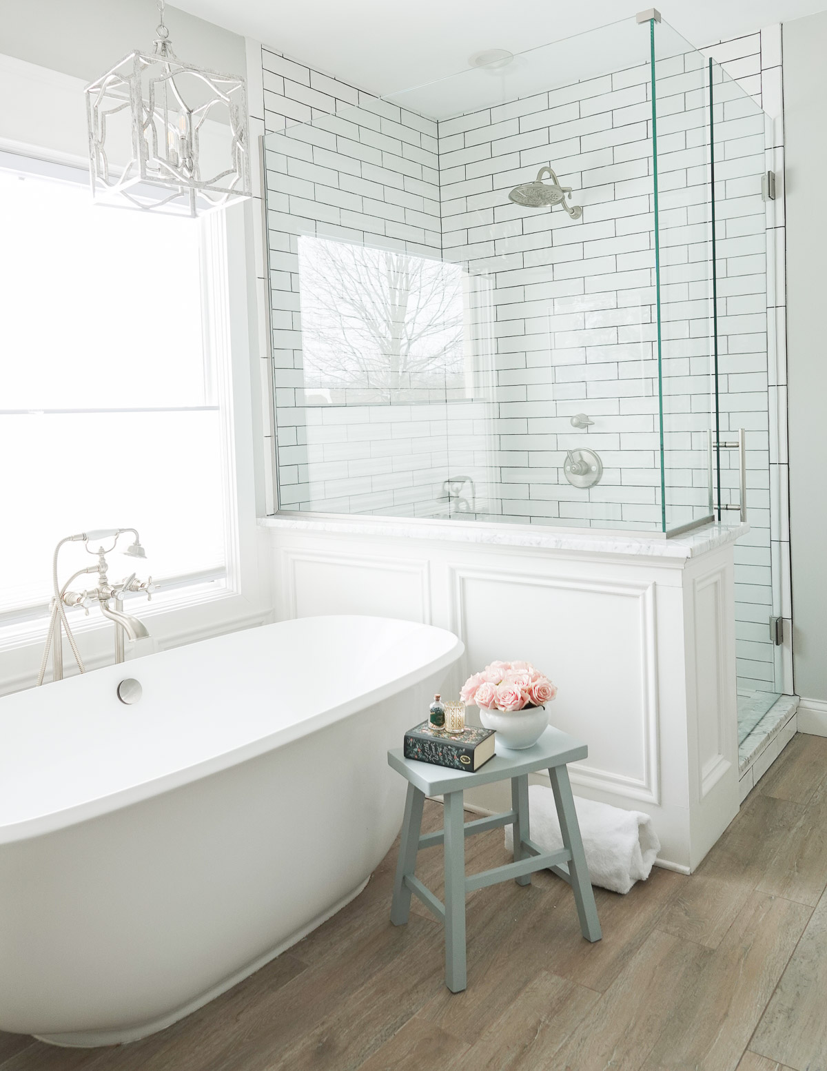
  This room was definitely a labor of love, and I really am so excited to share the full reveal
  I have a few finishing touches left (like caulking around the tile and finding accessories for the space), but the hard work has been done.
 UPDATE: It has been several years since I painted these cabinets, and they still look great! Spraying helped provide a smooth finish, and I ALWAYS recommend a water-based sealer rather than a wax for cabinets. You can


 To paint my cabinets, I used a chalk-type paint from Amy Howard at Home. I love this paint because it eliminates the need for sanding or priming. There is no prep work! Here’s what is needed:

 Now it is time to paint!
 Begin with a brush to get all the areas the foam roller will not reach.
 After the hard-to-reach areas are done, add a coat of paint to everything with the foam roller.
 Once the first coat of paint is dry, give everything a second coat.


